

This July, I'm happy to be sharing with you all some images kindly sent in to our MSRB inbox by friend of the blog, publisher73. publisher73 is a frequent reader and commenter from Mississippi who is also a self-described "Kroger loyalist/nut," which means he's in very good company here!
It's been quite some time since I've shared much in the way of image-based Kroger content with y'all, so it's probably about time that I got around to doing so again. I have a confession to make, though: I'm not the biggest fan of my "O Kroger, Where Art Thou?" décor directory posts; those were among my earliest publications on the blog, and I like to think that my writing style has improved significantly since that time. By the same token, however, because of their inseparability from this blog's origins, I recognize the importance of those posts to the blog; and I also, of course, am more invested than ever in keeping track of Kroger's décor packages. Which, again, is why I'm happy that publisher73's photos -- and, by extension, today's post -- provide critical updates in that arena.
At the time I shared those original Kroger décor directory posts five years ago, the current package was, without a doubt, Bountiful -- what you're more apt to see referred to as "2012 décor." The package garnered the 2012 moniker from the Mid-South flickr gang, who dubbed it as such upon first encountering it in our region in that same year... but in fact, the package debuted as early as 2009, meaning it had a good, long lifespan until its retirement sometime in the mid-2010s.
 |
| Bountiful/2012 Décor |
One reason I dislike a lot of my earlier writings on Kroger is that I slammed the Bountiful/2012 décor package quite a bit. In reality, I think it's actually a very nicely-designed, cohesive look; I love its attention to detail, and honestly I think it's Kroger's best design in modern history (even if it's not my personal favorite -- I'm not sure which décor gets that honor, actually. It seems to vary daily!). Truthfully, the only reason I hated on it so much is because so many Kroger stores locally seemed to be remodeling to it at an unbelievably fast speed; in effect, I was mad not at 2012 itself, but rather the fact that its rollout was, on the flip side of the coin, eliminating so many other, older décor packages that had had the good luck to survive up to that point. (The Southaven Bauhaus Kroger and Horn Lake Neon Kroger both come to mind.) publisher73 agrees: "I remember thinking that every store in the company was going to end up with that package since it seemed so prevalent." Now, sadly, nearly all of those older décor packages were simply and unceremoniously being wiped away in favor of achieving a largely homogeneous store base.
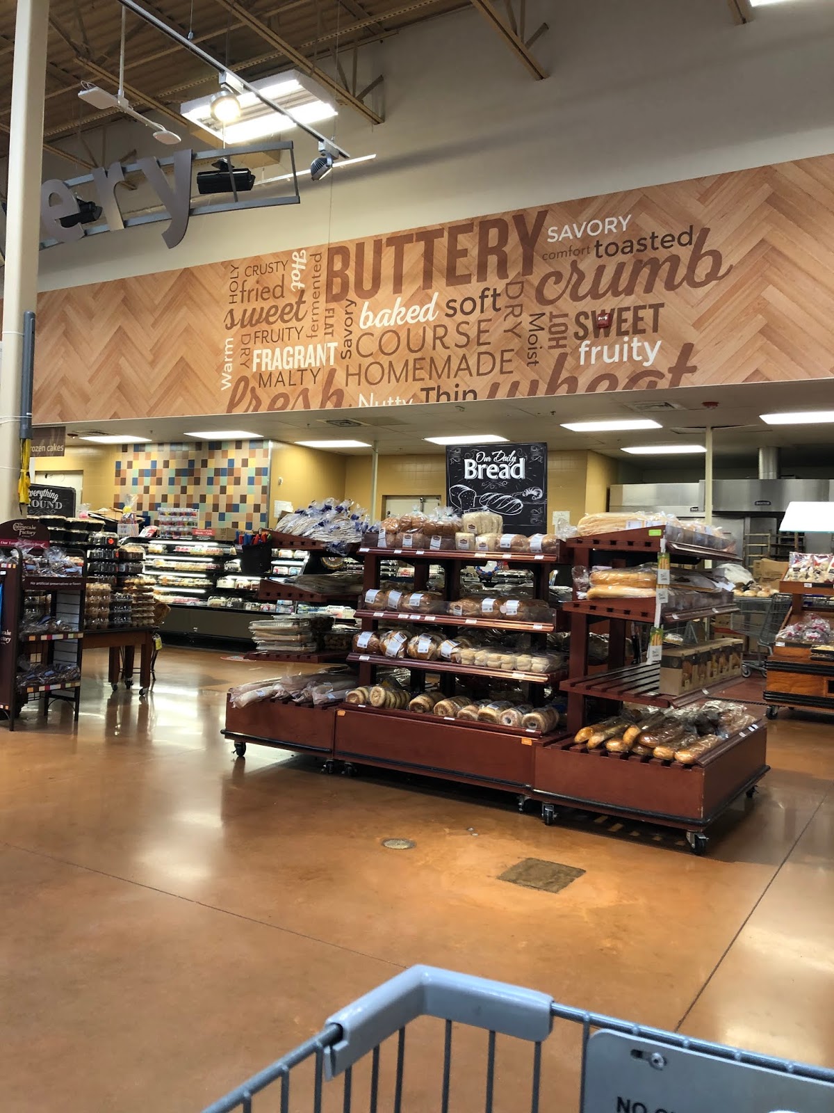
As I said, though, Bountiful was finally retired not too long into my stay on flickr; if I'm not mistaken, the Truse Parkway Kroger, which held its grand reopening in January 2016, was the last store in the Memphis metro area to remodel to 2012 décor. A few short months later in 2016, a new package popped up on the RetailWatchers radar: internally known as "Neighborhood," but what we now like to call "Fresh and Local." After its major remodel spree in the years prior, Kroger Delta Division understandably seemed to take a break from remodels for a span, meaning it took a little while before Fresh and Local appeared here in the Mid-South... but finally the Memphis metro got its first F&L remodel in the summer of 2017, with the Millington Kroger. Additional remodels took place in the months and years to follow.
 |
| Fresh and Local Décor |
Then, curiously, in the winter of 2017 (carrying over into 2018), another décor package was introduced to the mix when the Trinity Commons store adopted the Marketplace décor during its remodel. That décor, too, has had quite the lifespan, dating back at least to, incidentally, the year 2012 (if not a while even before that; I honestly have no clue when it debuted). It is known officially as "Banner" décor, but we prefer to call it "Marketplace" simply because it was reserved for use only in Kroger Marketplace stores. Until, that is, the Trinity Commons remodel evidently proved otherwise! Thus far, only one other non-Marketplace Kroger in the Memphis area has remodeled to Marketplace décor, but Kroger Delta Division has used the package in many other "regular" Kroger stores throughout its region, namely a number of stores in central Mississippi. (Likewise, Fresh and Local seems to have more prevalence in Kroger Delta's Arkansas stores, although it is growing in number in and around Memphis, too.)
 |
| Marketplace Décor |
Remodels featuring both the Fresh and Local and Marketplace décor packages (to non-Marketplace stores) continue as we speak; in fact, I've found evidence that two Kroger Delta store remodels scheduled for later in 2020 will, respectively, feature those two designs. After historically having one (and only one) current interior décor design, you may think it strange for Kroger to be using two simultaneously. But here's the kicker: it's not just two. Indeed, as a matter of fact Kroger -- at the time of this writing -- has no fewer than five current décor packages. All going on at once, and with little to no obvious indications as to how which stores are selected to receive which package. It's a lot to try to keep up with, and certainly a lot more complicated than the days when every remodel was infallibly known to lead to Bountiful!
It may not be a traditional "décor directory" post, but I'll be sure to cover all of Kroger's current, myriad looks before the end of today's entry. First, though, we need to jump into the store publisher73 aims to shed a light on... and to do that, we need to briefly travel back in time all the way to the beginnings of Bountiful décor.
--------------------------------------------------
The store publisher73 has sent in images of is Kroger V-492, located at 1070 Hwy 51 in Madison, MS, just north of the state capital of Jackson. Perhaps fortuitously, this is the exact same Kroger that I got a handful of photos at earlier this year; so since I have some pre-remodel pics, I thought I would go ahead and share those first so that we would have a basis for comparison.

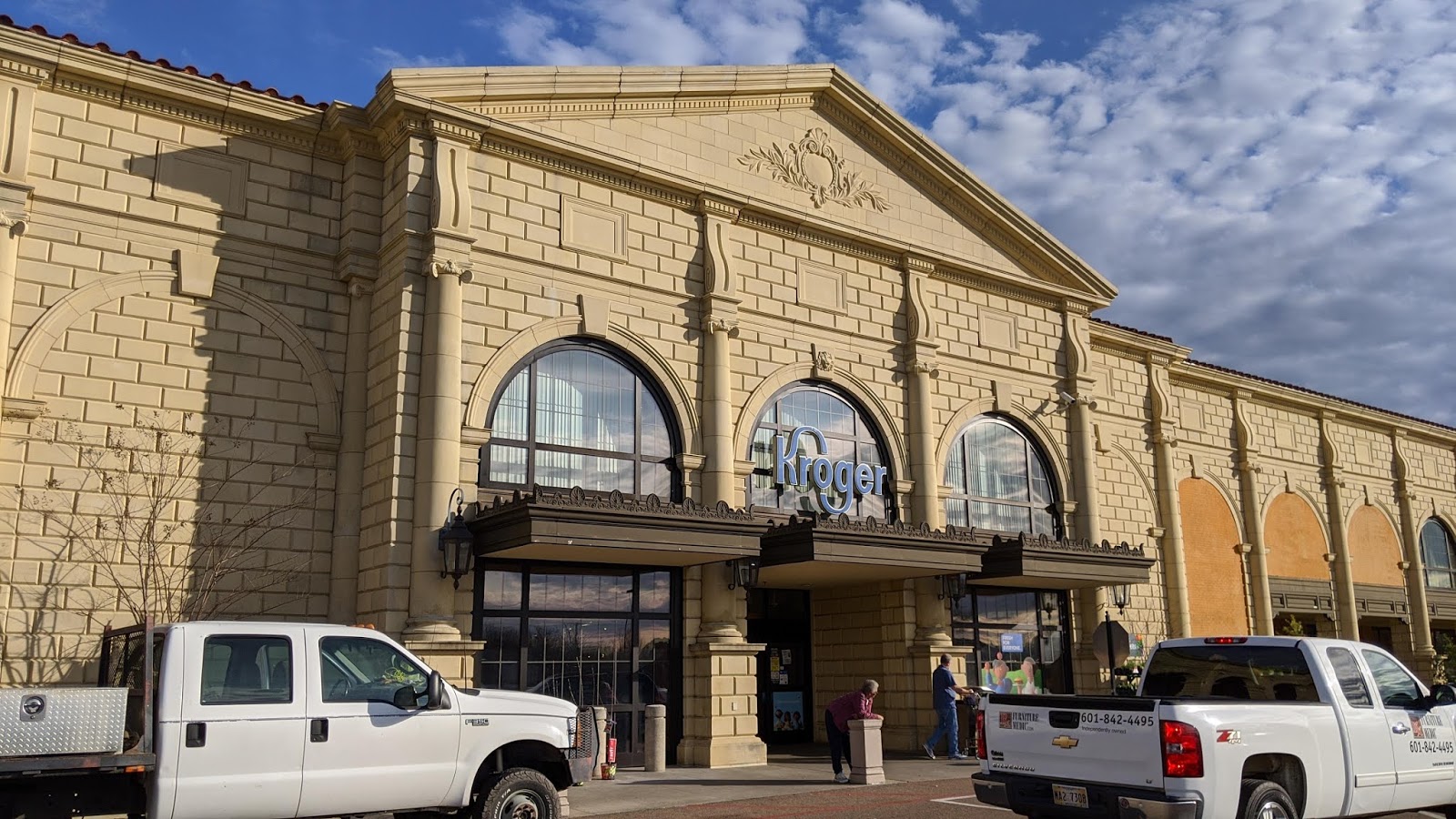

When I say "a handful of photos," be warned that I really do mean only five or six; and more than half of those, you'll see, are solely of the store's exterior. There are two reasons for this: one, the store was insanely busy, and I hate trying to get interior pictures when a place is so crowded. And two, the primary reason: just look at this store's architecture!! The Madison Hwy 51 Kroger is like a legitimate castle. It's mind-blowing.
To be honest, I don't think I would like seeing this every day if this were to become my "regular" Kroger, but I've got to admit that its unusual look is definitely unique and fun to experience in person at least once. The massive façade here actually reminded me a bit of the eccentric buildings and architectural styles famously found in touristy places like Branson, MO. Madison's buildings aren't quite on that level of eccentricity, but they do all feature very fancy, often custom designs. More examples can be seen via a quick Google Images search.


By comparison, the interior of the store was significantly less over-the-top, although that doesn't mean it wasn't special. Clearly, since I've been alluding to it so much, there must be something worth discussing here! And hopefully the above two pictures, the lone interior shots I got of this store, are enough to help you realize the significance.
Figured it out yet? Pay close attention to the department signs. There are two major aspects that are different from what we normally see. First, the colors: usually meat & fish gets the darker basket sign, and bakery a lighter one. Here, they're swapped. (Probably for good reason, too -- a darker sign for the bakery might give the impression of burnt bread, and that's never good.)
Second, look at the size of the signs themselves: the "basket lids," as I like to call them, are significantly longer than what we're used to seeing. That is, the upper parts of the signs stretch out from the wall much further than is typical in most Bountiful/2012 décor remodels. The longer basket signs, my friends, are a hallmark of what I call "Early 2012" décor. From what I've been able to ascertain, only the earliest installations of this design used such department signs. Below, you'll find a side-by-side comparison of the Madison store's deli sign (sourced from Google Maps) and a typical later 2012 décor deli sign (sourced from SeekingAlpha).
 |
| I tried to find two shots that match up as evenly as possible. You can see from the blue lines at the bottom that the bases of the basket signs are in the same position in both photos. Up top, the two pairs of lines show the distance from the top of the leftmost protrusion of the "basket lid" to the bottom of the rightmost one for each deli sign. On the left (the outer lines, in red) is the "Early Bountiful" sign, and on the right (the inner lines, in gold) is the regular Bountiful sign. Hopefully, even without the lines, you're able to tell just from looking at both pics side-by-side that the "basket lid" is much longer on the sign on the left. |
I'm not sure how long, exactly, this early variation of Bountiful décor was in use; for all I know, it could have been used for a number of years, seeing as how (as I mentioned) the package existed for several years before it was discovered in the Memphis area, and the "2012" name took off. In any case, here in the Memphis area, there seems to be only one store with this version of the décor -- located on Stage Road, in Bartlett -- and I have to imagine that that was the first location locally to receive this package. This Madison store opened with this look in 2011 (more on that later), and by the 2013 opening of the Poplar Plaza store in Memphis, the design had been revised to the typical, shorter basket signs we all know and love. (Of note, there are also many additional elements that have changed in this package over the years -- such as décor-specific gooseneck signs, and hanging lanterns to match the light boxes on the walls -- but that's too much both to delve into here and to keep track of in general!)
 |
| One more parting shot of the Madison Hwy 51 Kroger, pre-remodel, for good measure. Incidentally, this photo shows the exact same two signs seen in my images -- meat & fish, and bakery, both off in the background. Courtesy Google Maps |
--------------------------------------------------
I've been eager to talk about Early Bountiful/2012 for quite some time (likely exacerbated since this pandemic is preventing me from visiting that Bartlett store, which I've wanted to do for a while), so I thank you for indulging me there. But you and I both know that that's not what you came to read this post for. You're here to see publisher73's remodel images, and to learn more about one of Kroger's newest, current décor packages, not some obscure early variation of a now-former one. I hear you. So without any further delay, let's jump right in to publisher73's pics.
These first two pictures come from early March 2020, very shortly after my most recent visit to this store, in fact. publisher73 writes, This was taken after the walls had been painted and was the first hint of what the new package would look like. Be sure to note that this store's solution to providing temporary department signage during the remodel was to take the existing hanging curved rails from the basket signs and suspend them from the ceiling (see the tail end of "bakery," top left of the image). Very resourceful!

This wood paneling effect had just been finished; prior to this that area and the space above luncheon meats had been painted a deep blue, which is what originally led me to suspect the Marketplace package was going to be used (that and that the fact it has appeared at three other metro area stores in the couple of years.) I hated to see the mosaic pattern in the bakery and meat departments disappear; I thought it was really cool. The back wall of the meat area is now a vivid blue brick pattern, evident in an upcoming photo.
The deep blue paint color publisher73 is referring to ought still to be present above the Choice Cuts department nearby.

We move to June 2020 for this and all but one of the remaining photos. You can see the dairy department signage in this pic. publisher73 says, I'm ambivalent about this new design in general, but this particular area just says "1980" to me. Undeniably the store's color scheme inside is much brighter.
I have to agree; even when I had little evidence to go off of, what I saw made me feel that Artisan wasn't going to be a décor package I particularly cared for. At least the dairy department here in this Madison store looks better than it does in some others I've seen online. In those other stores, the dairy sign doesn't have that herringbone pattern wood background element at all; instead, the "DAIRY" letters are simply stuck on the empty wall space. Which brings us to the next couple of pictures...


...lots and lots of empty wall space. The top image takes a look at the lunch meats department, while the bottom one is from the back wall in dairy (separate from the department sign we've seen already). I found it very surprising that so much of this package is simply a bland-colored, off-white, empty wall with a black stripe above it. Very boring, in my opinion. Especially compared to plenty of Kroger's other décor packages that seem to have put in much more effort to occupy the sometimes vast stretches between primary department signs.
What's more is that those silhouettes you see filling up the otherwise-empty space aren't even an official part of the Artisan décor package. Here's what publisher73 had to say about them: This is part of the package that I really don't care for. The random silhouettes would make more sense to me if they were somehow specific to Madison County or Mississippi in general. As they are here, they just look kind of chintzy and say "Piggly Wiggly" to me for some reason. Honestly, the dog is the only one I can say I truly like.
His sentence about how the silhouettes aren't specific to Madison was probably more spot-on than he realized. You see, back in March, I had the opportunity to visit the Kroger at Houston Levee and Winchester in Collierville, TN, and photographed the results of its recent remodel to Urban Mix décor (which, by the way, makes four out of the five current décor packages!). While there, I (and l_dawg2000, before me) discovered these same silhouettes in the dairy department. Not just "the same" as in "the same in concept"... "the same" as in "the exact same." See below.

 |
| The above two images (with the yellow walls) come from a Collierville, TN, Kroger, not the Madison store. |
As you can see, the Collierville store features the exact same symphony, train, house, and lightpost silhouettes. (It looks like Madison switched out Collierville's gazebo for the dog and his/her human.) When I first encountered these in the Collierville store, I knew that the silhouettes, as with Artisan, were not an official part of the Urban Mix décor package... but I at least assumed that their inclusion meant that the figures had been chosen because they have some relevance or significance to Collierville. Helping that assumption was the fact that, next to the symphony silhouette, the word collage background (which actually is truly customized for Collierville) does indeed reference a local symphony (see the top left of the image).
However, seeing publisher73's images proved once and for all that, in fact, the silhouettes are not chosen due to having any local significance. Rather, the Kroger Delta Division has simply been placing them in some of their recent remodels regardless of their relevance. In response to hearing this news, publisher73 wrote back, Thanks for sending these images. Very interesting. I hope I warm to the silhouettes; I guess I just don't like the ones they chose. The symphony, in particular, feels like something in a school auditorium or community music hall. ... I think they look better in the Collierville store, frankly.
I tend to agree with publisher73 here. Not only is it disheartening to see that the silhouettes are generic, but like him I also find them a bit tacky in design. Similarly, I agree that they look better in the Collierville store. That said, though, remember what I said earlier about the Artisan décor package having a lot of plain, empty wall space? It's worth noting that if the silhouettes were not installed in the Madison store, those two images that publisher73 provided would feature nothing but blank space between the vertical-oriented wayfinder signs. So, perhaps it's better to have the silhouettes present after all.
I'm ambivalent about the markers for yogurt here, as well as for eggs, butter, etc. elsewhere, publisher73 opined. But, yeah, that wall would be extremely dull in white with only the vertical signage.

Thankfully, the décor starts to pick up a bit more in the next images. In this image of the meat and seafood department, publisher73 writes, you can see the blue brick pattern. I think it's attractive, but I also think I like the grey brick pattern above the frozen seafood cases more. But, no question the blue gives the area some much needed depth of color to contrast all the white and wood paneling in the rest of the store.

Indeed, the Artisan décor package is very heavy on its wood paneling. Yet more of this can be seen in publisher73's photo of the neighboring bakery and deli departments, shown above. Something else to note here is that the trusses (?) to/from which the department names are affixed are all installed in different arrangements -- compare the bakery, to the deli, to meat and seafood. At least that gives the package some visual interestingness here in the service department area of the salesfloor.
The Oxford, MS, Kroger is also currently remodeling to this package, simultaneous with a store expansion. Unfortunately, the deli, bakery, and meat and seafood department signs are significantly more curtailed in design in that store, even though (for all intents and purposes) those departments are in a new-build Kroger.

Health and beauty presents us with Another trip to 1980, according to publisher73. Yeah... I definitely have to concur on that one! Between the blank walls in over half of the salesfloor to the... interesting... sign you see here, Artisan certainly has some unusual color choices.
As always, I'm curious to hear your opinion on the design of this new décor package. If you've got any thoughts, please drop them in the comments below.

Up next is a view of the pet section, where we also get a look at the signage used for all interior departments. Aisle markers, I believe, are redressed but physically same from prior packages. publisher73 is correct about the aisle markers -- at least reusing the existing aisle markers, just with new skins, is a good way not to waste materials during a remodel.
Note that the style of these signs is, like the ones we've seen on the perimeter walls, funky, wood-laden, and fairly reminiscent of the 80s. The picture inserts are a new and unusual element, too. (Perhaps a callback to the days of photo-insert aisle markers? Having Artisan take inspiration from the 80s would be an interesting parallel to the way Bountiful quite obviously seemed to pay homage to the "superstore" décor of the 70s...)

publisher73 wraps up his June 2020 photos with this shot of the beverages department. I may be wrong, but this department seems larger than before and takes up no fewer than four complete aisles right at the front. Another look at the department signage and aisle markers, as well as the very white front wall.
In the distance, you can see a square green sign with the text "MADISON MISSISSIPPI," which is cool. Also, in the pets picture shown previously, if you zoom in you can make out the "Thank you for shopping MADISON Kroger" sign. Note that the Kroger logo there is the chain's new logo, which has very quickly begun rolling out to stores chainwide (especially those being remodeled).

Last but not least, publisher73 shares with us a pic of the store's pharmacy department, taken in July (so, just a few days ago!). As you can see, it uses a gray paneling (or bead board) type design with blue (and black) lettering.

EDIT, Mid-July 2020: After this post was published, publisher73 sent in this image of a new solution to the empty space along the rear wall, writing, This appeared in the Madison 51 Kroger this week. Very tacky in my opinion. Clearly they know those walls are too empty, but this is a bad solution. See the comments section of this post for more.
As I shared earlier, not to put words in his mouth, but publisher73's consensus seems to be a lot like mine... that this new décor package falls flat in some areas. Speaking of the meat and seafood counter, he writes, I do like the blue tile because it's really the one true "burst of color" in the store. As we've seen, so much else in this package is either empty or almost even dated-feeling.
So that you can get a better feel for just how much of this décor is based on a minimal use of color, below I've included the interior décor elevations for this store's remodel. Again, note that the silhouettes are not included, as they are not an official element of Artisan décor.


The final image you see above -- the nighttime exterior shot -- is one last image that I took of the Madison Hwy 51 Kroger. But it's not this post's last nighttime exterior shot of this site...
--------------------------------------------------

Remember how, much earlier in this post, I mentioned that the Madison Hwy 51 Kroger opened with its Early Bountiful décor in 2011, then promised that I'd give more details later? Well, here are those details. While the specific castle-looking store you just saw did indeed open in 2011, it was not, in fact, the first Kroger store to stand on that property. Previously, there was an existing, smaller Kroger building, that was torn down and then rebuilt into the store that stands on the site today. Thanks again to publisher73, we're now getting a brief look at that old store, just shy of a decade after its demolition.

publisher73 wrote of the current (2020) remodel, Actually, I'm surprised that our Kroger was redesigned now; it still seems "new" to me. It was built in '11 after they tore down the original Kroger here that was built in the early 90s. It was originally true Neon, but was Millennium by the time I moved to town in 06. I've attached a couple of low-rez (sad) photos I captured on my last night to shop in the store (January 4, 2011) before it closed. I then shopped across town at the Kroger at Colony Crossing for a year while they rebuilt this one.
This WLBT story also has some details on the replacement store, which opened in October 2011. At the time, it was the largest Kroger in Mississippi!

I'm very grateful to be seeing these photos, and I'm sure you guys are, too! So thanks again to publisher73 for sharing this great content with us today.
As I said, publisher73 has commented here on the blog before, and has mentioned that he lived in Olive Branch (and shopped almost exclusively at that Kroger) for a couple of years before moving to Madison. So, in regards to the store pictured: My store in Madison, while Millennium when I arrived, was laid out almost to the exact same specs as the store in Olive Branch, which was true Neon at the time. So when I moved here, even the merchandise was in the same general spots. So it just looked like "my" store had been redecorated. Pretty fun coincidence!

The Olive Branch store that publisher73 mentions started out, like Madison, with Neon décor, but skipped over a Millennium décor remodel in favor of Script décor a little later on in the 2000s. Then, in late 2012/early 2013, it was remodeled to Bountiful décor (and I think it was this particular remodel that gave that package its "2012 décor" nickname, even). As of last year, it has finally been remodeled again, this time to Fresh and Local décor. Both l_dawg2000 and I have albums of the Olive Branch Kroger on flickr; you can view his here, and mine here. (I'll get to posting my Fresh and Local post-remodel pics soon enough...)
The Horn Lake Neon store, which publisher73 also mentioned in our emails (as both OB and HL started out as identical twins), retained its Neon décor all the way up until its own Bountiful décor remodel in late 2014/early 2015. And most of the other Neon-build Krogers in Memphis seem to have skipped over Millennium and remodeled straight to Script décor. So, about the only Neon-turned-Millennium stores that I personally am familiar with are the stores on Barnes Crossing in Tupelo, and in Starkville. (And of course, having been all around Mississippi, publisher73 said he's had experience with that Starkville Kroger as well!)

Finally, here's one more pic of the former Neon-turned-Millennium, original Madison Kroger, on one of its final days in operation before being demolished and replaced with the current, much grander Hwy 51 store. In the photos you've seen above, we've toured the produce department and perishables grand aisle (with the bakery and deli service departments, leading to meat and seafood in the back right corner); the first inner aisle of the store (which curiously appears to have been signed as Aisle 2); and the rear wall, not to mention the classy exterior as well (in the very first photo). Now, in the last pic above, is an overview of the left half of the store as viewed from near the pharmacy in the front left corner. The floral island can also be seen.
--------------------------------------------------
You might think that this post would stop there, but nope, we're gonna keep on chugging! You may have caught a brief mention of a second Kroger store in Madison earlier, when publisher73 said that, during the Hwy 51 Kroger's rebuild, he shopped across town at the Colony Crossing Kroger. Seeing as how Hwy 51 was rebuilt, Colony Crossing is now technically the older of the two buildings, but as far as the properties themselves go, Kroger has occupied the Hwy 51 site for longer. Colony Crossing had Script décor as of earlier this year, and I assume it opened with that package as well. Below, you'll find a handful of photos of that store, a mix of my own and of some sourced from Google Maps (which are credited accordingly).
 |
| As I said earlier, all buildings in Madison have fancy architecture; that holds true at the Colony Crossing Kroger, even if it's nowhere near as over-the-top as the Hwy 51 Kroger. Courtesy Google Maps |
 |
| Unlike Hwy 51, Colony Crossing's Kroger is a "reversed" store, meaning produce and deli/bakery are on the left. I entered on the right, to frozen and pharmacy. |
 |
| This has nothing to do with this image, but while I was at this store, I saw Barbie Bassett. (Something that actually does have to do with this image: somehow, this store actually managed to keep the little dot over the "i" in "Dairy"!) |
 |
| Note the aisle markers hailing from Marketplace décor, obviously installed more recently than the wall graphics. |
 |
| I always love seeing local flair on the walls! |
 |
| The grand aisle of the store was busy on my visit here, so I didn't get any photos of my own. But these ones I found on Google are thankfully very nice! Courtesy Google Maps |
 |
| Note how, in addition to the primary "Bakery & Deli" sign seen in the previous image, there are also two secondary, separate "Bakery" (previous image) and "Delicatessen" (above) signs. Courtesy Google Maps |
 |
| Produce has two signs as well -- "Fresh Produce" (primary) and simply "Produce" (secondary). Courtesy Google Maps |
The reason I bring up this other Madison Kroger -- besides using this post as a conduit to share my own photos of the place, like I did the Hwy 51 store! -- is because it, too, is scheduled to be remodeled in the future. In fact, its remodel will coincide with a brief expansion, to boot. Below you can see the site plan (with the expansion areas circled), as well as architectural renderings of the new exterior design. Kroger is accomplishing this expansion by taking over space previously occupied by some neighboring strip center tenants, which have since vacated.


 |
| I don't think the colors in this rendering are entirely accurate, but you get the gist. |

The above schematic shows what will be the store's new layout post-remodel and expansion. Obviously, it's difficult to point out what will be different without having the ability to truly show its current layout, but perhaps the biggest change that should be easily evident is the relocation of the produce department away from the front left corner, to a spot that's approximately straight ahead when you enter the store through its main (left-side) vestibule. If you divide the above image into fourths, a majority of the leftmost one-fourth will be entirely new square footage gained from the expansion.


Last but not least from this store, as I did with the Hwy 51 remodel, above you'll find that I've shared the Colony Crossing Kroger's interior décor elevations. And like Hwy 51, this store, too, will be getting Artisan décor. I'm sure publisher73 will be on the lookout for the upcoming changes to this Kroger!
--------------------------------------------------
For the final section of this post, it's time, as promised, to recap the five décor packages Kroger has going on concurrently right now. I already showed y'all the "trading cards" for both Fresh and Local and Marketplace décor at the top of this post. We've seen enough of Artisan that I can share that one without any further explanation, too.
 |
| Artisan Décor |
Unlike all the other ones, of the images in this collage, only one is mine; two more are publisher73's, and the final two are sourced from flickr. In the dairy department photo at the bottom left, note the lack of a herringbone pattern wood background, which I referenced earlier in this post.
 |
| Urban Mix Décor |
Next up is Urban Mix, which I've also already mentioned in this post. Note that I put that little ampersand symbol as the image in the center. The ampersand hails from Kroger's failed Main & Vine experiment up in Washington state, and, interestingly, can be found in both Artisan and Urban Mix. Because of this, I kept confusing the two whenever I saw photos of them, at first. But now, knowing that Urban Mix is considerably more colorful (even if the colors are on the darker range of the spectrum) than Artisan, I won't be making that mistake again!
Thankfully, my pal Northwest Retail documented Main & Vine on his blog before the concept went away; you can check out his coverage at this link. To make matters even more confusing, the décor in that store looks a lot like a combination of elements that later were allocated without overlap between Urban Mix and Artisan!
 |
| 2012: The Remix Décor |
The fifth and final décor package that Kroger is using currently might look very familiar in a lot of ways... it's just a Remix on Bountiful! Seriously -- all it involves is removing the existing décor lettering, and repainting the walls. Even the bones of the basket signs remain. You can also see that the radiating elements of the produce department sign remain, while the circular "the garden" sign itself is removed and replaced. The product images and light boxes are similarly reskinned, but otherwise left alone.
It's a very confusing décor package, in the sense that I don't understand why so much effort had to be made to keep the Bountiful stuff partially intact. Feel free to let me know what you think in the comments, but to me, this looks cheap. And if it was going to look cheap anyway, I don't see why the basket signs had to remain. Honestly, I feel that the basket signs remaining makes the "package" look even cheaper than it would with the new letters just stuck straight on the wall instead. Especially when the sign installation crews often get the letters horrendously off-center on the basket signs! (I've spared you images of that in the collage, but trust me, it's very common.)
Now, in fairness, I do think that the actual design here has promise. But the execution simply falls flat. From what I've found, Kroger internally calls this look a "paint and putty update" to Bountiful, meaning all that's required to complete the remodel are, well, paint and putty. If that doesn't say "economical," I don't know what does. That all but confirms that even Kroger sees this package as cheap, in my mind.
But, hey -- with five décor packages going on all at once, no wonder one of them is cheap; I certainly can't blame them for that! In truth, every one of the décor packages Kroger is currently using seems to be on a different level of "prestige," so to speak, although I honestly have no clue if Kroger sees it that way or, even if they do, if that plays a role in how they choose which décor package to remodel a store with. In fact, my friend Albertsons Florida Blog has suggested that "giving the store manager a series of pictures and asking him to pick the décor he likes best" might be the main method of decision making! Again, a far cry from the days of the Bountiful/2012 décor remodel rampage... even if it makes me sad now to see that package on its way out the door. But whatever the criteria are, having five décor packages at once certainly is good for one thing -- keeping things interesting!
--------------------------------------------------
That'll do it for this hybrid contributor/feature post. I hope you enjoyed going with me on a long and winding ride exploring lots of different Kroger décors, and thanks again to publisher73 for sending in his images of the Hwy 51 Kroger in Madison under remodel! Further posts on the blog this month will be on the sparser side, but I do hope I'll have the chance to get at least one more entry published before the end of the month rolls around. So until then and as always, thanks for reading, and have fun exploring the retail world wherever you are!
There is a lot to digest here, thanks to Retail Retell and publisher73 for all the work here. Perhaps it's just that I have not visited the diverse number of Krogers around town like I did pre-pandemic, but there are a couple of decor packages in this post which I've never seen before in a Kroger. So, yeah, looking at these pictures is like at a supermarket which isn't Kroger!
ReplyDeleteThe exterior of that Madison store is wild. If it didn't say Kroger, I never would have guessed that it was a Kroger. Even the older store with the Millennium decor looked pretty wild on the outside, but maybe less so. It's a shame the older store didn't last because it looks nicer to me than the newer one and the smaller size probably would have been more pleasing to me. Oh well, Kroger didn't ask me and I'm not sure why they would since I don't even live in that region, lol.
We have so many Krogers in Houston that it's hard to think of all of them at one time, but I'm thinking we don't have too many Krogers with as ornate of an exterior as that Madison store. The Kroger Fresh Fare on/near Montrose looks kind of unique, but not that fancy. I suppose the fanciest Kroger we have that I can immediately think of is the River Oaks Shopping Center Kroger. You may have heard me mention this location of AFB's blog since it was home of the famous Starbucks across the street from Starbucks with comedian Lewis Black made famous (one of those Starbucks closed earlier this year).
River Oaks is probably the most famous 'old money' neighborhood in Houston so it isn't a surprise that the Kroger there is perhaps the fanciest looking one in Houston on the outside, but the interior is pretty cookie cutter Kroger. The exterior has an art deco theme to it to fit in with the older part of the shopping center, but it also has some unique features to it. Here are a couple of photos of it on Flickr:
https://www.flickr.com/photos/gtotiger/4869403446/
https://www.flickr.com/photos/94283635@N00/207247113/
As for the 'Artisan' decor, well, I like the wood paneling. Of course, I remember the 1980s so maybe I have a more favorable opinion of those earthtone design schemes. The wood paneling look goes okay with the stained brown concrete floor, but I think it would look terrible with a regular concrete floor. I can't tell for sure, but I'm guessing that wood paneling is totally fake wood, right?
If it is fake wood, I think it would look better if it was real wood or more convincing fake wood. As it appears now, it kind of looks like a temporary 'decor of the week' type thing which will change again soon. Given what Kroger has been doing with refreshes, it probably will be a 'decor of the week.' Or at least a 'decor for half a decade.' There is too much plain white and black paint near the Dairy department, IMO. The produce department also does not look very convincing. Why is there just a small strip of wood paneling with other decor which doesn't really look like it belongs with wood paneling?
I don't know about Kroger using the 'Artisan' name on any of their decor. Kroger decor is the definition of mass produced, cookie cutter design. Isn't that the opposite of what 'Artisan' means in the dictionary? If that is an official Kroger name, I feel like they're pulling one on us here, lol. Then again, I've yet to see this decor elsewhere, so I suppose it is still unique to me.
I generally like the 2012 decor. The 2012 decor became somewhat synonymous to me with the ripping out of vinyl tile floors for hideous concrete floors. Granted, not all Krogers which got the 2012 decor lost their vinyl tile floors.
Call me crazy, but I think that Food 4 Less decor package might be my favorite modern Kroger decor package, but I think it looks better in a Greenhouse Kroger than an actual Food 4 Less.
Our pleasure! Yeah, at this stage it's not super common to have come across all five decor packages, I think. I've only seen Urban Mix once, Remix twice, Marketplace in a non-Marketplace store once, and Artisan only at the Oxford store in the middle of its construction (so, not the full package at all there). I'm sure they'll get more common as time goes on, though. (Which would actually be unfortunate, in the case of Remix, in my opinion...)
DeleteOh yeah, I imagine there's not a single other Kroger out there that looks even remotely similar to the Hwy 51 store in Madison. Like I said, Madison requires custom architecture for buildings in their town, and Kroger went above and beyond for that location. The Colony Crossing Kroger is a little more in line with the more typical look. Still fancy, but on a much more low-key level. But I guess with the 51 store being the largest Kroger in the state at the time of its opening, they wanted the exterior to make just as grand of an impression. (I'm not sure what the largest MS Kroger is now. Several more have broken the 100K sf barrier. I think the Hernando Marketplace might be it, which would be cool!)
Yes, I've definitely seen the exterior of that River Oaks Kroger before! I even incorrectly posited that that was the exterior design that went along with the rare/short-lived, similarly Art Deco-inspired "For Goodness Sake" interior decor. I was corrected on that though, and in fact I don't think that package was ever used in Texas.
I'm positive that the wood paneling is fake wood. I'm no expert on the true materials used, but I have to assume that everything in a store decor package these days is of a lighter-weight material just made to resemble whatever material they want it to look like. Too much liability issues if a heavy block of wood were to fall down and injure a customer. At least, that's the reasoning l_dawg2000 has used, and I'm inclined to agree with his logic. That said, I do have a sign from Albertsons' old Industrial Circus decor package, which is made out of true wood. Guess that was in the older days though, haha!
Yeah, I agree, Artisan leaves a lot to be desired in some places (okay, most places in my opinion, but I recognize that others may like it more than I do XD ). Artisan is in fact the internal name for this package (Northwest Retail is good at finding those things out). You make a good point about the name being a bit ironic, though! It finally just clicked for me the other day that "Bountiful" was probably meant to refer to "bountiful harvest," what with all the wheat stencils on the walls. "Banner" and "Neighborhood" make sense as well. "Urban Mix" I think is simply because that package was designed originally for use in urban stores such as the new downtown Cincinnati Kroger.
Like I said, I've still yet to actually see that Food 4 Less package in person. It definitely is nice and bright and colorful, which can't be said of Artisan, really. Urban Mix is a unique one too; it's colorful, but very dark colors are used. It's interesting because in photos, it comes across as a little dark, but in person, it was perfectly suitable. It's hard to explain.
I did some virtual tours of some Kroger stores in parts of Houston I don't visit that often and found some interesting things. One is a pretty new Kroger Signature store over in Je's part of town which seemingly was opened with the Food 4 Less package. This store is very close to Deerbrook Mall, a successful mall which is Je's local mall. I would say this area has a somewhat large Hispanic population, but again, there are certainly more Hispanic parts of Houston than this. It's interesting that the Food 4 Less package was installed in a new store that is meant to be somewhat upscale, but I've seen it in a Signature store which opened in the 2000s as well. With this Deerbrook location, we can see what that package looks like with stained concrete floors and an open ceiling. I think it gives these dull stores some needed color and brightness. Link: https://goo.gl/maps/tWs5JfrGQxe7HJiF8
DeleteQuite far from that Kroger Signature store is another relatively new Kroger Signature store in the Pearland suburb of Houston. This Kroger has a decor package that I have not seen elsewhere in Houston. It's a pretty strange one, but it does look pretty nice and interesting. Are you familiar with this one?
Link: https://goo.gl/maps/UMb1K1Nez6UKHGgc8
I do agree that sometimes the photos make these stores look darker than they really are and that makes it difficult for me to judge the 'Urban Mix'. I'm not sure what causes that. Perhaps a longer exposure would make for more realistic lighting, but then you'd need a tripod and I don't think Kroger will allow that, lol. Still, these stores are darker than, say, a Kroger with the Food 4 Less package, white tiles, and a drop ceiling. That combination is probably my favorite of the modern designs and I hope you're able to step foot in such a store at some point.
The 'Bountiful' name does make sense to me with all the wheat graphics and basket looking decor. Some stores, especially outside the Houston area in places like Orange, TX near the Louisiana border, have the 2012 'Bountiful' design, but without the 3D baskets and such. I think it still looks pretty good, it's certainly better than the stripped down 'Neon' decor that didn't have the neon! Of course, the 'Neon' design itself might be my favorite Kroger decor, but I don't think we have any stores like that left in this area. Here's that Orange, TX Kroger: https://goo.gl/maps/WGCGf8cZYD3C8DqF7
That is a good point about making sure signage is light in case it does fall. I reckon properly installed wood paneling is unlikely to fall, but that is probably too expensive for Kroger to install and it would then be a lot of work to remove it for the next redesign. Instead, we probably get not-so-credible looking fake wood. Other grocers who keep their decor longer, like Fiesta Mart, would probably be more inclined to use real wood or at least more study and credible looking fake wood.
There's a Kroger I shop at a lot which is a former Albertsons. This store got the 2012 package, but then got flooded during Hurricane Harvey in 2017 along with the other nearby Kroger on Cypresswood. The store reopened a few months later with the same layout, but a completely different decor package. Maybe you're familiar with it. I don't really like it, it's too basic in some spots like the bakery. Anyway, a contractor I suppose took a photo of the store completely stripped down after the flood. It's interesting to see the 2012, stripped down, and then current photos of the store. It's interesting that the drop ceiling was removed when the store was stripped, but then put back in before the store reopened.
Link to the contractor picture: https://goo.gl/maps/3NnLmz8emQoimmPC7
Link to the store itself with the various different decor packages: https://goo.gl/maps/eaGS74MuEF24jaM7A
You found lots of good stuff in your research! I'll see if I can help answer some questions for you...
DeleteWith the prevalence that the Food 4 Less decor has in your area, it's entirely possible that Kroger has simply adopted it as a "normal" decor package there. Only from what I've seen of its use and read from others' theories is how I got the impression that it was meant to be used in regular Krogers only in areas like we discussed. It seems like maybe your local Kroger division may just have incorporated it into its regular decor rotation, though. I honestly don't know how any of this truly works internally, but it's always fun to speculate! It does look nice in that store you linked.
Great find with that Pearland store! I had never seen enough of it to get a full mental picture of the decor package before you linked this store (so I appreciate that!), but as I understand it, that is the decor that Kroger used in its Marketplaces prior to the current Marketplace decor (aka "Banner"). Like the current package, it's interesting to see that one branched out from the Marketplaces into a "regular" Kroger. Do you know when that store was built? Maybe that could help us tie down a timeline for when that decor was retired and the new Banner decor debuted.
Yeah, a tripod might be ever so slightly frowned upon :P I'd love to see all the packages that I haven't yet, such as that previous Marketplace one, the Food 4 Less decor like you mention, and Re-Fresh Fare, among others. So much is out there!
Ooh, I didn't even make the basket connection to the harvest theme either. (Clearly I can be slow on the uptake sometimes XD ) Good catch! Yeah, the design can look a little sadder without the basket signs, but still nice enough. I think I prefer that to the "stubby" basket signs like the Horn Lake formerly neon decor store has. As for neon itself, I'm only aware of one store remaining with it, in Blytheville, AR (which I've visited and photographed twice!). I would hope there are more out there, I just don't know where they are. It seems like neon is even rarer than Bauhaus these days, as up until recently there were still at least two of those (but one has sadly closed within the past several months). Think there may be a couple more out there that I can't think of off the top of my head right now as well.
Finally, the decor in the store you shop at (the former Albertsons) is fresh and local. I didn't like it when I first saw photos of it, but having seen it in person several times since then, I've come around. But yeah, the bakery looks a little sad there -- I don't think the decor was designed for that department to have so much excess wall space. (Having a "Plan B" for excess wall space is something prior packages did great -- bountiful, script, millennium. Why have the current packages let that fall by the wayside?) Plus, I hate that gray color they use in the bakery. There's an alternate blue color for bakery that I prefer a heck of a lot more. See here: https://www.flickr.com/photos/130271900@N03/48815946492/in/album-72157673872904492/
That contractor photo is really wild, too -- thanks for sharing!
The Pearland Kroger opened in December 2008 according to a Houston Chronicle article which I'll link at the end of the paragraph. The decor of that store does look like something that would fit in a Marketplace store. I knew it was something a bit unusual, but I didn't realize that you hadn't seen a full store like that. There are some aspects to that decor which look a bit cheap, but it's generally cheerful. It adds a little bit of warmth to those big warehouse looking stores that are over 100k sq. feet. Link: https://www.chron.com/neighborhood/pearland-news/article/Kroger-opens-store-in-Shadow-Creek-Ranch-area-1759333.php
DeleteI found the grand opening article for the Food 4 Less decor Kroger Signature over near Deerbrook Mall. I can confirm that the store opened with that decor. The article gives some insights into the store demographics by saying that it has 33% in the three biggest demographics. I suppose that adds some validity to the idea that the Food 4 Less decor is aimed at stores serving diverse neighborhoods. This store opened in August 2014. Here's the link for what might be an interesting read: https://www.chron.com/neighborhood/humble/news/article/Humble-s-Kroger-Signature-store-opens-for-9723092.php
I've seen the Food 4 Less decor with my own eyes and I did like it. Not only are the stores colorful, but there are some interesting pieces of artwork in various spots. Also, some of the stores which have that decor still have white tile floors from the Millennium/Cursive Script era and the colors of the accent tiles from that era matches well with the colors used in the Food 4 Less decor. I hope you're able to see a store with that decor with your own eyes, but I don't know where the closest one is to you.
A couple minutes after I posted my reply, I realized that the Kroger near me is indeed using the Fresh and Local decor. Duh. I was so distracted by the ugly bakery signage that I didn't see the other similarities, lol. The wall on the opposite end of the store where the lunch meats and hot dogs are is almost totally white/grey as well. There are parts of that store which look pretty good, but then others which look terrible. I'm not sure why they didn't use that alternate blue like in your link. That would have looked much better. Oh well.
I suspect those neon lights require some maintenance and so maybe Kroger was in a bit more of a rush to eliminate those. That's just a guess though.
One final Kroger to look at is the Kroger Signature near Channelview in the Houston area. This store has the Food 4 Less package and it looks great. That's not really the point of me posting it though. Check out what they did to the Greenhouse! I can't quite tell if that's great or terrible, lol. This store does have the vintage sign cube. Link: https://goo.gl/maps/xuDcQBd8P7kVbnDb9
Thanks for providing the opening dates as well as those articles! I'm not sure where my closest Food 4 Less decor store is, either. There isn't a single one in the Delta Division, which covers all of Mississippi and Arkansas, western Tennessee, and a few spots in both Missouri and Kentucky, so even if it's immediately outside that area that's still likely a lot farther than I want to travel.
DeleteHa, can't blame you there! There's a yellow color that can be used for Deli Meat in that decor, which might look better than the gray, but it could be that they're using gray in that area for the "welcome to your local Kroger" wall, the neighborhood map/sights wall, or some other local flair images. That's what makes the package fresh and LOCAL, of course, but I agree the gray can be dull in large quantities.
Yeah, I'd agree to that. The Blytheville store has removed two signs that quit working rather than repair them.
I've seen that modification done to many a greenhouse store in pictures, although I've never visited one like that in person yet. It's a nice way to make the exterior feel a little more modern (and taller) without sacrificing the greenhouse entirely.
I did some poking around in the south on Google Maps and it looks like there is at least one Food 4 Less decor Kroger in the Atlanta area. There might be many, but I just happened to click on one. I'm not sure if that would be the closest area with a Food 4 Less decor store to you or not. I reckon Atlanta is not too far from you, but not too close either.
DeleteThat Atlanta store has a modified Greenhouse similar to the Channelview one. I've seen Krogers, even ones here locally, with modified greenhouses, but I had not seen that specific redesign. It must be pretty common though because that Atlanta store has it. The Atlanta store has a very strange circular looking Kroger logo instead of the traditional oval. I'm not sure what's going on with that! It looks like that circular logo replaced an old 'Open 24 Hours' neon sign that was removed when the store went to regular hours. Link: https://goo.gl/maps/GuwkVQ7UkkhAJULE8
While clicking around in the south, I came across a very odd Kroger in Bossier City/Shreveport, LA. I really don't know what decor this store has right now because the photos of it are limited. From peeking through the windows from an outside shot, it looks like it could have the Cursive Script design. Anyway, what's so strange about this store is that it still has one of those very 1970s/early 1980s enclosed produce departments with the deep earthtone brown bricks. It looks like the store still has 1970s avocado green accent tiles on the floor in the produce department! It's very rare to see a Kroger as retro as this in modern times. I dare to say that wasn't originally a Kroger. It might have been a Weingarten's. Weingarten's was a Houston-based grocer that was eventually sold to Grand Union. The design of this store is similar to our old Weingarten's. If it was a Weingarten's, it was probably a Safeway after it was a Weingarten's. We have a Kroger here in Houston that I think was an old Safeway and maybe also a Weingarten's. It does have an older floor with an orange stripe around it, but at least the produce department looks somewhat modern unlike the Bossier City store. It doesn't look like Weingarten's were in Mississippi, but it looks like they did have locations in Arkansas. Anyway, here's the link to that disco Kroger in Bossier City with the unknown decor: https://goo.gl/maps/yhKvayBrDsmEbt9X6
Here's one final Kroger oddity and it's not even from a Kroger! I believe it was on the My Florida Blog that we recently discussed a Food Town that had mostly Albertson's recycled decor with a 2012 Kroger Bakery sign. Well, I've found another Food Town in the Houston area, this one in Baytown, with a 2012 package Bakery sign. Again, it appears to be from the same third party bakery as the other one. This Food Town, however, is much, much more basic than the other one. This has a pretty typical interior for a Food Town that isn't recycling decor from a previous tenant. If you want to know what a 2012 Kroger Bountiful basket looks like with the most austere decor, here it is! What's funny is that it looks like they put the Kroger signage right in front of their own signage. Also, this Food Town has very vintage Kmart looking HVAC vents. You know the famous huge round ones that used to scare the children. There's one right in front of this bakery. So, yeah, this Food Town is a mix of Kmart decor from 1972 and Kroger decor from 2012! Here's the link, you may have to scroll through the pictures a bit to get to the Bakery sign: https://goo.gl/maps/UyVi6PMUHCu9bnM87
The funny thing about 'Fresh and Local' is that it isn't very fresh of an idea. At least not here in Houston. When HEB first opened the HEB Pantry Foods stores here in the early 1990s, they put big photos of Texas and Houston landmarks all around the store. Now, granted, the 'Fresh and Local' decor does not use as many local photos as HEB did, but it's still kind of the same idea.
There's a good chance Atlanta is the closest area with that package, unless Nashville has some. Atlanta is about five and a half to six hours away.
DeleteYep, that was likely originally a 24 Hours sign at that greenhouse Kroger. That same design with the 24 Hours sign and Food and Pharmacy sign right underneath the Kroger text I think came out around the same time as the For Goodness Sake decor, if the information I've been given is correct.
Wow, that is very strange! I've never encountered anything like that in person. It kinda reminds me of the Marsh Supermarkets that I've seen a lot on flickr -- that's a chain that went out of business a few years ago. gameking3 has a lot of photos of them. Some of their stores seemed to have separate rooms for different departments like that, but obviously nothing quite as vintage since they were newer. Weingarten's seems as good a guess as any based on that information. Definitely agree that it didn't open as Kroger.
Anyway, yeah, looks like that store has a very stripped down version of script decor from the few images on Google Maps. And cool to see that independent bakery situation again at that Food Town!
Ha, yeah, good point. I assume they mean fresh as in the products more than the idea!
Now this is totally awesome. Do you remember how I was telling you a few weeks ago that when the Kroger Signature stores first opened in Houston, I remembered them having a very short-lived food court with Taco Bell, KFC, and Pizza Hut Express stores?
DeleteWell, you won't believe this. Pseudo3D has so many different websites and blogs that it's hard to keep up with all of them, but I discovered today that not only does he have a photo of one of these Houston Kroger Signature stores with the food courts on one of his blogs, but it's actually a color photo! How cool is that? I can't remember now, but I wonder if those Yum/PepsiCo Express stores had Crystal Pepsi available on their fountains, lol. You're probably too young to remember Crystal Pepsi. That's probably a good thing, lol.
Not only does he have that tremendous photo, but he also has a high resolution store layout photo from 1993 showing the neon themed decor. Just click on the link where it says "visually compelling." I know you're going to have a lot of fun with that.
Pseudo3D mentions that the childcare centers (Huggieland) in Kroger Signature stores are a thing of the past. I thought so too, but when I was touring Houston-area Krogers on Google Maps, I thought I saw photos of a currently operating one in or near The Woodlands (an upscale Houston suburb). So, yeah, those may still exist in some Krogers.
So, yeah, enjoy these photos! Link: http://www.carbon-izer.com/retail/kroger/signature.html
This isn't Kroger related, but Pseudo3D also has another, different page about the West Belt Houston Auchan. This one has a full map of the store. The map is accurate, but the part he has down below about the in-store Taco Bell closing is not correct. I remember specifically eating there in 2002 which was only a year before the store closed. Anyway, this might be something to add to the post about American Fare/hypermarkets. Link: http://www.carbon-izer.com/features/auchan/auchan.html
As far as the disco Kroger in Bossier City, LA goes, I do remember Marsh Supermarkets in Indiana. It was actually pretty common for supermarkets to have enclosed produce departments in the 1970s and they usually had those dark earthtone bricks like you see in those Kroger pictures. I can think of a few supermarket chains in Houston that had produce departments like that. In fact, we may have a couple of Fiestas which still have that. Still, it's really unexpected to see a Kroger like that. It looks like Kroger has been actively maintaining some of the disco aspects of that produce room like the lights and mirrors! Those photos are a couple of years old, hopefully the store is still like that. I know Kroger has some very small and somewhat retro stores in rural parts of Kentucky, Ohio, and places like that, but that Bossier City Kroger is something I've never seen before. It's not like that store is without competition either, there is a Walmart Neighborhood Market right next door! But, yet, that store does have good reviews on Google so maybe the community appreciates their disco Kroger. I know I would.
Anyway, enjoy those great 1993 Houston Kroger Signature photos. Those Kroger food courts were so short lived that I have wondered before if they really happened or if those are some kind of false memories that I have, lol, but I'm glad that I can now confirm that my memories were correct.
Man, that link is FANTASTIC! Thanks for sharing!
DeleteI know what you mean about Pseudo3D's multiple sites, but there's no denying he has some of the coolest stuff compiled in his postings -- you just have to search them out. That Kroger Signature page was well worth the look. That map, as you said, is downright awesome. I love how it even has everything right down to the neon decor itself on it! Although, I see the neon department signs oddly are mirrored from what they normally should be (i.e., backwards). Almost as if this was the map from another Kroger Signature location that had a reversed layout, and the brochure people simply flipped that image across the vertical axis. I guess that theory kinda diminishes the promise mentioned in those articles that these Signature stores were designed with input from the community and therefore totally custom, lol. Still, though, an amazing find!
It's great to see that color image of the KenTacoHut food court as well, especially with the old logos of the two chains present in that image. (Well, I guess Pizza Hut's logo is current again, but you know what I mean. I'll actually have a Pizza Hut post coming up here eventually -- from Madison, as a matter of fact, which publisher73 might be interested to know if he's reading this response.) Concerning Crystal Pepsi, yeah, you're right, I'm too young to remember that :P And as for Huggieland -- interesting to hear at least one may still exist. I wonder if the pandemic will prove to be the final blow for that concept...
That Auchan link is a great find as well! I'll add it into that post (thanks for the suggestion). And finally, as for the "disco" Kroger -- I agree, I sure hope the community appreciates that store! It's definitely unique.
I also meant to add -- Psuedo3D links to an article about "Kroger Premier" up north, which mentions "rich-looking decor." Now I wonder what that design was. XD
DeleteIt looks like I might have misspoke when I said that the neon Kroger Signature store map was from 1993. I read what Pseudo3D wrote again and it looks like that might be from around 2000. Those stores would have looked just the same in 1993 though.
DeleteI also noticed the reversed neon signs and I'm not sure why they are like that. The other text on the map is written normally. I don't get it, but we can still make out what the neon signs are saying. The store depicted in the map has an opposite orientation to the 1993 Kroger Signature store closest to me that I have the most vivid memories of with the food court (though I also remember the Cypresswood store in the photo as well). The one nearest had/has the main entrance on the right hand of the store and the produce, KenTacoHut (nice, I like that, lol), and Huggieland was all on that side of the store of course. It's always a bit strange seeing a store with an opposite orientation to what you're used to, lol. Even with those flaws, that's a great map and I thought you'd really like it.
I found the modern Kroger in The Woodlands with the child care center. It seems that it is now called Hugslie Land. I suppose their marketing deal with Huggies ran out, lol. The Hugslie Land photo is from 2018 and has modern signage so it must have been open at that time, but I don't know if it's still open now especially with the pandemic. I kind of doubt that it would be open. There are some interesting shots of this store from the second floor and also of the employee conference room since it looked like someone added photos of a retirement party they had there. This is one of the more ornate looking Krogers in the Houston area, but certainly it's nothing like the Madison store or even the River Oaks Shopping Center store. Here's the link, you might need to scroll through the photos a bit to get to Hugslie Land, but you won't miss it when you see it: https://goo.gl/maps/rq9ixMXeo7nRBc6z6
I'm not sure about those Kroger Premier stores in Michigan. I would guess that they used the neon decor as well, but who knows! Kroger likes to throw out surprises like Hugslie Land! There are some retail bloggers from that part of the country so maybe they would know something about it.
This isn't related to Pseudo3D's blog, but here's another interesting Kroger concept in my part of Houston that I forgot about, but remember now. The Kroger nearest to me was one of those very strange Albertsons that had a full garden center kind of like a Kmart Garden Shop. The Albertsons was only open for about a year before Albertsons left town and the store got sold to Kroger. The Garden Center was, like Kmart, part fully indoors and part semi-outdoors. When Kroger took that store over, and I forgot about this, Kroger briefly operated a dollar store in the interior part of the garden center that was somewhat separated from the rest of the store. It didn't last long, but I found an article talking about Kroger's dollar store attempt. I don't remember it being very big, but the article says they had between 10,000-15,000 items. Also, and I do not remember this at all, but the article from 2003 mentions that Houston had Fred's locations. I absolutely do not remember that. If they had some locations here, they weren't around here and they probably didn't last long. Who knew Fred's was around here? Anyway, that's probably not of interest to you, but the Kroger Dollar Store might be. Sadly, there are no photos of it here. Link: https://www.bizjournals.com/houston/stories/2003/07/07/story3.html
The funny thing about the Pizza Hut logo changing back is that I've kept some Pizza Hut magnets on my fridge that have the old logo on it. Well, now those ancient magnets from the late 1980s/early 1990s are current again! Hooray! I look forward to your Pizza Hut post. Surely it won't be cheesy and greasy like a Pizza Hut stuffed crust pizza, lol.
That's okay, the date doesn't really matter too much to me. I've never been able to tie down a precise timeline for any of the decor packages. It would surprise me if neon was still being used in 2000, but stranger things have happened I suppose.
DeleteHa, I wasn't sure if you'd have heard KenTacoHut before or not. I didn't come up with it. There were some three-in-one locations, like the combo KFC/Taco Bells you more commonly see, but with Pizza Hut Express also lumped in. That's the name I've seen thrown around for those. It's amusing for sure.
Yep, the "Hugsie Land" at that store definitely looks fully operational in that recent image. Interesting. I fully would've expected a concept like that to have gone away years ago, not least due to privacy issues and other such matters. The second floor shots are cool, too.
Interesting to learn about that dollar store attempt. I knew Albertsons had some garden centers, but at the stores I know of that Kroger took over, they didn't do anything with the outdoor space. The indoor space, I'm sure, is utilized, but I can see back then why they might think the overall space was large enough to play around with. Nowadays, I think an Albertsons of that size might even be considered small for Kroger. Funny how times have changed.
As for Fred's, it doesn't surprise me to hear that they had stores in Houston at one time. I don't know a lot about where all they operated, but they sure seemed to make a big push across the southeast in general. Although I guess Texas isn't really that much in the southeast. Who knows, maybe that's why Fred's wound up leaving Houston in the first place :P
Ha, what goes around comes around, right? And lol, thanks! Hopefully not greasy, but you might have to "eat your words" on the cheesy part once you see what the topic is XD Wasn't planning on doing it so soon, especially since it's the third of my three Jackson-area posts, and I didn't mean for those to all follow one another like the first two already have. But I may just go ahead and work on it anyway... we'll see.
Thanks for the shoutout! Yeah, this really isn't making me think any better of Artisan, but I'm still hoping to see it in person sometime soon.
ReplyDeleteAlso, looking at the plans for that other Madison Kroger, it's interesting how much the layout looks like a Fred Meyer! The arrangement of the service departments, as well as the placement of the produce department in the front half, with short aisles behind (which would be home to the liquor department in Fred Meyer), is pretty much exactly what most Fred Meyers have been getting with their recent Marketplace remodels.
You're welcome! Maybe my impression of it will change once I get to see the full package in person, but of what I've seen in Oxford so far, I'm not impressed. Which is unfortunate, as I really want to like it :/
DeleteInteresting! That layout isn't that uncommon around here, either. Usually what you say are the liquor aisles are natural foods and kitchenware for us, though. The Goodman/Getwell Kroger has that arrangement, as does the Olive Branch Kroger.
Boy this post brings up some memories for me. I can remember many instances of me being interested in decor packages for Kroger and now there are more I have yet to see in person! I actually kind of like the looks of the 'Artisan' decor. The others aren't bad, but 2012 remix is just a bit lazy.
ReplyDeleteMaybe one of these days I'll venture more into Ohio and look at more Kroger stores.
Kroger decor packages are absolutely a great rabbit hole to go down! I'm glad you said you like Artisan. I don't want my dislike to drain out other, more favorable opinions! Hopefully you'll get the chance to experience it in the future :)
DeleteYeah, Remix is lazy indeed (good way to put it). And if you do travel to Ohio, have fun! Despite being the headquarters state, a lot of fun old Kroger decors seem to be hiding around in Ohio...
Albertsons Florida Blog says:
ReplyDeleteI know how you feel about writing styles changing over time. If you look at my really old blog posts compared to now, there's a big difference in my writing style too. But like you said, some of that really old content is what our blogs are based off of, so it's hard to go back and change it.
As for the Madison Kroger, boy is that one fancy looking place! It's certainly up there on the list of fanciest supermarket facades. While I still feel that Urban Mix is my favorite of Kroger's current decor packages, Artisan isn't terrible. I can see where it falls flat in places, but at least it has some color and gradient to it, which makes things a little more interesting. I like the bakery decor the best out of everything in the store, as that had some character to it. The geometric department signs with the triangular cutouts are neat too. The photos of the original Kroger at this site were interesting too! Good thing publisher73 thought to grab a few photos of that store back then!
I'm also glad you found some merit to my decor selection theory too :)
I'm glad I'm not the only one who feels that way. I guess that's just an inevitable fact of having a writing-based project like this...
DeleteFor sure! All of Madison is really a sight to see. I'm glad to hear you like Artisan somewhat, too. Maybe my impression will change once I see the full thing in person (like it did for fresh and local), but I'm just not feeling it right now. I do agree with you that the bakery word wall is the best thing in the whole package, though. Unfortunately I don't like the geometric department signs much at all. And yes, I was very excited to see those pre-demolition/rebuild images of the Hwy 51 store!
Ha, that seems to be the most logical explanation we've got so far XD
Re, the facade of the Hwy 51 Madison Kroger: I'm so accustomed to it, I forget what an eyesore I thought it was when it opened. Madison has some ridiculously strict building codes. They were originally modeled after Germantown, TN, hence leading to the unique (and tasteful) version 1.0 of the Madison Kroger in the early 90s.
ReplyDeleteBy the time version 2.0 Kroger was built in 2011, anything east of I-55 was required to have a "Corithian" design to it to meet approval of the city. (West of I-55 maintains, in my opinion, a more tasteful "depot" type theme. That's why the Colony Crossing location looks more refined and classier, in my opinion.) Kroger and the CVS location at Main and 51 are the two most glaring instances of the bloated and garish Corinthian design requirement. The drug store literally looks like a giant flesh-colored birthday cake; Kroger reminds me of a Roman mausoleum.
There was also an amusing brouhaha over the CVS when it opened a dozen years ago: It had the most absurdly-exaggerated finials atop its columns. They were quickly replaced after townspeople shrieked about them. (I know, I know. We should have bigger problems to worry about). But they truly were ghastly. I suspect you can Google images of Madison, MS CVS and still get a look at them.
As for the new "Artisan" design of the 51 Kroger, I think the paneling effect is akin to the fake woodgrain on a 1970s or 80s station wagon: I truly think it's a kind of applique covering (especially since they originally painted the area above the meat counter the deep blue, the same as the packaged meat area, and then it was paneled on my next visit). It would also not surprise me if the lettering on the signage in Meats and Seafood, Deli, and Bakery are a type of styrofoam.
I am uninspired by the new look. I really did like the 2012 design, and I kind of think it would have funky to see a Remix version of it. But I suspect the powers-that-be would have thought it too tacky for Madison -- especially with the store's exaggerated exterior design.
That's really interesting that the codes were originally modeled after Germantown! You may have told me that before, but if so, I'd forgotten. Germantown has certainly had strict building codes of its own over the years, as I'm sure you know. They seem to have gotten more lax on that front in recent years, though (for better or for worse).
DeleteAh, that east/west Corinthian/depot delineation certainly explains a lot of what I saw while there! I agree with you, the depot theme on the west side of town is a lot less in-your-face about it. While the Corinthian design is still something nice and custom as opposed to the same old, same old... I'm glad I'm not the only one who thinks those buildings are just a little bit tacky. I'm also never going to be able to look at the CVS and Kroger in the same way again XD
I think I found an image with those finials: https://www.city-data.com/forum/attachments/mississippi/55093d1261602161-mississippi-pictures-cvs-030.jpg Yeah... wow. That's, uh... that's a look, for sure. (On the plus side -- I did like how "CVS" is spelled out in the ironwork above the entrance!)
You're probably right about the wood paneling effect (and thanks for providing the terminology, too; I'm terrible at identifying materials). I'm positive you're correct about the letters, too. Even that Industrial Circus decor Seessel's/Kroger that I got the aforementioned true wood sign from had foam-core letters on the wall (I know this from having also gotten that store's "Thank you for shopping" letters!).
Kroger definitely does like to put fancier packages in higher-profile stores, from past experience, so I bet that's exactly what got the Madison stores Artisan decor. I don't think Remix has appeared in your area yet, but I wouldn't rule out an appearance somewhere in the Jackson metro eventually, so hopefully you'll get to see it soon enough. Like I said in the post, I like the idea of its design, but the actual execution can leave a lot to be desired. Be warned that I chose only the best scenes of that decor for my little decor trading card in the post...!
Related, amusing trio of articles I just found (links to the other two within): https://misspreservation.com/2015/04/01/madisonia-mississippis-lost-greco-roman-colony/
DeleteHa! I read those Preservation in Mississippi articles a long time ago (great website, BTW. Helped me identify an old Hilton Hotel in Jackson that was downtown where we stayed when I was a child and that no one else close to me remembered).
ReplyDeleteRegarding the lackluster white back wall of the Hwy. 51 store, I was looking at the overall design during a visit this week. I wish they had continued the "gray brick" pattern above frozen seafood along the entire length of the back wall above lunch meats and the non-paneled portion of Dairy. I think that would give the area much needed character and perhaps saved us from the cutouts, which I've definitely decided cheapen the entire look of the store.
There has been another garish development: "Madison" is now hand-painted in script above the north wall juice and butter cases. The wordmark is book-ended by strange cityscape outlines flowing from both sides. I'll email a pix of this. It's a head-scratcher.
I'd stumbled upon Preservation in Mississippi once or twice in the past, before finding those articles. I need to explore more of their past entries!
DeleteExtending that gray brick pattern across the entire back wall would be a great idea. I agree with you, that seems like it would look nice and also help to eliminate some of the reasons the package as it was installed looks lackluster.
I received your email today and went ahead and edited that image into the post (thanks, btw!). Yeah, that's definitely a strange way to try and fill space. I don't dislike the city name mural idea in and of itself; the Whitehaven Kroger, which was the first (that I know of) in the Memphis area to get the 2012 Remix package, got "Whitehaven" and "Memphis" murals of its own. (For this reason, I was highly disappointed the Southaven Stateline store didn't get similar murals, until I found out that Remix is in fact a whole new package and not just a one-off!) Unlike the Whitehaven store murals, though, this new Madison mural doesn't really seem to have any connection to the city itself, especially with that generic skyline. Just like the silhouettes, this seems like just another non-local element that doesn't really add much to the store...
May I ask where the render things are from :o
ReplyDeleteThe building renders? Those came from construction documents available online.
Delete