

I've hinted at it at the end of just about every post since September, and today, we've finally arrived. This month's Fred's post brings us to a very special Fred's store, located quite a ways south of the Memphis metro area -- close to 300 miles, in fact, but well worth the trip.
 |
| This and all other pre-liquidation real estate listing photos featured in this post courtesy SmugMug |

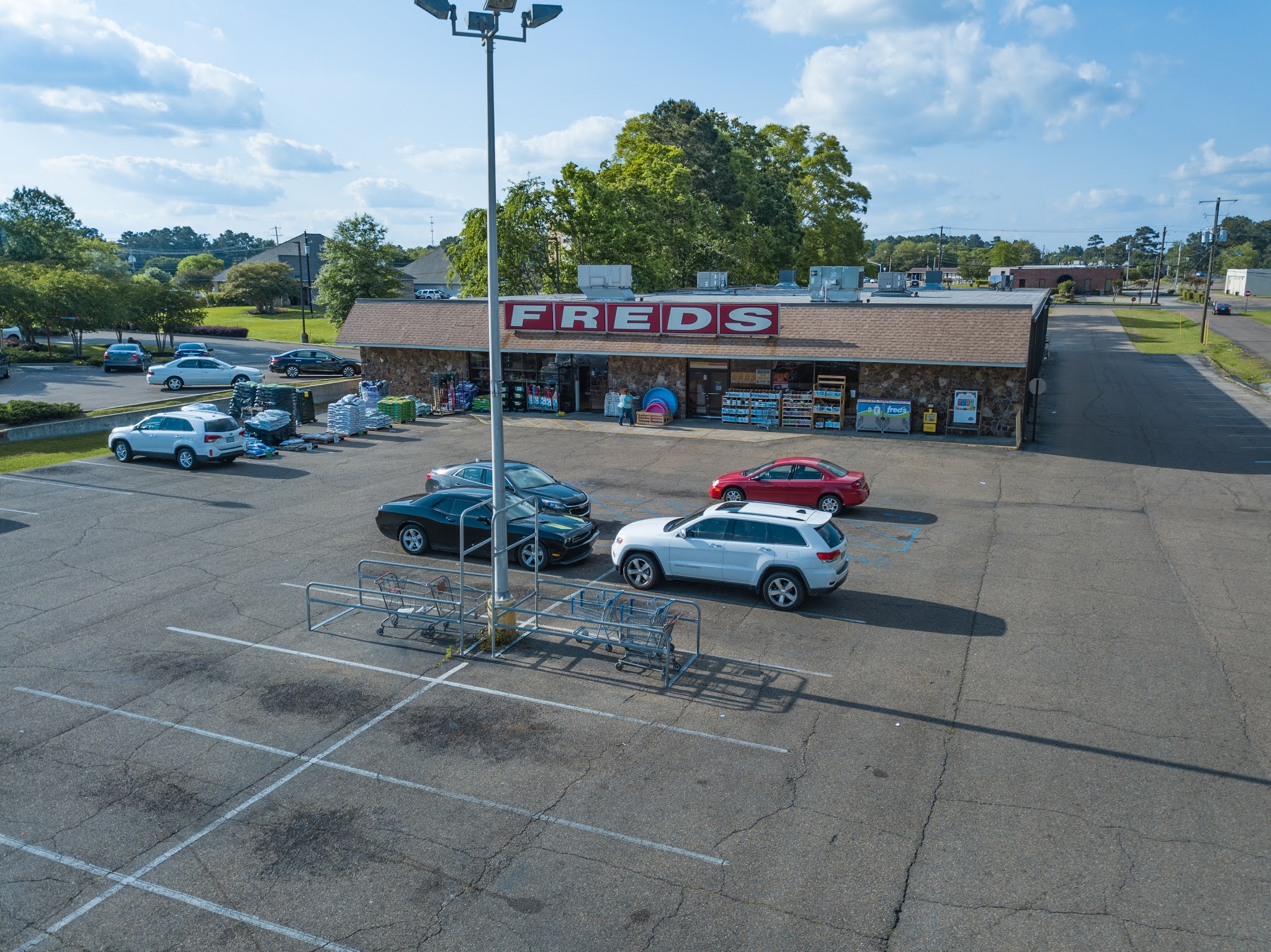
This Fred's is in none other than McComb, MS, a town that you might recall I referenced last month in this post. In that linked post, I briefly discussed how McComb's Kroger is (presently) the southernmost Kroger store in the state of Mississippi, and also described it as "a tiny superstore-era store that hasn't been remodeled in decades." To be more specific, it retains the wannabe neon interior décor, which dates back to sometime around the late 80s/early 90s. That Kroger had been on my radar for a while, and as a matter of fact in the above image you can see its cube sign, still standing proud across the street from Fred's. However, with McComb being rather far away, I never had much of a reason to make a visit except for the Kroger, so I always kept it on the back burner.


That changed once I found out about the Fred's in town. With the detail and effort that I've put into covering Fred's demise, longtime readers might not remember that I've actually said that I never really shopped at Fred's prior to its 2019 troubles. However, being a Mid-South company, Fred's, I felt, definitely deserved some documentation on this blog, and off down the rabbit hole I went! Most of the locations I traveled to cover were not very far from my home base, but I did do my best to scan the closure lists every time they were released for unique or interesting Fred's stores. McComb, quite obviously, jumped out at me. As it turns out, not only does the town have a vintage Kroger store, it also had a near-original Fred's store, keeping it classic until the end! The Fred's finally gave me more than one reason to take a trip to McComb, and moreover, added a ticking time limit as to when I had to visit by (lest I miss the Fred's for good). So, in early August 2019, I finally made the trek down to McComb, actually making it a two-day affair with a night spent nearer to the state's capital of Jackson. In due time I'll get around to sharing all of the pictures that resulted from that escapade, including (of course!) pics of the delightful McComb Kroger; but first, our sole focus today is this awesome Fred's.


I don't normally do a whole lot of exterior documentation of stores I visit, and true to form, all of the pics that you've been seeing thus far have not been mine. Rather, I (fortuitously) found them in some sort of real estate listing for this property -- which was issued some years prior to Fred's closure announcement, I should add. This definitely worked out in my favor, seeing as how this Fred's exterior has so many vintage traits, and thus deserves to be examined and enjoyed as thoroughly as the interior. Moreover, I thought these pics did a much better job of showing off the exterior than I ever could -- especially with those drone shots! -- and so that's why I've included all of them here.

I've mentioned in a few of my previous Fred's posts this year that, going forward, we'll be skipping around a bit, insofar as closure rounds are concerned. That is definitely true for this visit. I've already shown you all three of the stores I visited that were targeted for closure in the April round -- Coldwater, Getwell Road in Memphis, and Horn Lake -- as well as the lone store I visited from the June round (Middleton), a franchised store (Munford), and one of the two stores I visited from the May round (Hernando). I have another store from the May round to share with y'all next time, but for McComb, we're skipping ahead to the July round of closures. I'll also have two more July stores to share in the future, as well as two September stores. This series won't be ending anytime soon!


Now that I've gotten the backstory out of the way and we've seen quite a bit of pictures already, it would probably be good to finally get around to describing the McComb Fred's in closer detail. In the above two pics you can see the roadside sign for the store, featuring a much older logo that didn't bother to add the apostrophe into the word "FREDS." (We also see a very obvious former Shell station sign next door.) I've mentioned in the past that Fred's has had a complicated logo history -- or, at least, a very diverse one -- so I don't really have any way of knowing where this logo falls in the official lineage. But even without pinpointing a specific date, we can still tell it's vintage all the same.


Like the one on the roadside sign, the logo on the building proper also lacks an apostrophe in "FREDS," but otherwise the two logos don't appear to exactly match. For one thing, the logo on the building appears to use a different font, and for another, it is italicized, unlike the logo on the road sign. One thing the two do have in common, though, is the use of white text on a red background. The logo on the building itself somewhat calls into mind the red-on-yellow Fred's logo that would be common in the early 2000s, but as I said, I really have no way of knowing when exactly this white-on-red logo hails from, or if it is indeed original to this building.


All that said, I would certainly like to think that the Fred's logo seen on the building is original to the store, since so much of the rest of the exterior appears to be original! While I have thus far only shown you guys one stonework-and-mansard-roof façade Fred's -- incidentally, the location in the Fred's post immediately preceding this one -- you should know that this façade was in fact a very common one for Fred's, showing up on a very large number of stores in and around north Mississippi and the Memphis metro area, including three in DeSoto County alone. Of course, over the years, all of those locations were substantially remodeled, removing many of the storefront windows and replacing the logo(s) with more modern iterations; but the bones of the design usually remained fairly intact, albeit reskinned. In Hernando, for example, we saw the roof shingles give way to a new metal getup, and the stone painted a different color to disguise its presence. But here in McComb, we have the pleasure of seeing the original design, without any alterations. The stone remains natural, the shingles are still around, and the windows let plenty of natural light into the salesfloor. Such a treat!


Over on flickr, l_dawg2000 has mentioned that "the stone façade was a trademark of late 70's Fred's stores," and information that seems to confirm the aforementioned Hernando store's build date as 1977 falls right in line with this memory. Unfortunately, I've found it quite difficult to locate building history on not only McComb, but a lot of the Fred's stores I've visited -- this place most certainly was not built in 2008, LoopNet!! -- but based on the above, I'm thinking late 70's is a good guess for the origins of this McComb store, too. Historic Aerials backs me up, with the Fred's building not present in the 1971 imagery but open and serving an extremely large crowd by 1982. (Same goes for the Kroger across the street, for that matter.)

Finally -- with this pic, we're now jumping into my images from August 5, 2019! I more or less deliberately tried to line up this shot with the last of the real estate listing pics shown above, and I like to think I succeeded :) My pic, as with the real estate one, was actually taken from the next-door Wendy's parking lot (also our lunch spot for the day!), which explains the difference in elevation.


I was excited enough to visit this store based on the images of the exterior that I had found, but before my visit, I also came across a couple of pics posted to Google Maps that increased my desire to visit this place tenfold. While they didn't show much, those images captured enough to indicate that the McComb Fred's interior was just as vintage and unaltered as its exterior. Upon stepping into the building, I was extremely happy to discover that that was indeed true!

As compared to the more modern-day Fred's décor packages that we've seen in our escapades here on the blog, the Fred's of yore didn't have much in the way of department signage hanging from the ceiling or affixed to the walls. Instead, they simply had a tri-color stripe bordering the ceiling as their main cosmetic focal point. Sounds kind of understated, but it was definitely attention-grabbing in practice, especially with the three colors they chose: bright, and now-retro, shades of orange, red, and blue. We'll see later in our tour that hanging aisle markers were used to actually direct customers to the categories they were looking for.
Pictured above are the fitting rooms, which were located in the center of the right-side wall of the store. This suggests that apparel was always located along this side of the salesfloor, rather than relocated here from elsewhere at some point (as was common in other Fred's stores what with their multiple resets over the years). I particularly dig how the blue color of the uppermost stripe is continued on the jut-out light fixture above the fitting rooms themselves!


A couple of glances back up toward the front of the store show us a few things of note. First, those windows let a lot of natural light into the salesfloor, exactly as I wrote earlier. That's always refreshing to see, and in most Fred's (as with many other chains), grew to be rather rare in stores of this same vintage, given that a lot of the windows would go on to be covered over.
Second, note that jut-out in the front corner. That appears to be an office of some sort, although I'm not certain what it would have been used for considering the manager's office, in more typical Fred's fashion, was located in an open-air space out on the salesfloor as usual. It should also be noted that the office would have nothing to do with any pharmacy operations, as this McComb store was one of the rare Fred's locations not to have a pharmacy.
Third (and last), we see a lot of empty floor space. I'm not quite sure if that was due to the liquidation, just typical of this store, or maybe some combination of both. The lack of any renovations certainly indicates that this may have been a low-volume store, anyway, which lends credence to the latter theory. On the other hand, though, this store clearly did good enough business to stay open as long as it did, especially for a non-pharmacy store -- getting cut not in the first closure round, but as late as the fifth -- so maybe retailers in McComb simply have an aversion to remodels or something, I dunno. (Sounds like my kind of place, haha!)


Here are some looks across the front end (as viewed from the front right corner), where we can see more of that glorious tri-colored border stripe running across the ceiling, as well as replicated in the checklane lights. Neat attention to detail with that! In the foreground, you can see bins holding much of what's left of apparel, as well as a newer-looking table atop which we find some cardboard boxes filled with the last of this store's physical media selection.


Glancing toward the back of the store, we see more of the remaining apparel selection on standing racks, with the store's aisles beginning not too far from us on the left. The second pic above takes a closer look at one of the two fitting rooms. Unfortunately I didn't get a better shot (one of the few instances where perhaps a vertical pic would've been better!), but these things were definitely vintage. One lone built-in bench inside, a wood rack with simple hooks on which to hang the clothes, and even an inexplicable doorbell to the left of the fitting room door. (Okay, that one's not so much vintage as it is just plain weird, haha!)

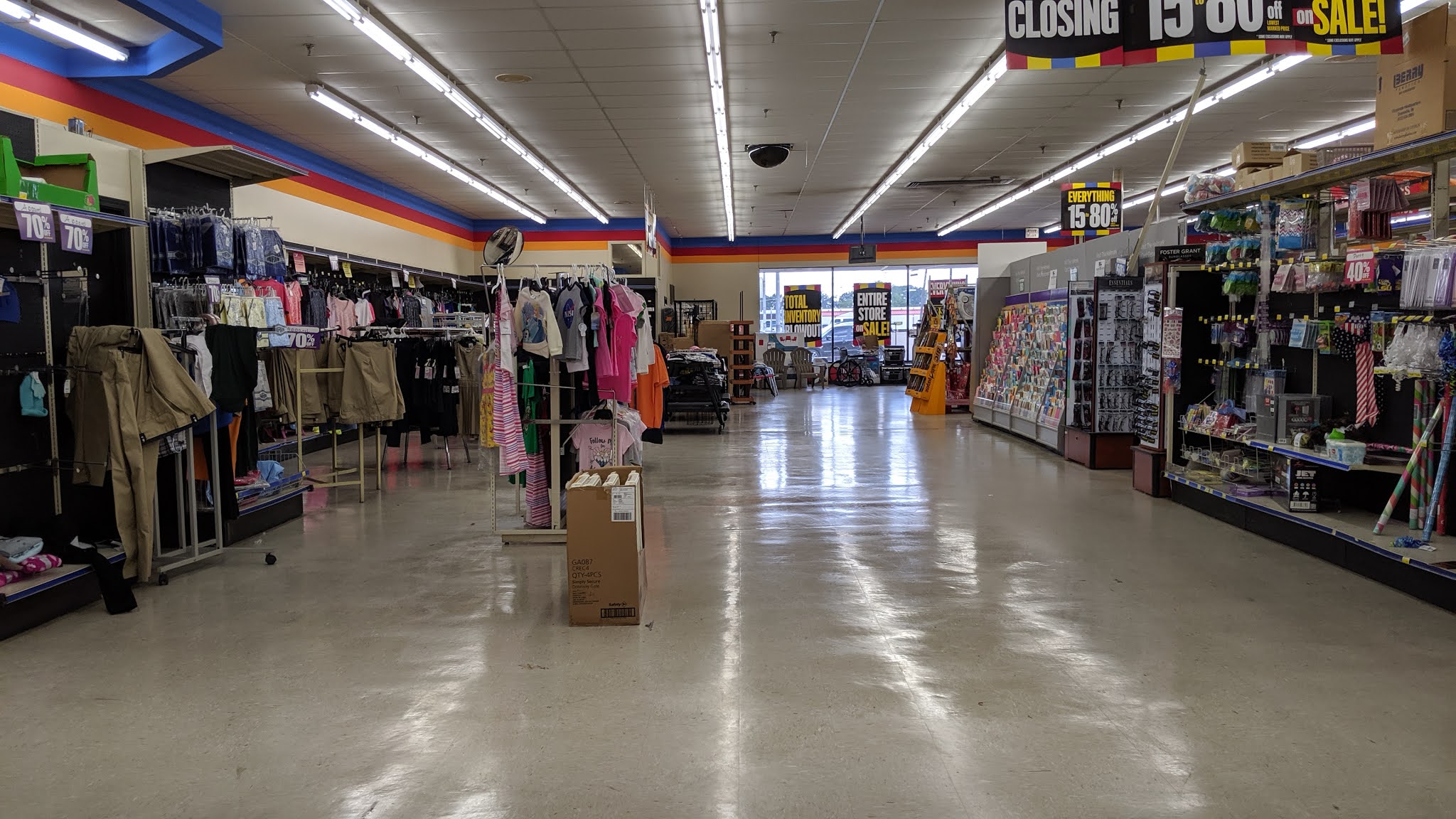

Several more views around the right-side wall, with the fitting rooms serving as our common landmark in all of the pics. Compared to the front half, you can see that the back half of the wall was much more depleted in the way of apparel and whatever other merchandise it carried. Also note the rather interesting liquidation percentages of 15-80% off. Usually the range is a bit narrower than that, lol!
Speaking of the liquidation signage -- for that matter, look at how well the colors on it match the colors on the wall. If I didn't know any better, I'd say the design was almost intentionally a throwback to this vintage Fred's décor! (Alas, surely that level of thought is *not* put into such things, especially since the liquidator is the one to design the liquidation signs. But still, a pretty cool coincidence, I thought.)


Another glance up towards the front of the store, followed by a new sight: a horizontal view down the salesfloor, looking across one of the cut-throughs between the sets of aisles. Unlike some other Fred's which I believe had two, there was only one such cut-through in this store, which you can see better in the floor plan I've reprinted for you below.
 |
| Courtesy LoopNet |

This collection of Garth Brooks anthologies was placed on one of the shelves facing out to the apparel department along the right-side wall. Poor Garth... these things seem to have sold so poorly. I imagine that's actually kind of a compliment, in that it suggests his fans already owned most (if not all) of his music and thus had no need to buy the collection... but now it just looks bad on the record label for having produced so many of these things. You can see that Fred's was selling them for 10 bucks, way down from the list price of $40. Ollie's has them for the same price as Fred's, and they're still kicking around, too, as I saw some on the shelves at Ollie's as recently as a month ago. The CEO of Ollie's even immortalized the item in a quote illustrating the variety of goods to be found at the chain's individual stores: "We might have a deal on a Garth Brooks five-CD anthology set one week, Scotts lawn fertilizer the next. It's whatever we can get our hands on."


One last look along the right-side wall, before we round the corner and head down the store's rear actionway. This Fred's was interesting in that it had some horizontally-placed aisles in-between the main gondolas and the perimeter wall itself. The one closest to us in the foreground seems likely to have stocked furniture boxes, and is now all but empty. The one farther in the distance looks weirder in that it's just a small section of a basic gondola, sans endcaps, but at least it still has some stock on it. The merchandise selection here was still pretty good overall given that it had not yet been even a month since the liquidation sale began.

The doors leading to the store's stockroom were located dead center along the rear wall, and were even left open for customers to look inside, which is a bit of an unusual find. There was something else interesting about this scene that I wanted to tell y'all about, too, but for some reason I can't place my finger on what it is right now. Hmm, maybe it will come back to me soon...


Moving away from the back wall for a second, here are a couple of views down Aisle 3, culminating in another look across the front end. You might recognize the top of this trio of pics from my 100 Posts celebration last November. Also recognizable is the aisle marker in the middle pic -- yep, those are indeed the same style that we saw at the franchised Fred's store in Munford! Cool to get some confirmation that those are original to Fred's late 70's design, and again, that they stuck around for so long here at this McComb store (in addition to Munford, for that matter!).


Alright, alright, enough teasing -- of course I know what's so cool about those stockroom doors: the super-vintage Fred's key logo hanging above them!! This is actually what I saw in those Google Maps pics I mentioned earlier (not just the tri-colored upper border). So, seeing this wasn't a surprise to me, but it is definitely what made me travel the long distance to McComb to be able to see it with my own eyes. (Had I not known about it in advance, I probably would have blown to pieces with excitement upon seeing it for the first time XD )
How amazing is it that this survived all these years?! As I said earlier, I'm not 100% familiar with Fred's logo lineage, and in regards to this logo specifically, I'm not sure if it ever graced any proper storefronts. However, we have seen it on at least one roadside sign, that being at one of the franchise stores in Louisiana. The fact that it's not also on the roadside sign here at the McComb Fred's makes me think that the logo was already on its way out by the late 70s when this store probably opened, and indeed this sign's construction looks like it may well have been custom-made for this store rather than a common element of all Fred's stores of this era. But then the question becomes, why make a sign using this logo if it was no longer current? The only logical thing I can think of in response to that is that Fred's must have had an older store elsewhere in town, and that's how the Fred's shoppers and employees of McComb were already familiar enough with the brand's key logo to warrant this sign's creation and installation at the newly-relocated store we're touring today. That's all just a bunch of conjecture, but if anyone has any info that can help confirm all or part of my theory, I'd love to hear it in the comments!


Heading back down the aisles for a bunch of these next pics. (Don't worry, we'll see more of that Fred's sign before this post is over!) It was interesting to me to see how empty certain departments/aisles were as compared to others. And more broadly speaking, this store just felt a little... off to me the whole time we were here. I'm not quite able to place my finger on why, though (and this time I'm not joking when I say that, haha!). Were the shelves perhaps taller than in a typical Fred's? The aisles narrower? Something to do with the lack of a pharmacy? Who knows. I can definitely tell you that the layout of departments here was unlike any other Fred's I went in... maybe that was it.

Aisle 5 was in a bit of a rough condition, given that -- for some reason -- a portion of its gondola unit on the left (both shelving and backing) was missing, and its aisle marker was devoid of any categories (though to be fair, there was only ever space for just two!). But still, it carried on. What a trooper! (I also liked how the messed-up shelving allowed for a handful of aisle markers to be seen in the same pic, a view which was next to impossible in all of the other aisles.)


From the center cut-through aisle, we're looking over towards the right- and left-side walls, respectively. Lots of empty endcaps facing one way; not so much, the other. Also be sure to note the dedicated closeout department there on the right, in the bottom pic of the duo. Even this Fred's that was otherwise lost in time managed to receive that post-private-equity department!

We've seen a couple of 'em already in this post, but here's a purposeful close-up of one of the support poles. Specifically, the base of one of the support poles. We can see that the wood paneling affixed to the base is done up in the same shade of red seen in that middle stripe running along the walls. More importantly, this exactly matches the uncovered support pole base that I shared with y'all in the Hernando Fred's tour back in September. Told y'all I'd be able to explain how I knew that element was original to the store! It also suggests that the Hernando store, as you might expect given its matching exterior design, also once matched this McComb store on the inside...


Another look down Aisle 5, before returning to the rear wall for more of that Fred's key logo goodness. Aside from that logo, though, the wall itself actually wasn't looking too hot, given that it appears to have sold out of a majority of its merchandise. Alternatively, it's likely that a lot of that stock had simply been consolidated forward within the salesfloor, which as we've discussed in the past is a very common liquidation technique.


Time now for some views across the rear wall, the top one looking over to the right and the bottom one, the left. Again, we see mainly a lot of emptiness back here, although those paper plates were still available in large quantities! That bottom pic also gives us a better look at the weird perpendicular half-gondolas, as well as the round mirror up in the corner by the ceiling, another common vintage retail element.


Aisle 6 was home to toys, and was one of the most disheveled, yet also well-stocked, aisles in the entire store. I'm thinking the condition had less to do with kids messing things up (although that probably did also play a role) as it did with the items themselves simply being quite small and thus, hard to keep cleanly organized! Notice that the toys were stocked practically up to the rafters, too -- a kid's dream :P
Also, if you look closely in the first pic of the two above, you'll see that the endcap of the right-hand side of Aisle 6 was stocked with -- of all things -- food! Definitely a weird category of merchandise to see right next to toys, even in a Fred's. Like I said, this store doesn't appear to have gotten so much as a major reset over the years (let alone a remodel!), so newer changes to the merchandise selection such as the expansion of grocery items simply had to be shoehorned in. We see further evidence of this below...

...with the presence of the grocery coolers along the left-hand wall near the front corner, sticking out more or less like a sore thumb! These were installed circa 2014, according to that floor plan I shared with y'all earlier in the post. The "GROCERIE" department sign above the coolers, meanwhile, would have been installed possibly as much as a decade prior; it's still definitely not original to the 1970s décor package we see everywhere else inside this store, but it's also not as recent as the coolers. Recall that we also saw the same sign added into the Coldwater store, which like McComb otherwise lacked any other department signs. And yes, it is of course supposed to read "GROCERIES"; somehow that red "Guaranteed Fresh Everyday!" part was accidentally shifted too far over to the left at some point.


While those coolers had to be placed along the wall, the actual dry goods grocery items were still located one aisle off the wall, in Aisle 7. This aisle was another one that felt weird to walk down, in that more modern Fred's had much more presentable and organized layouts for their food selections. Based on the aisle marker, we can tell that Fred's always carried some grocery (and candy!) items, but I doubt the selection was as extensive back then as it grew to be in the years before the company's demise.


Before we head over to the left-side wall, I couldn't resist doubling back to the stockroom doors one last time for some farewell shots of that awesome key logo Fred's sign. It's hard to tell, but I think that thing is made of solid, carved wood, not styrofoam like today's retail signage, which further points to its age. Similarly classic is the wood paneling you can see adorning the entire stockroom, if you take a peek through its doors (how neat!).
Finally, in the bottom pic above, we're looking from the stockroom doors over to the left-side wall, with a handful of the adjacent aisles also visible in the shot.


As I've said, this Fred's did not have a pharmacy. However, Fred's stores in general were still known for carrying a large selection of health and beauty items. The result is that this store's last aisle, Aisle 8, was home to a hodgepodge of all of that stuff -- pharmaceuticals, cosmetics, and even the very strange bedfellow of soda products, serving as another example of "Fred's placing soda where it does not belong" like we saw in Coldwater.
I hesitate to say that the aisle was double-wide, because its width most certainly was not double that of all the rest of the aisles; but there was indeed enough extra space so as to allow this store to squeeze in those diagonally-oriented four-way fixtures, which helped boost the available selection of merchandise by adding more shelving on which to stock items.


Here's another glance down Aisle 8 toward the back left corner -- curiously showing an indicator of another possible office (this one upstairs, although I wasn't aware this store had an upstairs!) -- followed by one last view down the central cut-through, where at the end of the road we can make out the edge of the fitting rooms one last time. This store certainly had a classic discount store feel to it, that's for sure.


Some more glances down Aisle 8, before we wind up back up front again, taking a look at the grocery coolers. Notice that the four-ways in the back half of the aisle give way in the front half to another of those half-gondolas like we saw along the rear wall. Clearly that was an easier way to stock the cosmetics. Also note the odd red and blue tape on the floor in the middle pic, as well as the fact that the aisle marker indicates that this aisle once also stocked seasonal merchandise. That may have been the case at some point, but clearly not anymore! (And in fact, based on that bottom pic, it looks like chips even managed to squeeze their way onto Aisle 8 as well...)


Here are a couple of pics across the width of the store, from the vantage point of the left-side wall. Normally, I would say that these views capture the front end, but that's clearly an aisle on our right, and not a register! If you'll be so kind as to reference that floor plan from earlier in the post one more time, you'll see that there is a strange little alcove here in the front left corner of the store, featuring three horizontally-oriented aisles. In a normal Fred's of this era, this is usually where the pharmacy counter would be located. (Note that this isn't true of all Fred's of this era, though, but that's something we'll tackle in a separate post...) In this non-pharmacy Fred's, however, this alcove is the replacement space filler. In it, we find the very odd combination of pet and school supplies, as is reflected on the Aisle 9 marker in the pic below.

Speaking of the Aisle 9 marker -- it's a little strange to call an entire alcove, one aisle. I'm thinking that the setup seen here clearly does not reflect the store's original layout, and that the store simply relocated its aging aisle markers (and the category plaques within those markers) as appropriate over the years. Then again, there had to have been *something* in this space to begin with, and an alcove of three short aisles makes as much sense as anything. Plus, I had already suggested that this store never had any major resets, and this would seem to go against that theory. Again, if anyone can shed some light on the original layout for us, please do share in the comments!

School supplies took up a lot of the alcove; the pet products were mostly located along the front wall. Note behind those industrial-style shelves on the right that some more vintage wood paneling, identical to what can be seen in the stockroom, is visible out here on the salesfloor. Pretty cool! (Also makes me wonder if there was ever any more wood paneling around the perimeter...) In the background, where you can see the little half-wall with the "All Sales Final" signage, is the open-air manager's office I had mentioned.


Here's that better shot of the actual front end, followed by a close-up of the manager's office to serve as our final shot of the interior. Besides the aforementioned lane lights matching the wall stripes, I find it pretty cool how even the checkout units themselves look vintage, with that red and beige paint job! The same color scheme is also reflected on the manager's office, which also manages to duplicate the tri-color stripe pattern as well. With the liquidator signs placed directly against that pattern in this pic, isn't it just uncanny how closely they seem to match? Just switch the yellow out for orange, and we'd be set...
I hope you guys appreciate the views of the manager's office. Open-air manager's offices were, again, a common arrangement in Fred's stores, even those that are newer builds; but it was also common, of course, for the manager to actually be in the office, which naturally made picture-taking a bad idea. Thankfully I had the opportunity to get these manager-free pics of it at this location. Having a raised, open-air office overlooking the salesfloor is definitely an interesting concept, and one that I believe was once much more widespread in the retail world, even though it has now gone by the wayside in today's environment.

Back outside, here's a close-up of the "STORE CLOSING" banner hung along the storefront, which I also intended to double as a close-up of the natural stonework gracing the façade. Even though it was not altered in any way at this store, I still was not able to capture a whole lot of the stonework, since Fred's had much of it covered up by outdoor merchandise, such as the swimming pool you can see peeking in at the bottom of this pic.


A couple more views of the storefront as we get ready to leave, one focusing on the center of the building and the other taking a more zoomed-out approach. Like I said earlier, I really wish I could have documented more of the exterior of this building myself, but unfortunately there were a number of people just flat-out lingering along the front walkway the whole time we were here. You can even see one of them through the windows in one of my earliest photos in the post, if you look closely. That, coupled with the food truck that was operating at the edge of the parking lot and also attracting customers, made it hard for me to find angles that I wouldn't be noticed taking pictures from. Thankfully, though, we have all those wonderful real estate photos to supplement my own few pics!


Last but not least, here's the usual snap of my receipt, joined this time not by a liquidation percent-off handout but instead a "Total Fixture Blowout" flyer that I hadn't seen at any other Fred's, so of course I picked one up. So many cringeworthy unnecessary apostrophes on there, but still a cool find...
That wraps up our fourth and final Fred's tour of 2020. I intentionally tried to save the best for last, and I sure hope you all enjoyed it! Plenty more Fred's posts are set to come your way in the future, sticking to the same quarterly schedule that I used this year. Then there's also my Rite Aid series, which has one post remaining and which also usually calls for a December entry. I'm not making any official guarantees, but my goal is indeed to get that post up this month as well. So be sure to stick around for that, assuming I do get the chance to write and publish it before the year is over! And if I don't, I'll go ahead and say in advance that I hope you have a happy holidays :) Until next time, then, and as always -- thanks for reading, and have fun exploring the retail world wherever you are!
Retail Retell
Wow, what a retro wonderland! I've never even been to a Fred's, but I'm feeling nostalgic just looking at these photos, lol. That photo from the real estate site at the top with the Kroger cube and the somewhat older Wendy's (though we have older ones here in Houston, but most of those are getting renovated if they have not already) is really awesome. There is the old Shell station as well.
ReplyDeleteThere's just so much retroness here. The sign with an individual square for each letter kind of reminds me of some older Alco stores before the chain went under. Alco and Fred's are kind of similar stores I suppose at least in terms of size, but Alco stores had more Kmart level merchandise rather than Dollar General type merchandise. Of course, the prices were higher at Alco as well of course. We didn't get Alco here in Houston until a few years before the chain went under completely, but I was fortunate enough to visit one. Je has some posts about Alco on his blog. Here's the sign from an older Alco: https://flic.kr/p/aDFNbS
The stone around the front of the store reminds me a bit of our older Oshman's sporting goods stores. Most of those were at malls and they had that stone-type facade around their mall entrances.
That Fred's key sign is really remarkable. It's odd how the name is referred to as 'Freds' in some of the vintage signs, but then 'Fred's' in that vintage key. Maybe they couldn't make up their mind! Some retailers have moved back and forth when it comes to using the apostrophe. Randall's used the apostrophe until around 1994 or so when they became Randalls, but I still call them Randall's most of the time. Maybe Albertsons used the apostrophe at one time, but I can't remember for sure. A lot of people around here call Kroger 'Kroger's', but that's not true of course. I've even heard 'HEB's' and 'Walmart's' at times!
The primary color stripe around the store goes well with the colors on the going out of business signs in the store! I'm sure Fred's wasn't thinking about that when they designed this disco Fred's, lol.
This is an awesome store, I'm glad you were able to capture it. It's up there with that retro shopping center Walgreens (Walgreen's? lol) you shared with us earlier this year.
It's nice to see Fred's selection of CDs. Not just the Garth Brooks collection, but it looks like they had some other CDs as well in those boxes on the table near the front of the store. I don't know if the music on those CDs are any good, but something is better than nothing!
On a completely unrelated note, after poking around on Google Maps, I finally found a Fresh & Local Kroger which I think looks nice! Unfortunately, it's in West Virginia! Oddly enough, it seems like a lot of Kroger locations in western/central Virginia/WV still have the Millennium decor (and some have Atlanta-style outdoor signs as well), which is okay to me, but this location got an update. Instead of concrete floors, it has some kind of wood-like vinyl which looks really, really nice! It's too bad Kroger does not put this kind of flooring in all their stores. I think it's a real upgrade over concrete especially in older locations. Link: https://goo.gl/maps/aH9ja1iFhqydcWTVA
Yes! I'm glad the nostalgic feeling comes across. This was my first and only time in a Fred's that looked this old, but I got the same feeling also. It definitely was an experience. I think you'll like seeing that Kroger as well, once I get around to posting it to flickr. Unfortunately I've got quite a backlog and many other Kroger stores that are more time-sensitive to post than that one, so it will be a while.
DeleteIt's really cool to hear of all the memories this Fred's brings up for you even though you've never been in a Fred's. Isn't it neat how the retail world will do that for you? You bring up a good point in terms of the individual block letters in the Fred's and Alco signs. Kroger even used to do the same thing, way back in the day. The apostrophe is an interesting point as well. Yes, many retailers seem to be quite ambivalent on their apostrophe usage. All the ones you mention are great examples. Another one is Roses, which used to be known as Rose's. Seems like typically the direction is to go from apostrophe to no apostrophe, whereas Fred's evidently did the opposite! (Oh, and don't get me started on adding the "apostrophe S" to retailers whose names don't have that... so, so many examples of that! All the ones you mention, plus Aldi's, Jo-Ann's, JCPenney's... ugh. Penney's is acceptable, but JCPenney's is not, lol. The only one that I know is wrong but I keep doing it anyway is Shipley's. For some reason that one just sounds right to me, haha!)
Ha, disco Fred's! Nice term for it. Yeah, I loved how well the liquidation signage seemed to match, even though it was entirely unintentional. And yep, Fred's did have a DVD and CD selection that wasn't too extensive, but also nothing to sneeze at by any means. Some of it was good, others about what you'd expect from a store of this caliber. Oh, and thanks for the compliment! I'm glad to have captured this store also :)
LOL! Yeah, West Virginia is just a bit far, from either of us really :P Really nice photos of that store at that link, though! It's neat to see that location got the fancy flooring treatment. I agree, I wish more of the F&L remodels would get that. That same style of flooring could be seen in the earliest F&L remodels back when that décor package debuted, which of course was in California with the Ralphs banner as usual. Concrete seems to be the preferred method, but those floors sure do look like a step up.
I just now remembered this, but if you're ever traveling west on I-10 through east Houston in order to visit a Ralphs in California or something like that, lol, you might see a giant Kroger sign in block letters! No, it's not for a Kroger store, but rather for the main Kroger Distribution Center in Houston. Houston is so big that we actually have multiple Kroger distribution centers around town!
DeleteHere's a photo of that: https://goo.gl/maps/9ewN7TRozu4dd14n9
I must sadly report that that ancient, rusty looking water tank on the right side of that image has been torn down since that Google Streetview photo was taken in 2017. Fortunately, the block letters are still around (or at least they were still up the last time I drove by there in early 2020).
Are you referring to Shipley Donuts? They're actually based in Houston and I can tell you that almost everyone here calls them Shipley's as well! I don't say or write their name very often, but I probably call them Shipley's as well so don't feel bad about that! I didn't realize Shipley has locations as far from here as they do. They've always felt like a local chain and not a large operation throughout the south. But, yeah, you won't have to try too hard to find Shipley Donuts around here. It's funny now that you mention it, but the local Shipley location to me (at least I think it's still the closest location to me) has been around for a very long time and still has pretty vintage signage at this point: https://goo.gl/maps/TUNnu9EnW7NDGRXB6
Back when JCPenney was using the 'Funky P' logo in the 1960s/1970s, they did refer to themselves as Penneys (no apostrophe). Then, they went back to JCPenney! Maybe that caused some confusion! Montgomery Ward had an even worse problem. At varying times, they referred to themselves as Montgomery Ward and Wards. One of their most iconic logos was the 1970s blue box logo that emphasized the 'Ward' part of their name! So, yeah, you never knew if you were going to hear Montgomery Ward, Montgomery Ward's, Wards, Ward, or who knows what else, lol.
Eckerd was another chain that almost everyone added an 's' to at the end. Almost everyone called them Eckerd's.
I know that some Canadian chains have dropped the apostrophes in their names since French does not use the apostrophe in the same manner English speakers do. Also, maybe some retailers have dropped the apostrophe to avoid confusion about web URLs.
Ralphs is an odd one. I'm sure people call it Ralph's, but the last name of the founder was actually Ralphs with the 's' at the end!
Speaking of apostrophes, check out that Fred's ad at the very end of your post! I suppose Fred's was the place for ladder's and shopping cart's! Lol, the person who did that ad must have also done the signage at the Fred Meyer (Fred's? lol) that NW Retail shared with us recently!
Oh, cool! I actually just visited a Kroger that similarly held onto its block letters, albeit on the rear of the building near the loading docks, for a very long time. Unfortunately, I visited it after a recent remodel, and it appears the sign was finally removed during that remodel, meaning I didn't get to see it after all :(
DeleteYep, that's the one! I love me some Shipley's. And glad to hear I'm not the only one who erroneously calls it that, haha! Unfortunately they're not as easy to find around here, especially since the only two remotely in my area -- Horn Lake and Oxford -- both dropped their franchises late last year or early this year. They still use the same recipes, though, so that's something at least. My mom grew up on Shipley Do-Nuts in Greenville, and that's how I was introduced to them. They are by far my favorite donut chain. They've been around for a very long time in Greenville also, and the signage there is similar if not identical to what's shown in that link. In fact, I believe a lot of locations have signage a lot like that!
Oh yeah, I'm certain that that Penneys/JCPenney debacle caused lots of confusion! Same for the whole Ward/Wards/Ward's situation you mention. Wow, that's got to be a tough timeline to keep straight, lol!
The theory about URLs is definitely a good one as to why apostrophes have been dropped, more than just laziness over time as seems to be the case in other situations. That's interesting about Ralphs as well, I never knew that was actually the founder's last name!
LOL! Yep, sure seems like the same people XD
Maybe you should bring a drone with you next time you go photographing - those are some neat vantage points of the exterior! However, I don't know what would be more obvious - trying to photograph a store with a drone, or crashing said drone into the store because I wouldn't know what I was doing! :)
ReplyDeleteThis Fred's is really a throwback. I like the natural stone exterior myself, as that's a design (and material) you never seen in modern retail architecture anymore. The interior is just as vintage too, which compliments everything else well. I don't know how this store slipped through the cracks for so long, but I'm glad it did (and that you got to visit)! Also, as soon as I saw the Fred's key logo in the background of the first image it was in, I knew that was the spark for you to make the journey all the way down here!
I agree, the drone shots are pretty awesome! And lol -- yep, I'd definitely be prone to crashing one if I had it XD
DeleteGlad you liked it! Yep, so much about the inside and outside are things you just don't see anymore in retail. Maybe for the better for some things, but for others, there's really no reason they couldn't still be used today (the natural stone, for example). Oh well... if it couldn't be all of them, then at least this one location survived so long with those materials and décor elements, and I'm glad about it also! And ha -- you know me very well :P
Thanks for the shout out! This time capsule Fred's, and the Kroger across the street are very cool finds. Don't blame you for making the long journey to McComb for that kind of two-for-one deal, haha! And for sure: you know a store has vintage decor when it's color scheme is just as bold as the colors on the liquidation signs :P
ReplyDeleteAlso LOL at your first comment about the "thing" above the stock room doors - awesome find on that one (as well as those original aisle signs)! In the closeup photo, that logo kind-of has a hand-made look to it, so it would be really interesting to know it's back story. Were those individually made for each Fred's store? Certainly not out of the question in the early days of Fred's, and could even point to this store being open just a few years earlier than the late 1970s. Perhaps this store was even the prototype for this style of Fred's - also not out of the question given it's location! If the logo isn't original to the store, someone sure went to a lot of trouble to reproduce it, right down to the last detail!
You're welcome! Ha, yep, definitely couldn't pass this trip up once it became a two-for-one :P And lol!
DeleteHa, thanks! Yep, this store was full of treasures. And I agree with you -- all of those are very good questions! I'd like to know the answers myself... one thing's for sure though, it definitely does look like it was custom handmade, just like you said. And exactly down to that last detail as well!