 |
| Today's post highlights Lafayette County, MS, retail. |
Not only does it feel like it's been forever since I've written a new blog post, it has literally been forever since I've been to Oxford: after graduating last April, I haven't gone back, meaning this month officially marks one year since I've been in town. It's hard to believe it's been that long, so in an effort to get a little bit of Oxford back in my life, I was inspired to make the Oxford Sonic our first subject after the blog's winter hibernation period.
 |
| Courtesy Mutual Art |
You might be wondering what's so special about the Oxford Sonic. Honestly, to begin with, not a whole lot was special about it. It was built in 1974 and hadn't really had any significant upgrades in the years since then. You can compare the above image from the restaurant's early days to the images below, taken in more recent years.
 |
| Courtesy Hotty Toddy News |
 |
| Courtesy Google Maps |
.png) |
| Courtesy Google Maps |
Really the only thing special about it was that, by way of its lack of upgrades, it remained fairly original, up to and including the pole sign with the classic Sonic logo and slogan. But for a restaurant facility, an old, deteriorating property is, of course, less than desirable.
And so, in early 2017, the Oxford Sonic closed for business, citing plumbing issues beneath the concrete slab, and electrical wiring incapable of supporting modern technology. Oxford residents and Ole Miss students weren't deprived of Sonic -- a new, second location had just opened across town on Jackson Avenue, pictured below. But the original location, on University Avenue, was sadly down for the count.
Until it wasn't.
.jpg) |
| New Jackson Avenue Sonic, April 2017 |
--------------------------------------------------
In the summer of 2018, Oxford news outlets began reporting on the status of the University Avenue Sonic, which had been sitting empty and abandoned. As Channing Green of the Oxford Citizen wrote, "When Sonic Drive-In on University Avenue shut down well over a year ago, the lettering on their sign read 'We will be back.' And they were; however, it was several months later and on the opposite side of town. The Sonic on Jackson Avenue opened near the shopping center containing the Chow King Chinese restaurant and Johnson's Furniture.
 |
| Courtesy Oxford Citizen |
.png) |
| Image source unknown |
"On Monday, however, Sonic owner Ronnie Solberg presented plans to the Courthouse Square Historic Preservation Committee. He's getting ready to reopen the University Avenue location."
"There were a lot of rumors, but we always planned to reopen," Solberg is quoted as saying in the Oxford Eagle in July 2018. "The issue is, we've got to do what's right for Oxford, and that's not a cookie cutter. So it's taking some time."
Indeed, the new building would go through a lengthy design process, resulting in several visits before the Planning Commission and the aforementioned Preservation Committee. It is the thought, consideration, and attention to detail that went into these iterative designs that has made the rebuilt, retro-iconic Sonic such a special topic worth covering. We'll explore more of the design inspirations later in this post, but first, it's worth looking at the existing property prior to its demolition.
 |
| Courtesy Twitter |
 |
| Image source unknown |
 |
| Courtesy Oxford Eagle |
 |
| Courtesy Oxford Eagle |
In February 2017, the Oxford Police Department posted the top image above to their Twitter account, lamenting the closure of the longtime Oxford square icon. As you can see, the property was roped off by caution tape. The accompanying images present more of an overview of the building as a whole, and show that nothing really changed in the months that ensued, besides more and more weeds taking over the once-popular drive-in.
I drove past the restaurant in October 2017 and took the pictures below. Many of them are repetitive, but I wanted to be sure and get some form of documentation of the classic structure before it would inevitably be demolished. At this point in time, the property's future and whether the restaurant would return was still in question, as the public announcement of the redesign and reconstruction didn't take place until the summer of 2018.
That vintage Sonic pole sign was something worth capturing -- surely one of very few remaining in service in the late 2010s -- and would eventually serve as a major inspiration in the design of the new facility. Ultimately, the old drive-in was demolished on Wednesday, September 5, 2018, leaving behind only the longstanding pole sign as a beacon of what once was.
 |
| Courtesy Hotty Toddy News |
--------------------------------------------------
Part of the problem with the existing Sonic property, as may have been obvious from many of the above images, is that it did not have a driveway turnaround at the front of the building, meaning that if one were to drive around the entire parking lot looking for an open stall, s/he would have to exit the property and reenter traffic before being able to circle back around a second time in hopes of better luck. On busy University Avenue near the Oxford square, this was not a very good situation to put potential customers into. The newly-designed rebuild was primarily engineered to resolve this issue, as well as the other structural and electrical issues that needed upgrading simply due to the age of the 1970s-era building. Everything else we'll be seeing is just the cherry on top of the Sonic Blast.
Due to the restaurant's location, not only its new design, but also just the initial request to demolish and rebuild, had to be presented to, and approved by, the Oxford Courthouse Square Historic Preservation Commission. Franchisee Ronnie Solberg's initial application included several images of the existing conditions at the property, many of which allow us to see closer details beyond the roped-off roadside entrance. These images are reprinted below, and show many signs of aging and deterioration along the property.
.png) |
| Screengrabs from Preservation Commission documents all courtesy of City of Oxford website public viewing |
Also attached were site plans, which show the reimagining of the layout so as to include the long-overdue driveway turnaround at the front of the property, as discussed above.
.png) |
| Existing aerial view |
.png) |
| Existing site plan |
.png) |
| New site plan |
.png) |
| Overlay of old building on top of new site plan |
--------------------------------------------------
Next comes the fun part -- the design proposals. Included were two distinct design possibilities, each presented in color scheme options of just red, or both red and blue. (Please feel free to click on any of the images in this post to enlarge them, so that you can examine them in closer detail.)
"The first design," reads the June 2018 Preservation Commission document, "is a two-tone scheme with charcoal-colored brick massing, canopy awnings, central tower with flat roof cap, halo channel lettering, LED border, and either red or red & blue accenting."
Meanwhile, "the second design is also a two-tone scheme with charcoal-colored brick massing, canopy awnings, LED border, and halo channel lettering, but offers a different treatment of the central tower. The tower in this alternative does not have a flat roof cap but, instead, is adorned with an antenna-like finial. Like the first option, the building may feature either red or red & blue accenting."
Clearly, at this point it should be obvious that Solberg was not proposing to build your average Sonic Drive-In. Rather, this building would be customized, special and unique to Oxford. As the Oxford Citizen explained, major corporate restaurants like Sonic "typically have to have a certain look, follow a specific color pattern, and be designed in a very particular way. There is, however, some flexibility with this particular restaurant. Due to its unique position in terms of city districting and the historic value of the restaurant, the building will be able to break away from typical corporate design and create something wholly new."
Preservation Commission documents expound on this by noting that Solberg was looking to "build a new restaurant with architecture that emanates a nostalgic feeling." The Commission saw, amongst its responsibilities, a duty to "discuss whether they believe the new structure is convincingly modern in design without mocking the nostalgia the business evokes from Oxford residents."
--------------------------------------------------
In response to the June 2018 application alternatives presented above, Alyssa Schnugg of the Oxford Eagle reported, "Most of the commissioners said they preferred the red-only accents, but were torn when it came to deciding if they liked the tower with or without the antenna." So, in the following month Solberg and his design team returned, this time with significantly more detailed design proposals in order to facilitate the final selection. Two options were presented... the Retro-Iconic, and the Retro-Modern.
As explained in the above screengrabs from the application document, "the first design -- the Retro-Iconic -- is 'rooted in the 1920s Art Deco' style, and includes a central tower with an antenna-like finial that will have 'LED/neon rings and lighted sphere.' The central tower will also have backlit or exposed LED/neon channel lettering that reads SONIC, and brushed aluminum halo/backlit letters reading OXFORD."
Meanwhile, "the second design -- the Retro-Modern -- similarly has a central tower but with 'post-war mid-century modern design' features. The tower would have 'cleaner lines with [a] cantilevered shed roof trimmed in red neon' lighting and white channel letters reading SONIC."
Obviously, these two designs were more or less the same ones as presented at the previous month's meeting, just a little more fleshed out and detailed. Based on the commission's preference for the red-only accents expressed at that prior meeting, it should be noted that the shared common aspects of the two alternatives had already been finalized: "Both designs feature a common central kitchen building clad in charcoal brick wainscoting, medium-gray upper brick, red glazed porcelain tile accents, cantilevered neon-edged parking canopies, and a seating patio screened by brick planters."
--------------------------------------------------
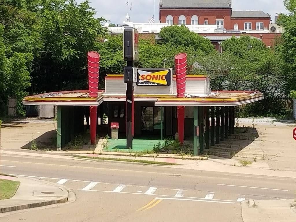
What's really exciting in all of this, to me, is the obvious inspiration these two design alternatives took from Sonic's past. This inspiration is most easily seen in the presence of the old-school, blocky, italicized
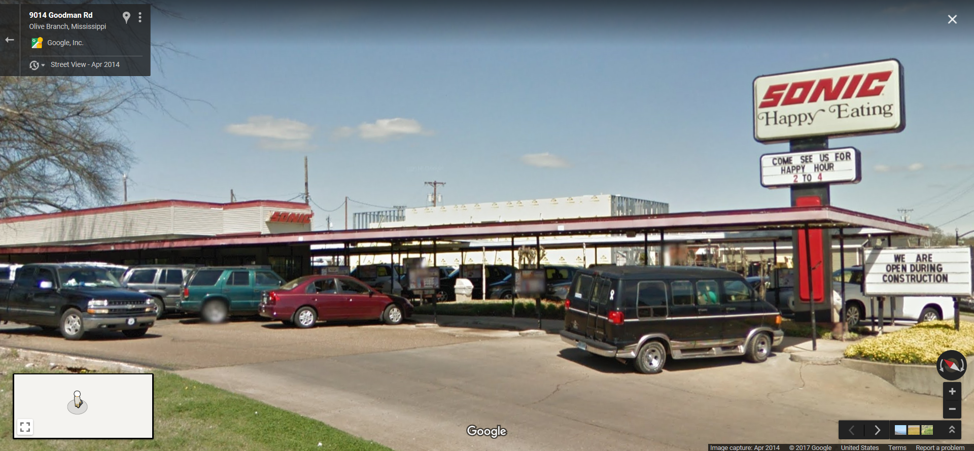
SONIC lettering, matching the classic pole sign that had been an icon at the Oxford location for years. (Incidentally, similar signage survived at the Olive Branch, MS, Sonic until 2014, some street view images of which are shown below and more documentation of which can be seen in l_dawg2000's album on flickr, at
this link).
 |
| Image source unknown |
 |
| Courtesy Pinterest |
.png) |
| Olive Branch, MS, Sonic, 2014 street view. Courtesy Google Maps |
 |
| Olive Branch, MS, Sonic, 2014 street view. Courtesy Google Maps |
Perhaps less obvious, though, is that the Retro-Iconic design in particular goes far beyond just the classic logo. Instead, that design goes all the way back to Sonic's roots, with the antenna finial/spire reaching out of the top of the building recalling the chain's original association with radio signals and "Service with the Speed of Sound." Below is an illustrated reproduction of one of those vintage signs, as well as some actual historic images with that logo.
 |
| Courtesy Dribbble |
 |
| Courtesy Pinterest |
 |
| Courtesy The Daily Meal |
I'm curious to hear which of the two design alternatives you prefer -- let me know in the comments below -- but it probably shouldn't come as a surprise that the Preservation Commission was swayed in much the same way I was by the nod to Sonic's past. "Of the two designs presented, the commission gave its endorsement for an Art-Deco 'Retro-Iconic' design, which will feature a gray and red exterior with a concrete wall fencing in part of the patio. On the inside of the wall will be a bench for diners, with the Sonic logo on the outside and a flower bed surrounding it," wrote the Oxford Citizen.
"A distinguishing feature of the building will be a spire fashioned after Sonic's iconic radio tower antenna logo. Towering above the restaurant's one-story canopy will be a gray brushed aluminum antenna, adorned with the drive-in's signature red LED neon light trim and topped with a red LED neon ball."
You have to imagine that Sonic corporate had some involvement in approving this design also, so it's especially cool to think that higher-ups within the company, too, saw the value in not only allowing the Oxford location to have a custom look, but more specifically to have that look evoke so much nostalgia harkening back to the chain's roots. This was a really special project for sure, and I'm glad it took place when it did, because who knows what would have happened had it occurred after Sonic's recent early 2020 rebrand, which included a new logo, advertising/marketing identity, and redesigned restaurant prototype as shown below.
 |
| Courtesy Inspire Brands |
--------------------------------------------------
Still of concern after approving the Retro-Iconic design alternative was ironing out the final details and actually crafting the official construction plans, exterior elevations, etc. In its July 2018 response, the Preservation Commission did suggest that the signage elements shown in the renderings presented earlier in this post should be tweaked, as noted in the excerpts below:
By right, businesses in the City are allowed three signs. ... The existing Sonic only has two signage elements -- a pole sign and a wall sign on the portion of the structure facing the street, toward the rear of the building. The applicant is proposing signage on the tower (in what appears to be three locations), on the front "curb wall" (in what appears to be two locations), and to refurbish and relocate the existing SONIC pole sign (which is approximately 22 feet in height). ... Staff believes that the cumulative amount of signage proposed gives a rather cluttered appearance, especially when combined with the multiple ordering board stations signage.
Staff believes that fewer signs are needed (as locating the business will not be difficult) and that if retained, the pole sign should be substantially reduced in height. ... New businesses are permitted only monument or wall signs. Despite the nostalgia factor for Sonic, the existing pole sign is very suburban in height (designed to catch the eye of cars approaching from a distance), and out of place (at that height) in an urbanizing corridor like this corner of University Avenue. Staff recommends that, if retained, the pole sign should be reduced in height to no more than 12 to 15 feet (such as the [nearby] Goodyear or McAlister's signs).
Solberg and the design team working with Sonic Properties adjusted the design proposal in tandem, sadly resulting in the elimination of all of the localized "OXFORD" signs from the structure. Still, though, the retro "SONIC" logos were retained, and in fact wound up with even more prominence given that the logo is what replaced the town name lettering front-and-center on the building, running vertically directly beneath the antenna element. See the adjusted rendering below, followed by exterior construction elevations.
.png)
.png)
.png)
.png)
.png)
.png)
Also spoiled in the above excerpts was the reveal that the restaurant's historic sign would be staying, just refaced and relocated. "The vintage Sonic pole sign will remain, but move from its current location to the southeast corner of the property, and lowered to comply with current city ordinances." The below screengrab shows the new facing of the sign as compared to the original one. While it's sad that the original sign couldn't be cleaned up and saved, I can understand the installation of a new one; and while it's not exact, the design matches pretty dang closely. It's nice to see the amount of effort that was put into that, anyway.
.jpg) |
| Ignore the giant orb in the sky -- I accidentally had my flash on :P |
 |
| Courtesy Oxford Eagle |
In November 2018, a variance allowing the building to be set back far enough to accommodate the new driveway turnaround between the patio and public sidewalk was approved, and construction commenced. In addition to the above images showing the newly refaced and relocated pole sign as well as the new building in progress, Google Maps also captured the construction in its June 2019 street view, screenshots of which are presented below.
.png) |
| This and the eight below images courtesy Google Maps |
.png) |
| Note the new location, as well as the shrunken height, of the pole sign, as well as the driveway turnaround in front of the building. |
--------------------------------------------------
 |
| Courtesy Twitter |
On July 20, 2019, the Twitter account @OleMissSonic was created, sharing the above image with the caption, "We are getting closer!" Then, finally, after more than two and a half years, the Sonic on University Avenue celebrated its grand reopening on Monday, August 5, 2019. I drove by the restaurant a little over a month later, on September 22, 2019, and captured the below images. I was thoroughly impressed with how well the new drive-in turned out, and I hope you will be, as well.
.jpg) |
| The pole sign is now right next to the entrance to the property. |
 |
| Note that the little "enter" and "exit" signs not only mimic the classic "SONIC" logo font... |
%20arrows%20are%20current%20Sonic%20logo%20shape!!!.png) |
| ...the arrows themselves, as shown in this rendering, are actually a nod to Sonic's present, as that shape is the same as the background shape in Sonic's then-current logo! |
 |
| The finial is looking good! |
 |
| View of some of the drive-in stalls beneath the new canopy |
.jpg) |
| Wide view, including the driveway turnaround |
 |
| Front view -- notice no signage was placed on the patio wall after all. |
 |
| The roof above the patio is slightly angled upward. |
 |
| I think going with the red-only accents was the right choice. |
 |
| Refaced and relocated pole sign, with Ole Miss pride on the message board and the Oxford water tower in the background! |
 |
| Close-up of the finished product. |
It is my opinion that the rebuilt University Avenue Sonic is something unique and special that Oxford should be proud of. The callbacks to Sonic's past are deep-seated in the design, and lovingly and meticulously articulated in the construction. The new building truly is retro-iconic, and as the image below proves, it looks pretty darn fantastic with all the LED and neon elements lit up at night, too! Hats off to this reimagined version of America's Drive-In.
 |
| Courtesy Google Maps |
--------------------------------------------------
I hope y'all enjoyed this post, and for those celebrating, have a happy Easter this weekend. I look forward to hopefully getting the blog back into gear over the coming months, so keep an eye out for new posts in the future! Until then and as always, thanks for reading, and have fun exploring the retail world wherever you are :)
Retail Retell


.png)


.png)
.jpg)

.png)


.jpg)
.jpg)
.jpg)
.jpg)


.png)
.png)
.png)
.png)
.png)
.png)
.png)
.png)
.png)
.png)
.png)
.png)
.png)
.png)


.png)
.png)
.png)
.png)
.png)
.png)
.png)
.png)
.png)
.png)
.png)
.png)
.png)
.png)
.png)
.png)
.png)
.png)
.png)

.png)


.png)
.png)
.png)
.png)
.png)
.png)
.png)
.png)

.jpg)
.jpg)

.png)

.png)
.png)
.png)
.png)
.png)
.png)
.png)

.jpg)

%20arrows%20are%20current%20Sonic%20logo%20shape!!!.png)


.jpg)


Hotty Toddy, and Happy Easter!
ReplyDeleteI never knew a Sonic could have such a story to tell! Neat post, and I'm glad you were able to capture it through your time in Oxford. While I wish they were able to salvage more of the original structure, it is cool that design teams went through so much effort to make the location unique. I'm also glad they were able to keep a vintage-inspired sign.
Personally, I think I like the modernist design better, especially since it is (slightly) closer-looking to the building it replaced. In my opinion, all of the designs look better than Sonic's new prototype!
I'm glad you were able to get back in to the groove of things, and I look forward to what you'll have to share next!
Right back atcha, my friend!
DeleteMe either -- it's certainly not a common thing, which makes it all the more exciting! Thanks for the compliments. The effort that went into designing the new location was very neat. I'm surprised they thought up one custom design, let alone two.
That's fair enough, and definitely a valid point about it looking more similar to the original location! And I agree about the new prototype... not really a fan.
Thank you!
Happy Easter, and welcome back to blogging!
ReplyDeleteI'm quite impressed with how much detail Sonic put into the design of the new Oxford location, and all the nods to the company's past. With how bland fast food architecture has become of late, it's nice to see something so unique be built these days! I appreciate how the franchisee was able to work with corporate for permission to build a unique location like this, as it really is very special.
I have to say retro-iconic would have been my preferred choice too, so I'm glad that was the design that was ultimately picked in the end. I liked the little bit of extra detail it included (like the radio antenna), and I'm also a sucker for art deco-style buildings.
Same to you, and thanks!
DeleteExactly! Well-said. This location is special indeed.
The radio antenna is really my favorite thing about the whole design. I'm glad they went with that one. The art deco-ness of it was another reason the commission went for it, too. I didn't include this in the post, but there's only one other art deco-ish building in the area, so the commission liked that this could present another option.
Well, this is interesting! A retro Sonic! While I can't say that I remember anything Sonic looking like the Retro-Iconic building that ended up getting built, I do very much remember Sonics that look like the ones in those 2014 Olive Branch photos with the "Happy Eating" signs. The last time I ate at a Sonic was probably when they were still using the signs like the Oxford location had before it was torn down! It's been a long, long time since I've eaten at Sonic! It has to be over 25 years at this point!
ReplyDeleteSupposedly my alma mater had a Sonic at one time in the late 2000s, but I don't know anything about it. The building it was in was built after my time there. There's nothing retro or otherwise typically Sonic looking about the Sonic that was at my alma mater! Link: https://commons.wikimedia.org/wiki/File:University_of_Houston_Sonic.jpg
I do like both the Retro-Iconic and Retro-Modern designs. It's hard to go wrong with either, but it does seem that Retro-Iconic was the more adventurous of the two so that's neat that they picked that one.
For a bit of a retro Sonic experience, check out this 1988 video from the Portal of Texas History website! Those were certainly more quaint times for Sonic! Link: https://texashistory.unt.edu/ark:/67531/metadc983543/m1/
Ha, yeah, I don't think any Sonics ever really looked like the retro-iconic design, or even had any radio antennas. But it's a cool look nonetheless!
DeleteThat's interesting that you had a Sonic on-campus! It's strange seeing Sonic in places that don't have drive-in capabilities. I think these days they're starting to do standalone stores (I've seen some in former Arby's, for example), and near me there's even one inside of a gas station!
Yeah, retro-modern would have been nice as well had that been what was chosen, but I am glad they went with retro-iconic instead.
Wow, very cool! Besides the vintage content, that's just a cool story altogether. Thanks for sharing!
Oh, just one more thought to add to my previous reply! My alma mater does have one kind of vintage fast food place that's in the process of being built right now, a Shipley Donuts! It's not just any Shipley, but a Shipley Donuts combined with their new corporate headquarters! I know that you are a Shipley fan so perhaps you'll be excited about this one. They are putting a vintage sign on the place. Link: https://www.prnewswire.com/news-releases/shipley-do-nuts-breaks-ground-on-new-headquarters-301411134.html
ReplyDeleteThere is one old Shipley location in Houston that is old enough to still have a sign not too dissimilar to the one that's on the new store/HQs that is going up. It's so old that it still refers to the company as Shipley's instead of Shipley! Link: https://goo.gl/maps/Hdoh7v6eck1CW82HA
The site that the new Shipley store/HQs has an interesting history. It used to house the main location for the 'fabulous' Finger Furniture chain. In Finger's prime, they were not just one of the top furniture stores in town, but they were also a major appliance and electronics store as well. Prior to that spot housing Finger's, it used to be the home of Buff Stadium, the stadium used by minor league baseball teams in Houston prior to Houston becoming a big league town. When Finger's built their location, they kept home plate in the store and built a sports museum around the home plate area that was right in the middle of the store. It was a neat memorial to the old stadium. Since the old Finger's has been torn down, I don't know if anything was done to save home plate.
Anyway, I thought I would add that in! It's not as neat as the Retro-iconic Sonic (hey, that rhymes!), but it's still neat and probably doubly neat for Shipley fans.
Awesome, I hadn't heard about that! That's neat to learn about, especially the drive-thru running straight through the building. Exciting times for Shipley!
DeleteAh, nice! You know, Shipley is the one place I'll break my own rule of adding on an "apostrophe-S" even though it shouldn't have one, because that's the same way my mom has always said it. I wasn't aware that that was actually the official name at one time -- now it all makes sense!
Wow, that's cool that Finger kept the old home plate inside and turned it into a museum! That's unfortunate if nothing was done to save it post-demolition, but I guess still good that it lasted as long as it did, anyway.
Yeah, neat for sure -- thanks!
Ha, I logged into Google but this still may not post as it should (l_dawg2000). Anyway, thanks for the link (and apologies it took so long to get around to viewing this blog post).
ReplyDeleteIn some ways, think I would have preferred the "not as busy" retro modern design also, but nice that they ultimately went with retro iconic anyway. And *very* cool that the original sign was saved (unlike with what happened at the Olive Branch Sonic, grrrrr), even if the Oxford one was altered quite a bit in the process.
Looks like the login was successful! They changed the comment box on all blogs, so this is going to take some getting used to, lol. You're welcome, and no worries!
DeleteThat's certainly fair to say -- glad you like the retro iconic design as well, even if retro modern was more your style. And yes, I agree, even though the signframes were replaced, I'm happy the original sign was saved! Too bad for Olive Branch, indeed...