Kroger #259 - Disco Kroger
Peachtree-Piedmont Crossing Shopping Center
Atlanta, GA 30305
Disco Kroger's Last Dance: Part II of the Disco Kroger Series
Make sure to also check out Part I and Part III of the series
Welcome back to The Mid-South Retail Blog! In case we haven't met, I'm the Sing Oil Blogger, and I typically cover the history of my namesake Sing Oil Company, in addition to supermarkets across the Southeast on my blog, My Florida Retail Blog, and occasionally The Albertsons Florida Blog. You probably know that our typical host, Retail Retell, has been quite busy over the past few months and hasn't had a chance to write new content as frequently as he used to. I offered to step in and go into more detail on a store he kind of stole my thunder on a few months back. I will say I was a bit salty when I saw him post about this store before I did! Regardless, at least he acknowledged that I already had something in the works; furthermore, I have a feeling you may learn a few more things from my adventures even if you've already read about his . . .
As I alluded to before, I've been working on this post for nearly the past two years: ever since it was announced
in July 2021 that the Kroger store at the corner of Peachtree and
Piedmont Roads in Atlanta would have its second and final encounter with
a wrecking ball. Since then, I visited the store twice while it
remained open (with both visits happening exactly a year apart) and again
during its liquidation auction. This post will focus on the time Kroger #259 remained in business, but you can read more about my auction experience on today's companion post.
I also realized while I was writing that my portion of the series includes a few "hot takes" that somehow found their way onto the paper (or screen). These in no way represent the overall opinions of the blog and are solely my own – that's also an advantage I have to being completely independent!
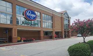
Today's post will take us to the affluent North Atlanta suburb of Buckhead. Situated just blocks away from The Georgia Governor's Mansion, The St. Regis Atlanta, Phipps Plaza, and Lenox Square Mall, the store colloquially known as "Disco Kroger" was seemingly located in the heart of it all.
 |
| The Atlanta Constitution (Newspapers.com) - August 14, 1975 |
It will also be open 24 hours a day, strengthening the move toward around-the-clock shopping introduced here last winter by A&P, which now has 10 stores operated on this basis." - The Atlanta Constitution
At this time, Kroger's competition in Atlanta included the likes of A&P, Colonial Stores (Colonial & Big Star), Alterman Foods (Big Apple, K-Mart Foods, & Food Giant), and Winn-Dixie – none of which remain in the area to this day. It's pretty impressive that Kroger managed to last in this location for over 47-years (and outlive all of those other players); however, its longevity doesn't quite beat the tiny Publix located a few miles away inside a 63-year-old A&P.
 |
| The Atlanta Constitution (Newspapers.com) - November 20, 1986 |
During those 47-years, Disco Kroger remained a flagship store for the chain, especially considering it was allegedly the first supermarket in the Southeast to feature a sushi bar – all the way back in 1986! This was only the second Kroger in the country to feature sushi, with the other being in Kroger's hometown of Cincinnati. Can you just imagine a Bauhaus-themed sushi bar?!
For two short years, Buckhead residents could indulge in a $2.50 California roll or a $3 tuna roll all while shopping for their weekly groceries, dropping off their dry cleaning, or depositing money into their BankSouth checking accounts – until they couldn't. Kroger ended up closing the sushi bar in 1988 citing the difficulty of finding and keeping trained sushi chefs.
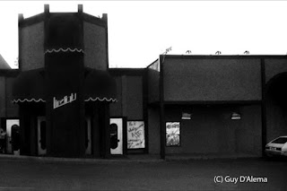 |
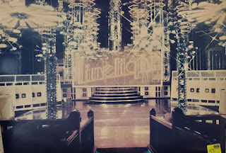
| Courtesy Guy D'Alema (Arts ATL) - The Limelight |
In addition to fancy peanut butter and sushi, this supermarket also boasted another feature: a disco club next door. The Limelight, seen above, opened its doors in 1980 in a former dinner theater. The nightclub is said to have included a glass dance floor with two sharks swimming underneath and a plethora of neon lights illuminating the space.
Anybody who has seen a lively nightclub knows what happens after midnight: many impaired people slowly trickle out in search of their next refuge. What better place to "sober up" than the 24-hour supermarket next door!
There is additional folklore that the store hosted late-night frozen turkey bowling and cereal aisle dance-offs, and while this does seem likely, I have not been able to corroborate it.
The Limelight eventually closed on September 26, 1987 citing "dwindling attendance" but was followed by Rupert's Nightclub (1988-1996) and Atlanta Live (1996-1998) before the adjacent storefront next door was leased to Cost-Plus World Market. More pictures of the inside of the Limelight (and the World Market store) can be found here.
 |
| The Atlanta Constitution (Newspapers.com) - September 20, 1988 |
Something that I love about these posts is all of the tangents I go down while performing background research. Our next example of that is this article about Kroger's failed hostile takeover attempt by Dart Group in 1988. The deal followed a $3.77 billion defensive restructuring effort by the Cincinnati-based chain to ward off any potential buyers.
The article above, which goes into detail about the takeover attempt, also shows us a rare glimpse of this store's original Superstore façade. Some more pictures of a former Michigan Superstore (that still had the 1980's Bauhaus décor until at least 2008) can be found here.
 |
| The Atlanta Constitution (Newspapers.com) - September 21, 1988 |
The following day, Kohlberg Kravis Roberts & Co (KKR) announced it would top Dart Group's offer in attempt to perform a leveraged buyout, which would have brought Kroger under the same corporate umbrella as Safeway had the deal gone through. (You may also remember KKR from my post a few weeks ago covering a former Bruno's / Food World store.) That would've saved Albertsons and Kroger a lot of time and effort today!
The 1980's are known for a plethora of attempted and successful leveraged buyouts, but I never realized that Kroger was entangled in this hectic web either.
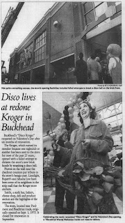 |
| The Atlanta Journal-Constitution (Newspapers.com) - Disco Kroger's first encounter with a wrecking ball - February 22, 2001 |
Based on what I've read, I'd imagine that this store received its first remodel in 1986 (when it received the sushi bar), followed by another possible remodel in the 1990's. Sushi would once again return to this store in 2001 following a six-month overhaul that included a grand new façade out front (which even a disco ball couldn't crack). I wouldn't be surprised if this is when Kroger expanded the retail outlet into some of the adjacent storefronts, like the former SuperX.
.jpg) |
| The Atlanta Constitution (Newspapers.com) - October 18, 2008 |
The store once again underwent an extensive remodel in 2008, which upgraded the location to Kroger's upmarket "Fresh Fare" banner. The $5.5 million remodel made this the fifth Fresh Fare store in the country and the first in Georgia. The new banner focused on "organic and freshly prepared foods" with "about 10,000 square feet, or nearly one-fifth of the store, dedicated to sushi chefs, chef-made entrees, imported cheeses, olives, and fresh breads." The supermarket also offered more than 4,400 wines, including a $1,184.99 magnum of Chateau D'Yquem, 1995 vintage Saunternes – I wonder how long that sat on the shelf!
The article above goes on to point out, "Still, it may seem like a precarious time to launch an upscale grocery store, given the recent gyrations on Wall Street and dramatic dips in retail sales . . . But Kroger officials say they aren't worried. 'We have no reservations launching an upscale store in the Buckhead community,' said Glynn Jenkins, director of communications for Kroger's Atlanta division. 'We will still offer items that provide value. We have the Kroger Plus Card savings and Kroger brand products as well.'" - The Atlanta Constitution
It seems as if Kroger couldn't have picked a worse time to roll out an upscale grocery concept, as during the prior month, the Federal Reserve took over AIG, the Federal Government announced the takeover of Fannie Mae and Freddie Mac, and Lehman Brothers filed for bankruptcy (which remains the largest bankruptcy filing in US history and triggered a 4.5% one-day drop of the Dow Jones Industrial Average). Needless to say, the economy was backfiring on all cylinders.
It doesn't take much to see that the Fresh Fare concept was designed during the height of the real estate boom, and likewise features all of the gold and gild of pre-Recession America. All of that seems to be a stark contrast to the soured environs it was ultimately introduced to, but it must not have fared too poorly in order to have survived for 14-years here. Just keep that context in mind as we embark on our "stour".
As we learned above, Kroger has gladly embraced the "Disco" badge for this store over the years.
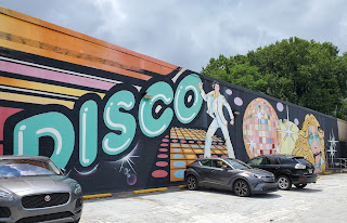 |
| Allons-y à la discothèque |
That's especially apparent thanks to a large mural painted on the side of the shopping center. Tucked away facing a small parking lot, this funky facsimile reminds us of the feverish fervor of past patrons. The dance floor may be gone, but the memories remain!
 |
| Quelle est cette tête de cerf dont tu parles? |
As I mentioned before, this store is located on prime real estate in the heart of Buckhead. Probably the most striking thing about the location is how there can be a full-sized shopping center with a surface parking lot in the midst of these skyscrapers! It will be interesting to see what changes here once Publix moves in; however, I believe the part of the shopping center we see here will remain.
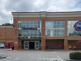 |
| «Farm I see» – Où sont les vachettes et les poulets? |
Turning to the right, we see this store's secondary pharmacy entrance. I feel like this door should have more aptly been labeled as "exit" because it led directly to the checkout lines.
I would like to point out the Art Deco-inspired accents on the awning above the door. These appear to have been added during the 2001 façade remodel, but I initially couldn't figure out why – until I realized that the Atlanta Division's Olympic Spirit décor is what this store remodeled to following the turn of the Millennium. Duh! That would also explain the checkered floor tiles we can see in this newspaper picture which match the ones seen in several of these pictures.
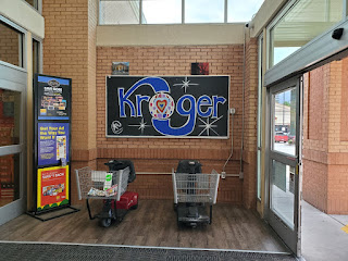 |
| Bienvenue à Disco Kroger |
From Disco to Deco, and every Fare in between, this store has been Stayin' Alive for generations of Atlanta residents. Even if all of that shakin' led to the city (or some bones) breakin', longtime shoppers are welcome to continue rollin' on the sales floor thanks to the motorized carts we see here.
Unlike some of Atlanta's other nicknamed Krogers, like Murder Kroger, the Cincinnati-based grocer was proud to embrace this location's colloquial moniker. It looks like an employee even decided to make a chalk pen graphic to boot! (This image managed to survive until the auction as well.)
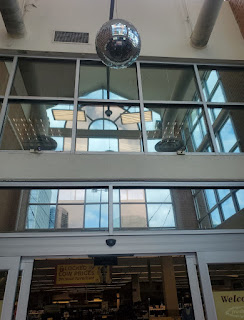 |
| «J'adore Stevie Nicks» |
As if the drawing wasn't enough, now, here we go again, we see the crystal visions of bygone revelers in the reflective sphere above.
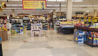 |
| «Des prix plus bas que bas pour des aliments qui sont plus frais que frais» |
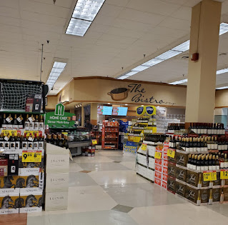
Once inside, we are greeted by a variety of specialty departments with arguably no clear guidance on where to go. I'm a huge fan of implied design cues in stores, but I often personally feel overwhelmed by all of the "stuff" calling for my attention inside a Kroger. On top of the plethora of yellow and red graphics, this store had no less than six different directions shoppers could turn at this crossroads. Here's a quick rundown using "clock" directions:
- at 9 o'clock, I could have ventured into the floral department and then funneled to the front of the checkouts
- at 11 o'clock, I could have walked down a corridor leading to the grocery aisles of the store
- at 12 o'clock, I could have meandered through the wine department
- at 1 o'clock, I could have zig-zagged through an alcove of pre-packaged deli foods
- at 2 o'clock, I could have browsed through the dump bins of items on special
- at 3 o'clock, I could have walked into a wall of Gatorade blocking the old "Bistro" ready-to-eat counter
- at 4 o'clock, I could have walked toward the in-store seating area
- and at 6 o'clock, I could have given up from my indecisiveness, walked right back out the door, gotten in my car, driven home, crawled into bed, and cried myself to sleep due to my agony
Am I unjustified for being a little overwhelmed? Anyhow, my Magic 8 Ball told me to pick option "D", so deli foods it is!
Kroger Greenhouse stores may often show their age, but at least they provide a clear direction of where shoppers should go (the produce department) when entering those stores.
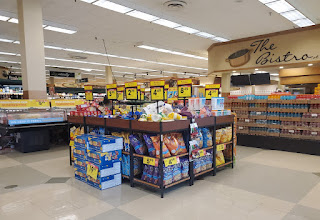 |
| Le Bistro est fermé |
On a positive note, I noticed how this location survived up until the end without having to expose its concrete subfloor (Anonymous in Houston can rejoice). I do appreciate that the circa 2008 flooring uses a subtle checkered pattern since it is more interesting than solid white yet more inviting than brown concrete.
 |
| Ce n'est qu'une question de temps |
Furthermore, I'd assume that both the 2001 and 2008 remodels radically altered the layout of this store since I don't see any obvious remnants from any original configurations. That being said, I'd guess that we would be standing in the SuperX drug store portion of the shopping center had this been taken in 1975.
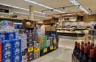
I'm not sure whether it was because my initial visit was earlier in the afternoon or because the store was already decidedly destined for demolition by my second visit, but The Bistro hot food counter only appeared to be open during my 2021 visit. I at least remember the sliced meats portion of the deli was open and staffed on my second visit because that is a rare sight of its own in my recent Kroger experiences.
Interestingly, I've also seen this same Bistro signage used in a Bountiful store, so it must not have been exclusive to Fresh Fare.
 |
| «Catch a Bud» |
We now find ourselves in the midst of the zig-zag I mentioned earlier, with the "L"-shaped deli cooler off to my left and the specialty cheese island in front of me. The bakery and produce department can be seen off in the distance.
 |
| La Boulangerie |
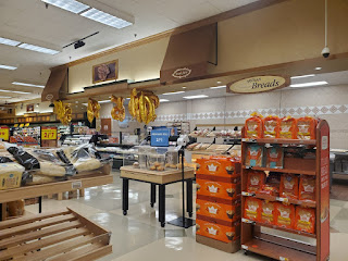
Retail Retell has mentioned this in the past, but this store's Fresh Fare décor lacks formal department signage and instead utilizes pictographs to designate each area of the store. As we can see here, the bakery counter is identified by a muffin. Having navigated several grocery stores which lack any English signage, it's surprisingly easy to pick up on context clues to find what I am looking for. I applaud Kroger for trying something different with this package, as it highlights how text isn't really necessary for navigation (even if a clock compass is).
Several of the department "signs" were also framed by a pair of the "Fresh Fare" awnings like we see above.
 |
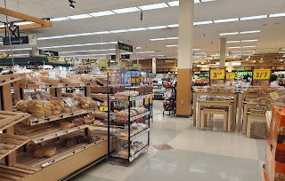
| La Fromagerie |
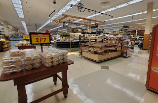
Spinning around, we see the part of the sales floor between the specialty cheese island and the bakery which was designated for pre-packaged baked goods. If you haven't tried them, Kroger has some very tasty sugar cookies.
 |
| Le Labyrinthe |
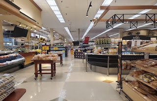
If this shot is any indication, I feel like Kroger is hell-bent on getting shoppers to purchase something from the bakery. This picture highlights one portion of the maze between the entrance and the produce department – there really is no clear path!
 |
| La Charcuterie |
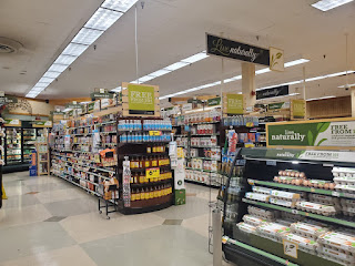
I wish I had taken a better photo or two of the fresh departments' secondary signage because they feature an interesting copper-metallic background and ghosted Fresh Fare logo in addition to the department category.
At least this shot does give us a decent overview of the front end of the store, with the deli sliced meats counter located just off to my left.
 |
| Le Bio |
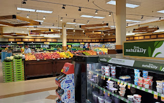
Inching further toward the back, we see this store's dedicated "Live Naturally" organic department just beyond the "L"-shaped deli cooler. Interestingly, there was corresponding signage hanging from the ceiling on all four sides even though the space was only accessible from two. It's worth noting that Kroger, like most other grocery chains, has been phasing out this specialty department in favor of placing the items throughout the store.
 |
| Les Fruits |
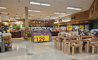
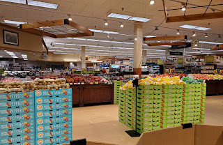
The back right corner of the store was home to the produce department, which received some added wood accents to differentiate it from the rest of the store. Do you think that sale poster for the red seedless grapes is large enough? It is at least 4-feet wide!
 |
| Les Légumes |
The department also had a number of hanging "props" to provide a change from the mundane white ceiling tiles. These accents almost make me think of something one would hang pots on in his or her kitchen. I do appreciate how "warm" this corner of the store looked too.
 |
| La Pastèque |
I'm your private shopper, a shopper for money
I'll buy what you want me to buy
I'm your private shopper, a shopper for money
And any old melon will do . . .
I guess I was trying to obscure my camera behind that watermelon bin in order to not get caught by the man looking at oranges! Regardless, it provided the perfect tie in for my musical reference. If you're totally lost, I'll explain with a reprise in Part III . . .
 |
| C'est quoi ce piment kiwi dont tu parles? |
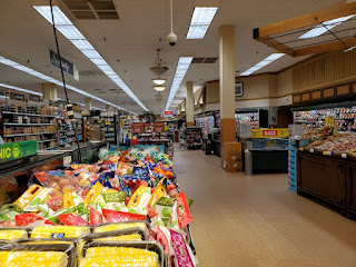
Turning back toward the front, we'll take another quick glance over what we've covered so far . . .
 |
| Suivre la lumière |
. . . before shucking our attention away to look toward the back actionway. I do like how Kroger decided to use different flooring in this department to serve as a subtle differentiator.
 |
| Se sentir mieux, manger mieux, vivre naturellement |
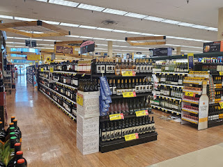
Now, time for a bit more salt; Retail Retell has pointed out these pendant light fixtures before and how they can add to the upscale feel of the Fresh Fare package; however, I think they just make the space look dated in 2023 (on top of the fact that the bulbs in the majority of the fixtures were burned out).
To me, Fresh Fare and its sister package Flagship Script scream of the opulence and excessive nature of pre-Recession design. With this store undergoing its last remodel in 2008, I have a strong feeling that the package was developed with the mentality that "the bubble would never pop" – except that it did. The Recession seemed to usher in a new era of minimalism and contemporary design which was a stark departure from all of the warm colors, brass finishes, textured wallpapers, and "sketched" graphics of the previous years.
 |
| Le Vin |
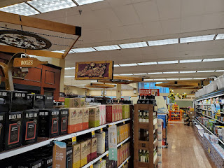
Continuing on to the wine department, we can see that this store has a rather expansive selection compared to your average supermarket; I do like the faux-wood flooring used here!
 |
| Qu'est-ce que c'est? Le vin en boîte – comme c'est scandaleux! |
I can tell this shot was from my 2021 visit because I see several of the original Art Nouveau-inspired category markers which were absent from my previous picture. By that point, this store's fate had already been sealed so I wonder why Kroger bothered to swap out the old signage.
This department also reminds me of the "Tuscan" look that was very popular before the Great Recession took hold.
 |
| La Cave du Vin |
The highlight of this store's wine department was certainly the climate controlled cellar (making this only the second time I've seen such in a supermarket). I'd presume this is where the "$1,184.99 magnum of Chateau D'Yquem, 1995 vintage Sauternes. Kept at the requisite 58 degrees," was stored when the location reopened as a Fresh Fare in 2008 – now I wish I had ventured inside the cellar to see what kind of high-priced wines this store offered in 2022! I wonder if the 50% off store closing discount applied here too?!
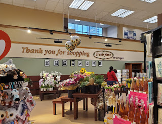 |
| Merci d'avoir fait vos achats chez Fresh Fare |
Now that we've finished our tour through the vineyard, we'll pop our heads out for a quick look at the florist. I've always been intrigued by the fact that Kroger minimized its own branding in Fresh Fare, similar to Publix with the now-retired GreenWise concept. I also like how the designers added some local flare with the black and white photos below the text.
 |
| La Conserverie |
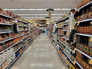
Next up, we'll meander through a few grocery aisles, beginning with aisle two. Other than the enlarged service and wine departments, this store seemed to be stocked much like any other Kroger I've been to.
 |
| La Poissonnerie |
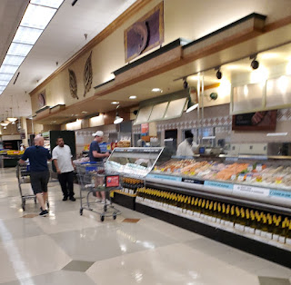
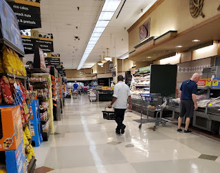
This photo also shows us a rare sight in an Atlanta Division Kroger: an employee working in a service department. I am personally shocked by the number of times I've walked past a deli, bakery, meat, or seafood counter in a Kroger, regardless of the time of day, only to find neither active employees nor active lights, with this store being one of the few exceptions. That's not to say that this store had ample numbers of staff running around, but I was at least able to find one person working at both the deli and seafood counters.
I do like all of the spotlights and "awning" accent panels used in this department, as I feel like they do dress up the space. It's also worth noting how the seafood display uses the frameless glass panels which are typically reserved for premium stores in Publix world.
 |
| La Boucherie |
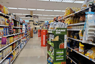
Since I haven't mentioned this yet, all of the department "signs" are bolted to two metal posts secured to the inside of a light box below. I personally feel like uplighting is an underutilized feature in store design, and I like how it sets off the panels by highlighting the wall behind them. (Check out my afterlife post on more details about the signs themselves.)
 |
| Le Snacking |
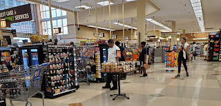
Over on aisle five, we see a selection of chips and crackers. I primarily notice the "Scan-Rite Promise" pennant off in the distance which looks just like one we saw back at Art De-Kroger. I'd also like to point out how the category sign for "tortilla chips" got into a tussle with something at some point. At least it was luckier than its neighbor closer to us.
 |
| L'Espace des Services |
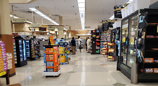
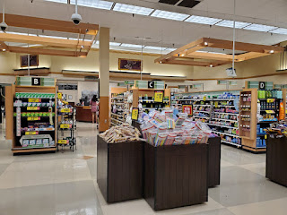
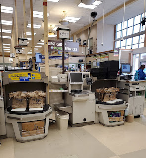
Back up front, we can see the checkout lines and a rare sight inside a supermarket: natural light. I know the current façade was added during the 2001 remodel, but I wonder if this store ever had a Greenhouse following its Superstore days.
 |
| Voie rapide |
Since Fresh Fare and Flagship Script are sister packages, they did share several sign designs, such as the ones seen above the checkout lines here.
 |
| Tape m'en cinq, des pâtes |
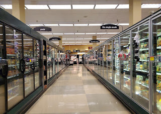
We'll next look at frozen foods on aisle seven, which curiously features different models of freezers on either side.
Another curiosity is the fact that these floor tiles lack the diamond accents which are present around the perimeter of the store.
 |
| Un carré d'agneau |
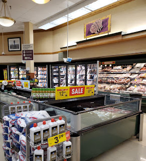
This store featured an additional meat alcove between the service counter and the dairy section which boasted the rack of lamb pictograph we see above. Curiously enough, it doesn't even look like lamb was sold under the sign because all I see is clearance ham and frozen shrimp.
 |
| La Laiterie |
Turning a bit to the left, we can see the dairy department come into view along with another reminder that we are inside a "fresh fare by Kroger" store.
Another odd thing about this store is the fact that it used surface-mount florescent light fixtures rather than ones set into the dropped ceiling grid; I wonder why this is? I did notice during the auction that there was an additional, unused grid hiding above the one we see here, so maybe that didn't allow for enough clearance for traditional fixtures? That being said, I still wonder why Kroger didn't remove the old grid during one of the multi-million dollar remodels.
 |
| La Papeterie |
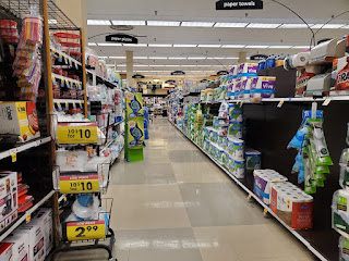
I'm also surprised that this store maintained its Kmart-style air diffusers through all of those remodels.
Hopping back into the grocery aisles, we'll take a quick glance down aisle 10 to see paper goods and a small section of housewares.
 |
| L'Animalerie |
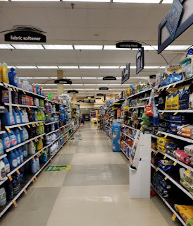
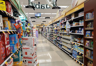
Aisle 11 hosts a combination of cleaning supplies and pet foods . . .
 |
| Le Bébérie |
. . . while aisle 12 offers all sorts of baby products. I'm no Kroger expert, but I found it odd that this store received a Bountiful baby department sign (which is just barely visible in this photo). These signs also happen to interpret "baby" as "babee" considering they feature a child in bee form.
 |
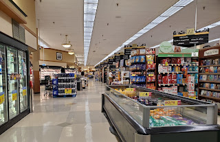
| La Colonne |
Jumping over to 13, we see a variety of personal care products along with this section's special branding. I've never quite understand why Kroger opted to use a different style of aisle sign for the health and beauty section because I feel like it abruptly breaks up an otherwise cohesive package.
 |
| La Librairie |
We'll pop back out to the back actionway of the store for one last overview . . .
. . . before I mention that there happens to be a shoe hidden here from view. More on that in the next post.
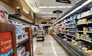 |
| Déballer un sourire |
We'll continue on the other foot as we put ourselves in the middle of the dairy aisle which runs along the left wall of the store. I like how Kroger used more of the Fresh Fare awnings here to accent the orange juice pictograph: they really help to break up the empty wall space.
 |
| La Pharmacie |
"Hello, may I ask who is calling?"
"Oh, hey 2006! How have you been?"
"You said you want your interior design back? Well, let me transfer you to the pharmacy."
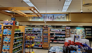
Back up front, this store also had several short pharmaceutical aisles by the pharmacy which featured the green version of the H&BA signage. I think the colors in this section blend in much better than the blue, even though they look fairly dated at this point.
 |
| La Photographie |
The pharmacy butted up to the front left corner of the store, and happened to feature one of the most interesting pieces of local flare . . .
 |
| La Boosterie |
. . . a roughly 18-foot wide collage! It looks like Kroger decided to make one of these for each Fresh Fare store, which I can appreciate considering how most stores don't spend the time to develop a one-off piece like this. Retail Retell shows off some of the variations of this collage used in different stores here.
 |
| La Charité |
It wasn't long after I took this shot, when a random lady walked up to me and asked if I could buy her a gift card. I typically don't like when people confront me inside stores, but this experience was much less like Stone Dae Muntain and much more like money request encounters I've had amidst the aisles of a Walmart or Harveys.
The lady went on to say that she would pay me back, but she wasn't able to purchase the gift card herself for some reason. I respectfully declined the offer, wondering what kind of con she was either playing or being played in and how I wanted no part of it. That encounter, in a flagship Kroger of all places, only adds to my admitted bias against the chain; out
of the 99 Publixes I've photographed (much less the additional stores I've been to) I've never had anything close to that happen. She's also far from the first "character" I've come across in a Kroger store, to put it nicely.
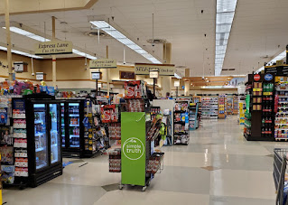
Anyway, this shot gives us another nice view of the natural light that is let in through the front windows of this store. I wish more retailers would have big windows like this!
 |
| La vérité simple |
The simple truth is this store's days were numbered by the time I got around to capturing my first photo set.
 |
| Les feux de la rampe |
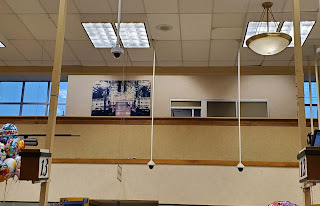
That feeling was only accentuated by the dirty-looking off-white present throughout the store and the faded photo of years gone by hanging above the registers. Much like The Limelight, this store will soon, if it hasn't already, meet a similar fate as it is demolished for a fancy new grocery store. Buckhead residents must be hungry for change!
 |
| La Caisse Libre-Service |
I was in for some change of my own after I made my purchase at the self-checkout line because next time, I would see this store was under entirely different circumstances. Kroger ended up permanently closing this store on December 9, 2022, in order to make way for the aforementioned Publix which will presumably be a 54M. It will be interesting to see how the aging nearby Publix stores, such as #282 at The Peach, will fare following this store's grand opening.
Regardless, make sure to check out Part 2 of this post to see this store during its final days in existence: The Afterlife.
Profiter du présent,
- The Sing Oil Blogger





I’m glad to see Sing Oil make a guest appearance here at the Mid-South Retail Blog! I figured this was something that was bound to happen at some point! I have some other comments to make about this topic which I made over at the Sing Oil Blog companion post. Those are probably the more controversial comments so I suppose I’ll do Retail Retell a favor and keep it over there, lol.
ReplyDeleteSing Oil, as you probably know, there were two Disco Krogers until both closed recently, the more famous and nicer Atlanta one and one in Houston. The Houston one was not a flagship Kroger to say the least, lol. That said, for a brief period, the Houston Disco Kroger also had Fresh Fare décor, but Kroger renovated it to have Bountiful after only a few years and it ended up closing with Bountiful. Mike has a post about the Houston Disco Kroger: https://houstonhistoricretail.com/2021/01/02/retail-news-disco-kroger-closes-on-cue-opens-and-bill-miller-has-their-eyes-on-west-houston/
So, yes, it is not a surprise that I prefer the Atlanta Disco Kroger! For one, it has a real floor! Rejoice, rejoice, no Krotesque tile scar! But, yes, when Kroger puts some effort into things, they can create a nice store that appears to be what we have here. Would I prefer shopping here over a Publix? Well, I’m not so sure about that. It is a Kroger after all, lol, but this was a better effort so I’m not sure how I would answer that. One thing Kroger does very well is the quality of their store brand products, but I can't speak for Publix in that regard.
This is more related to the post you made at your blog, but I’m glad you were able to go to the fixture auction for this store! You should ask Mike about old store clocks since he has one from an old Randall’s! I really wouldn’t have much interest in Fresh Fare décor because it was very rare here in Houston. It didn’t exist at the stores I shopped at, but there is some crossover between Fresh Fare and the Script décor which was more common. That said, Fresh Fare does look nice, albeit a bit dated now with the 1990s clip art like designs (though I’ve seen Fred Meyers with even worse looking clip art décor), and I wouldn’t have minded it if it was more common here.
I like that Bauhaus vector art! June’s The Year of Kroger post will have a little bit of Bauhaus in it so stay tuned for that as there aren’t too many places where Bauhaus still lives on at Kroger stores! You’re really going to like June’s post, which should go live around June 7th due to the first Wednesday occurring a bit later in the month, because it is a very unique Kroger store. It is also a case of failed Publixization where Kroger intended to replace the store and then ultimately did not. It’s an odd case, one a Publix fan might be interested in hearing about since it is uncommon for Publix to call off the wrecking ball the way Kroger did!
As for strange things happening at urban stores, yeah, Houston is the same way. It isn’t just Kroger, it seems to happen at a lot of places…though I wouldn’t be surprised if it is more common at Krogers than elsewhere. The Houston Disco Kroger was named Disco Kroger after some of the ‘unique’ people who shopped there so that probably ought to tell you that you never know what you’d see there. Someone asking for money was probably small potatoes there, lol.
Anyway, Retail Retell’s blog is a fitting place for Kroger commentary and so I’m glad to see a new Kroger post here and I’m also glad to see Sing Oil do more Kroblogging even if I know he doesn’t like doing that, lol. I’m a regular Kroger customer though so I do get it!
Ha, thanks! I had a feeling it would happen eventually too, I just had to find something that would fit in! An Atlanta Kroger isn’t exactly in the Mid-South but at least I wasn’t doing something unheard of when I posted about such a store here.
DeleteYes, I do remember you mentioning the Houston Disco Kroger and I can never seem to remember everything I need to point out as I am writing a post. I’m amazed at how little stock was left in the Houston store when Mike went – and talk about tile scar!
By no means was this store bad, but I would have been curious to see it in 2008 or 2009 when Kroger really seemed to be taking on Whole Foods and the like with this location. I guess you’re right that “it is a Kroger after all”! As far as the store brands go, I don’t have any complaints about what I’ve bought from Kroger or Publix. Both seem to do a good job with the quality control on private labels and I never hesitate to buy a product from either brand. Since Kroger is larger, I think they can afford to carry a wider variety of private label items, but Publix still does good with having its own brand of product in most categories.
Yes, I’ll have to talk to Mike about his Randall’s clock! Hopefully it was at least functional when he purchased it. I have a feeling that the one here could’ve been through one-too-many thunderstorms. I also don’t have much of a connection to Fresh Fare, considering this is the only store I’ve seen it in, and I may have been to this store once before 2021, but I still think it is neat to have a piece of such an iconic store for the state.
Thank you! I attempted to fully recreate the Bauhaus look by adding the split-letter overlay like the Kroger décor used to have, but I couldn’t figure out how to actually implement such. Regardless, I still think the graphics turned out nice for somebody who isn’t a graphic artist! I’m intrigued by your June post teaser because I thought the last Bauhaus Kroger (one in Ohio) closed a few months ago and the package was now dead. I’ll certainly have to check it out in a few weeks!
I guess I shouldn’t totally single out Kroger for having strange scenes at its urban stores, because fires were recently set in two Atlanta Walmarts and one Atlanta Target to serve as a distraction for shoplifters. Those fires ended up resulting in Walmart shuttering one of the stores and converting the other into a Neighborhood Market. The NM location actually started off as the ill-fated Publix #790, and I think it is ironic that Walmart can’t even justify keeping a Supercenter at the location! Target ended up repairing its damaged store and reopening it several months ago. I can’t imagine what I would think of the Houston Disco Kroger if somebody asking for money is the least of your worries!
I’m glad you liked the post, and maybe I can find some other Krogers where I can have a more pleasurable experience (I promise that I still prefer to write about things in a positive light)! I’d especially be curious to visit a Mid-South Kroger to see how it compares to ones in the Atlanta Division and if the lack of competition actually helps.
Interestingly enough, a few days after Kroger announced that they were closing the Houston Disco Kroger, it somehow caught on fire! Link: https://abc13.com/disco-kroger-fire-trash-burned-at-locations-houston/8009088/
DeleteI'm not really sure what happened, but given how the Houston Disco Kroger got the Disco Kroger name, it probably doesn't take much of an imagination to guess what happened!
I wish I could say that June's The Year of Kroger post will have Bauhaus inside the store, but the Bauhaus is actually on the outside of the store. It is still neat. The interior will have Banner, but Banner looks a bit strange on the inside of this store. In fact, any of Kroger's decor packages would have looked strange. It has to be one of the strangest Kroger interiors in the country! Hopefully the post matches the intrigue I'm posting here, but I think it will!
I'm sure there are some nicer Atlanta, or at least GA, Krogers out there. I think the first time I saw the 'Krobar' name used officially, it was a photo from a GA Kroger! Probably from a Kroger Marketplace, which are stores I don't particularly like, but it is still an interesting name! Those Delta Division Krogers seem interesting. The Delta Division seems more aggressive with remodels than the Houston Division and some other prominent Kroger divisions. That may be a good thing, but maybe not, but at least the Delta Division is putting money into their stores.
Oof, just take a look at this quote from the ABC 13 article: "the nickname stems from ‘the diverse and often bizarre late-night crowds you can find there most nights of the week, but especially on the weekend.’" At least Atlanta’s Disco Kroger had a much more innocent reason for its name! That also seems a bit ironic that the store mysteriously caught fire. In a way, it reminds me of the South Atlanta Kroger that had to close for several months because somebody had stolen a bunch of copper wire from the back of the store – it was also one of the stores that required a separate walled area for laundry detergent . . . https://goo.gl/maps/j9SZwBVJjvG7wpSm9
DeleteThat makes much more sense. I’ll still occasionally come across a Kroger with the Bauhaus pills on the exterior, but that seems to be increasingly rare. I’ve been to one such store that still has the pills and the cube out front, but it is set to close any day now for a replacement just down the road. https://goo.gl/maps/7eYrpbEXSQcTs9XPA Maybe I’ll have time to check out that post today as well!
What I believe to be the original Atlanta “Krobar” store (link here: https://goo.gl/maps/G5xUyduyzGthMMyY9 ) actually seems to have lost its bar in the last few months. I went to that store several months ago and was curious to see the bar but could never find it. I happened to be scanning through a permit database when I came across a listing from January of this year for that store mentioning “Demo of the existing wine bar kitchen and seating area. We will be remodeling the space into a new office area. Updates to lighting and new receptacles will be added to area.” It sounds like “Krobar” may now have Nobar! I think the new Murder Kroger still has a bar though. I’ve only been to that store once, and the time I went there was a man walking around the store smashing wine bottles on the floor. That store is supposed to be “fancy” too considering it is right next to Atlanta’s Beltline and Ponce City Market; I wouldn’t consider anywhere fancy that has people acting like that! I’ve only ever been inside one Marketplace Kroger and it was nearly 10-years ago at this point. The store seemed nice at the time but very overwhelming. I also remember wondering who in the world Fred Meyer was and why did he want to open a jewelry store inside a Kroger, lol! I’d like to revisit that store at some point because it would be fun to reminisce on the conversion process that store had as the preceding Greenhouse location was demolished in stages. You are right, at least the Delta Division is putting money into their stores!
It's pretty rare for me to read a new post on my own blog -- although at this point, it's pretty rare for *anybody* to read a new post on my blog, haha! I appreciate you choosing to share your first post about the Disco Kroger here, and I hope to return with new blog posts of my own soon. I guess (to your point) this is not, in fact, the first-ever Disco Kroger post to go up on my blog, but at least you found more things to be salty about in the post than just me stealing your thunder!
ReplyDeleteBackground! History! Sushi! I like the neat Bauhaus transition pieces you created, and of course, as always, thoroughly enjoyed seeing the obvious fun you had while writing this post. The French translations are all awesome, and there are tons of other hilarious moments as well -- some of my favorites include the motorized carts, 6 o'clock, "le labyrinthe," and "oh, hey 2006!" I really lost it at that last one...
I didn't really research this store before writing my quick post about it, so I was actually surprised to learn it's been around since the superstore days. Great find with that photo of it from back then, too. I guess logically I should have realized its age, but the store simply didn't feel that old when I was in it. (And we all know that other old Kroger stores definitely can feel very ancient!) I'm also very shocked to learn that Kroger dabbled in sushi that early! I guess it didn't last long back then, but ultimately did come back to the store.
On that note, you make a great point about the rather unfortunate timing of fresh fare's concept debut, too. For as upscale as it is, coming out right when the recession began to take hold was not ideal. I would (and have in the past!) argue that a lot of the specialty service concepts introduced with fresh fare would later become standard chainwide, so that, at least, is a plus and something that has had a more lasting impact than the rest of the visual gild and glitz. I would also argue that fresh fare is fancier than script, but you make an interesting point in comparing them. I look at fresh fare as more opulent and script as more traditional, but I think it's fair to say you're right that both of them exhibit elements from that particular pre-minimalist era. Like the store concept itself, I wouldn't doubt that the two decor packages were both in development for years prior to when they were actually rolled out. And in any case, my takes on the two are ultimately just that -- my personal opinion. Compared to the minimalism of Artisan, I'll gladly take fresh fare or script any day!
Regarding the bountiful baby sign, and the separate health and beauty decor -- I'm positive those were both added later. In my experience, Kroger typically added the HABA stuff to all of its stores, regardless of their decor package. All of that to say, it doesn't match because I guess technically it's not supposed to!
I appreciate all the links of mine that you shared in this post, and look forward to checking out Part III as soon as I publish this comment!
You’re welcome! I’m glad I was able to finally figure out something that would fit in on your blog while also freshening up some of the content! Yes, I was a bit surprised when I saw that you had stolen my thunder on covering this store, but I think it worked out quite alright in the end. Sarcasm is my middle name, and I typically have more trouble holding back my salt than I do dishing it out!
DeleteThank you! I had fun making the Bauhaus section headers. Like I mentioned to Anonymous in Houston above, they didn’t quite turn out how I initially envisioned them but I’m still happy with the outcome, nonetheless. I also had to make different versions for both posts since I figured it would be jarring to have a white background graphic on your bright orange blog page (and blogger does not like properly rendering images with transparent backgrounds). I’m glad you enjoyed the French captions as well – I was pondering how I could spice this post up when I thought of commenting on how The Bistro was closed during my second visit. From there, I figured it was only fitting for a comment on a French department should also be in French – the rest is history! Throwing in another language also gave me another medium for me to throw some subtle shade: comme c'est scandaleux! Regardless, I’m glad that somebody else gets my humor because it is sometimes hard for me not to crack up as I’m writing these posts! I feel like I think of my best lines when I’m doing something totally unrelated, like taking a shower, and I have to make sure I write them down before I forget.
Considering all of the press coverage it received, I knew that this store had been around for some time, but I’m really glad I was able to find that photo of it with the superstore façade. It was also cool to learn that this was essentially a “super” superstore since those articles mentioned it possibly being the largest supermarket in the Southeast at the time it opened. I’d say it’s because this store underwent two multi-million-dollar renovations during the Twenty-First Century that it didn’t feel ancient. I could certainly tell that it was starting to feel tired near the end, but there wasn’t anything that really hinted about the store being close to 50-years-old. I was also shocked to learn about the sushi bar experiment in the mid-1980’s.
Kroger really did botch the timing on the release of Fresh Fare because I agree that the concept was very well tailored to the years leading up to The Great Recession. I’m not as familiar with the long-term impact Fresh Fare had on the chain, but the way you describe it seems like it served a similar (yet more widespread) role to Publix’s GreenWise for testing new upscale concepts that would be later integrated into more stores. I can understand your argument for Fresh Fare being fancier than Script since the former typically received additional elements like the light boxes and pendant cauldron lights. I still do see a lot of similarities between the two packages, from the textured wallpaper to the general tan/brown/green color palette throughout the store. The signs for the two packages are where the real differentiations begin to occur, with Fresh Fare’s being more opulent and Script’s being more traditional, as you mentioned. Regardless, they both show signs of being from the pre-minimalism era.
I’m not surprised to hear that Kroger added the extra H&BA signage later in this store, but I still wonder why they thought it was worth standardizing the signage in that area throughout most stores rather than keeping at least the aisle signs consistent with the rest of the remaining store fixtures.
I doubt you’ll see a day when I write a Kroger post without some sort of link back to a page of yours, so thanks for all of the work you have put in over the years!
This was the first retail post I've ever read where I had to break out Google Translate! :) I figured a collaboration between the Sing Oil Blog and the MSRB would have to happen before long as well, with all the overlapping territory you guys cover.
ReplyDeleteI like how Kroger really embraced the local moniker of "Disco Kroger" with some of the personalized elements this store got (like the mural), although "Disco Kroger" was probably one of the few local monikers that portrayed the store in a positive light!
From the interior and exterior, it's pretty hard to tell this building began its life as an old superstore (at least in photos, I don't know if this building showed its age more in-person). The Fresh Fare decor was quite nice and it was obvious this store was designed to be more upscale. Even if it may be considered dated today, I thought it was a well-rounded package with lots of little detail in it. I'm not too crazy over minimalism, so it's nice to see some of those well-rounded details of a 2000's-era decor package!
If it makes you feel better, I had to use Google Translate a good bit as well; thankfully, I have a friend who took French during school, and he was able to help verify the computer’s translations. I certainly don’t have anything on the books right now (considering I haven’t even planned out what my next post will be) but maybe Retail Retell will be kind enough to invite me back again as long as I didn’t go too far off the rails this time!
DeleteYeah, most of the other local Kroger monikers I can think of range from neutral to flat out bad for business, so I’m not surprised that the chain gladly accepted the Disco title for this store! It’s funny how Kroger even tried to rebrand the new Murder Kroger store as “Beltline Kroger”, but I don’t think a supermarket at that location can ever let that name go (even if the area is nicer than it once was).
Like I mentioned before, this store was starting to feel a bit tired in person, but more along the lines of a store that hadn’t been remodeled in 15-years rather than one in a 50-year-old building. I didn’t notice anything in particular on the surface that pointed to this store being older than 2001, so kudos to Kroger for at least keeping up with this location in the past (which is much better than what can be said about some of their other stores). I do agree that I have gained more appreciation for the Fresh Fare package since staring at the muffin pictograph for the last month because the designers really did put some effort into small details. Fresh Fare still isn’t particularly my taste, but I can still have some respect for it, nevertheless.
Update: plans have gone live for the replacement Publix and store #1867 will serve as Georgia's first 55M prototype. For those who don't know, the 55M is Publix's new flagship design and currently has one active store in Tampa, FL, with more under construction in Kentucky.
ReplyDelete