 |
| Today's post highlights Dyer County, TN, retail. |
It's time for something unexpected... and by unexpected, I mean completely expected!
(...listen guys, I don't know how to start a post anymore. Just go with me here.)
Late last night, I found myself scrolling randomly through a bunch of old photos in my camera roll (as one does). In so doing, I came across the photos I took of the Dyersburg, TN, Gordmans during one of my 104 days of summer vacation back in 2020. (Except that it was actually more like only 50 days of summer vacation, since I began my masters program in late June... but I digress.) The point is, revisiting those photos motivated me to finally write the blog post I had been intending to write ever since I photographed the store. In short, heading into this morning, I told myself I know what I'm gonna do today.
--------------------------------------------------
Three years ago, I teased a follow-up to my first Gordmans blog post, which covered the chain's modern history up through its demise, and promised that the sequel post would take a look at the design aspects that made Gordmans unique. For those of you who might need a refresher on that modern history, here goes. Founded in the midwest as an "everyday value price" department store chain, Gordmans filed for bankruptcy in early 2017, liquidating all of its stores. Shortly thereafter, Specialty Retailers, Inc., better known as Stage Stores, purchased the Gordmans intellectual property, distribution center, and numerous store locations, reopening them. Stage's game was to convert these newly-reopened stores to a full off-price format. Per the Omaha World-Herald in May 2017:
Gordmans' current business model is a hybrid between a department store and an off-price retailer. ... Off-price retailers typically buy excess inventory from department and specialty stores, allowing the off-pricers to sell well-known brands at a heavily discounted price.Such chains often operate under a "treasure hunt" model, where items may not be available in a full run of sizes and colors. This is seen as somewhat of an antidote to the threat bricks-and-mortar retailers can face from online shops: To get the deals at the off-price retailer, shoppers actually have to go into the store.Gordmans previously had bought about 80 percent of its merchandise normally and 20 percent "opportunistically," the way a chain like TJMaxx buys merchandise, said Thorsten Weber, Stage chief merchandising officer.Stage plans to shift the model to buy about half upfront and the other half opportunistically, he said. ... The chain will eliminate coupons, sales, and promotions as a result.
[Stage CEO Michael] Glazer also touted that Gordmans stores are located in Midwestern markets larger than those Stage already operates in and that Gordmans' average customer is much younger than Stage's. He also praised Gordmans' home and gift business, which he said makes up more than 25 percent of sales.
Stage saw pretty good success with the off-price format. So much so, in fact, that, besides the Gordmans stores they reopened, they further converted nine of their own Stage-owned stores to the new format the following year. The success of these stores was so great that Stage, in 2019, decided to go all-in on off-price, and convert its entire fleet of 700 stores to the Gordmans nameplate and format. Below are some investor-relations slides documenting the rationale behind the move, with the bold declaration "our future is off-price." (Note: all image sources in this post are unknown unless otherwise specified.)
Stage moved forward with its ambitious plan, but retail analysts were skeptical. For one thing, Stage hadn't been in the best financial shape prior to purchasing Gordmans out of bankruptcy; there was concern that the acquisition might become "simply additional weight for a company already treading water." Second, even if the purchase did turn out to have benefits, Stage was basing its decision to convert the entire company to off-price on a comparatively quite small sample size. Who's to say that the entire chain of 700 stores would perform as well as the 70 or so -- a mere 10 percent! -- that were converted and driving this decision?
The latter fears were, unfortunately, offered much validity when Stage's adjusted 2019 earnings guidance -- originally a range of +1 to +3 percent, then bumped up to a maximum of +9 percent in the slide above based on the excitement of the projected off-price performance -- in reality panned out as a dismal +1.4 percent. But even then, Stage might have been able to salvage the company... if it weren't for the pandemic. Already behind on its bills, the prolonged temporary store closures of spring 2020 left the company without sufficient cash flow to pay its vendors or its landlords, and ultimately, Stage succumbed to a bankruptcy filing. Stores reopened from the lockdowns only to begin immediate liquidation sales, and the company was out of business by late September 2020.
--------------------------------------------------
With that background out of the way, now we can jump back into the intended subject of this post: Gordmans' branding. Even before the Stage takeover, Gordmans had a unique personality. A logo consisting of a funky wordmark and an unusual-for-retail focal color of purple was complemented by, as described in the marketing portfolio from 2013 below, "a high energy, streamlined signing and graphics package" with "bold, colorful graphics" and specialized in-store feature areas such as Gordmans Giggles, Gordmans Grandstand, and "cross-merchandised presentations continually rotated to feature the latest trends in gifts and home decor."
The Gordmans store that I grew up with in Southaven, MS, had this interior design, and I documented that store thoroughly on flickr in case you are interested in seeing more of it; click here to see my album. The uniqueness didn't stop on the interior, as Gordmans' exterior design had a characteristic architectural look to it as well (also shown above).
Over time, Gordmans toned down the funk somewhat, though its interior design and layout remained largely similar, and true, to the existing brand identity. It was the store exteriors that saw a more drastic change, unapologetically introducing a giant purple logo wall to the storefront. With its 100+ year history, this certainly isn't a comprehensive look at all of Gordmans' branding, but I do believe these were the main two exterior and interior design identities in place at the chain's modern locations during the 21st century.
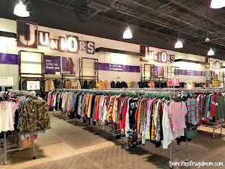 |
| Original design. Courtesy Twin Cities Frugal Mom |
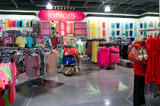 |
| Second-gen, toned-down design. Courtesy MLive |
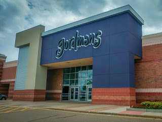 |
| Courtesy Google Maps |
--------------------------------------------------
Unlike "Gordmans 1.0" (above) with its new-construction buildings, in taking over the brand Stage Stores had the challenge of finding some way to make Gordmans pop within its existing architectural constraints, both interior and exterior, which on such a wide scale as Stage was envisioning would be far too costly to change anything more than cosmetically. So, to meet this goal, Stage went all-in on the unique purple color that had been with Gordmans from the start. It was an interesting part of Gordmans before, but without necessarily permeating the entire in-store experience of the brand, which was already filled with numerous other bold colors and visually interesting elements. Now, though, it was to become the most crucial part of Gordmans' entire identity. Stage Stores were mostly white and neutral inside, with fluorescent lighting and drop ceilings as opposed to Gordmans' dark, open ceilings and halogen lights. Purple would be infused into Stage's interiors as the strategic pop of color, such that it -- and the merchandise -- would stand out amongst all the other neutral elements. This was the best, most efficient way to make Stage's stores pop with minimal effort; Stage, obviously, wanted to spend as little as possible on the conversions while still making a big impact. The colorful, eye-catching signage was installed both indoors and outdoors as the brand's hallmark. It's new, it's different, and it's attention grabbing.
To complement its existing (and now amplified) quirky purple color, Stage also leaned heavily on giving the Gordmans brand a quirky attitude to match. Off-pricers such as TJMaxx and its family of related stores, and Burlington, are known for their phrases on the wall, touting low prices and such. Like its competitors, Gordmans, too, would have a bunch of phrases all over the store, but its phrases would be more playful, punny, and sassy. In more of its investor presentation slides as shown below, Stage indicates that the "fun, friendly, quirky store experience" would serve as one of Gordmans' most important off-price differentiators. In addition, from a merchandising perspective, the rebrand would also have to emphasize the "scarcity driven, treasure hunt experience" and the greater focus on home goods, which before the Gordmans off-price rollout occupied a much smaller percentage of Stage's largely apparel-focused department stores.
We'll get to see many of the elements mentioned above in play in a real-store environment once we get to the store tour portion a little later in this post. For now, I wanted to focus on some examples of early Gordmans marketing. As soon as November 2017, the new brand identity was already being associated with the revived, Stage-owned Gordmans chain, just months after emerging from its bankruptcy. At an event tent for a converting Palais Royal store, Gordmans was introduced as "our sassy sister." In 2019, as the store conversions picked up speed, a retro-chic themed VW bus (with the Gordmans "G" emblem on the front) embarked on a "Grand Opening Tour," inviting shoppers to "rock with us" at store opening events. This turned into the "Grand Opening Brand Bash" in 2020, in preparation for which shoppers were encouraged to sign up for text alerts to get "the latest skinny & savings [sent] to your phone!" On a temporary basis during the transition, Gordmans was featured alongside the other Stage brands on the company's rewards card, with the eventual intent, of course, to be the elimination of those brands, with Gordmans being the sole survivor.
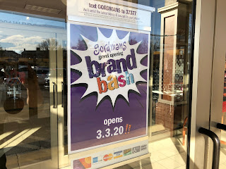 |
| Courtesy The News Leader |
While perhaps not everyone is, I am a huge fan of retail branding -- the psychology behind it, the artistry behind it, its various implementations, everything. To me, that goes hand in hand with the hobby; I am not just appreciating the application of a decor package inside a specific building, I am appreciating all aspects of the decor package overall in addition to and in tandem with its individual application in that building. Same with the incidental branding of marketing posters and whatever else may be inside or outside the store. And the store's architecture and layout. So on and so forth. I'm even fond of merchandise packaging, which has nothing to do with the stores themselves!
I subscribe to the fantastic website Brand New, which chronicles logo changes, the designs and processes that go into them, and the designers who make it happen. The site is meant more for those who have actual careers in that industry, but I find it interesting and enjoyable nonetheless. Anyway, I bring all this up because one of the coolest things that Stage and their design team did in developing the Gordmans branding identity and attitude was open it up to the public! On their Facebook page on January 12, 2018, they solicited their customers' input in selecting Gordmans' go-forward slogan. Despite making logical sense (although I'm certain there are drawbacks too, but that's beyond the scope of this conversation), most companies don't go involving their customers in branding decisions. In my opinion, though, this is a great way to interact with your actual target audience to get real, meaningful input that takes away the guesswork on how they'll actually respond to something. It also has the bonus effect of having them feel that their opinion is valued and that they are a part of the change, in turn getting them excited for the transition!
After 39 votes, option "C" came away the clear winner, sweeping the board with a 49 percent majority. The tagline was installed on multiple converted storefronts, letting shoppers unfamiliar with the Gordmans brand know exactly what to expect of the chain's offerings. (An alternate slogan I found, which was not featured in the initial poll, speaks even more directly to expectations!)
 |
| In case you're curious, option A got 7 votes... B, 3... D, 3... E, 5... F, 1... G, 1... and H, 0. Courtesy Facebook |
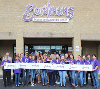 |
| Courtesy Circleville Herald |
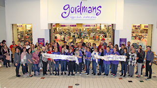 |
| Courtesy The Shoppers Weekly |
 |
| Courtesy Footwear News |
--------------------------------------------------
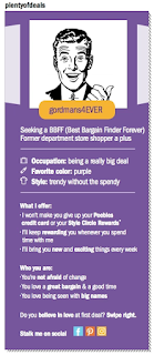
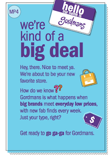
Further insight into the branding direction comes courtesy of Aimee Rhodd, one of the designers on the marketing team. Her portfolio has since been taken down, but before that time, the website featured many branding examples as well as some design briefs. Initially, Rhodd writes, "When Stage Stores acquired Gordmans and transformed it into an off-price retailer, a new voice had to be developed for the brand. I created a fun, tongue-in-cheek voice to match the in-store shopping experience. Emails deployed at least three times per week include a witty headline and a value message to entice shoppers to come in to Gordmans and discover that the store is where frugal meets fierce." And later, "When Stage Stores decided to close all department store locations and replace them with Gordmans off-price stores, it needed to be a big deal. Our team not only had to introduce the new store to customers, but also had to stir up excitement for the grand openings. We used the concept of dating as a way to convey the idea of what happens when big deals meet everyday low prices." All of these items helped present Gordmans as both more youthful, and more home decor oriented, than the existing Stage Stores brands that Gordmans was replacing, exactly as the Stage CEO is quoted as saying were Gordmans' strengths earlier in the post.
 |
| "Scratch off the circle to see how much scratch you get!" Courtesy Aimee Rhodd |
 |
| Note the use of the alternate slogan here. Courtesy Aimee Rhodd |
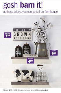 |
| A series of those email ads mentioned above. Courtesy Aimee Rhodd |
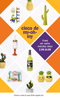 |
| "Nacho everyday deals"... Courtesy Aimee Rhodd |
 |
| Some others I didn't feature include "excess waggage" (pet merch), "active ingredients" (activewear), and "wise man gifts" that make a lot of "frankin-sense." Courtesy Aimee Rhodd |
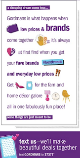 |
| A more emoji-themed example with this one. Courtesy Aimee Rhodd |
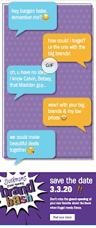 |
| Perhaps you might find some of these cringey, but I think they were at least engaging and different from what others were (and are) doing. Courtesy Aimee Rhodd |
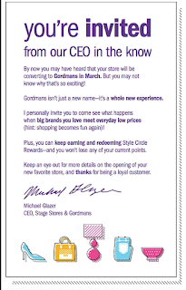 |
| One last example, an invitation from "our CEO in the know." Although I doubt he wrote this himself! Courtesy Aimee Rhodd |
--------------------------------------------------
Ultimately, Gordmans kept its new brand identity going at full force all the way through to the end, as shown in the examples below (one of which is their final-ever message to social media). These days, the Gordmans intellectual property is owned by BrandX, the same group that owns all of the various Bon-Ton brands' intellectual property -- as well as all of the other Stage Stores brands, with the exception of Bealls, the reasoning for which will be discussed later in the post. Presently, Gordmans does have a website, but it's just a static page with no actual merchandise for sale. It feels very wrong seeing the Bon-Ton honeycomb icon next to the Gordmans "G" emblem!
 |
| Gift card notification related to the liquidation sale. |
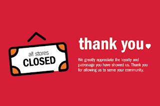 |
| Final Gordmans/Stage Stores "thank you" message. Courtesy Facebook |
 |
| Current Gordmans logo |
--------------------------------------------------
I hope y'all enjoyed all those great looks at the "Gordmans 2.0" branding as much as I did! If not, well... thanks for at least continuing to scroll until you saw some actual store photos, lol. As promised, we'll explore a little more of how the branding actually translated to a real-life store, in addition to what a Stage-to-Gordmans conversion was like, as we move forward through this part of the post.
Since my original plan to do a before-and-after of the Senatobia, MS, Goody's-to-Gordmans conversion was thwarted (by way of the Senatobia Goody's aborted conversion and outright closure), on June 25, 2020, I traveled up to Dyersburg, TN, to see what (I believe) was the region's only successful Gordmans conversion, the former Peebles at the Dyersburg Mall.
As expected, the store -- one of two mall anchors -- was holding a closing sale, same as all of its other brother and sister stores across the remaining Stage Stores portfolio at this point in time. The yellow "STORE CLOSING SALE" banner is likely the same one used back when Peebles was quote-unquote "closing" -- really just a gimmick by Stage to clear out merchandise before the conversion; no outside third-party liquidators were involved. For that matter, at the time of my visit to this store, liquidators still were not involved, as the chain was still searching for a buyer; it wasn't until the middle of the following month, July 16, 2020, when true going-out-of-business sales began at all of Stage's remaining stores, including Dyersburg.
Heading inside, we get our first looks at what a converted Gordmans is all about! As I mentioned previously, a great deal of the existing elements in the store were left intact -- the ceiling, flooring, even possibly the paint (assuming it was white to begin with). What Gordmans added were all the new colorful department signs, wall border signs (with fun phrases!), and changeable letter boards. The one shown in the bottom shot above features the pun "blooming good deals for your garden."
The middle of the salesfloor had some fake walls constructed as a way to divide and differentiate departments; the above shot takes an overview look at that area, as well as several of the fun phrases on those walls, including "you'll flip with every trip." Notice how those signs are in orange and blue, and not purple, for some extra added color.
One of the fitting rooms entryways along the front end was closed and blocked off by a shelf of books. Whether this was a deliberate elimination of one of the sets of fitting rooms due to having less apparel as Gordmans vs. Peebles, or it was a COVID closure, I'm not sure.
Pretty much the entire right-side and rear walls of the store became home to decor and other non-apparel items, while apparel remained concentrated in the center and left side of the salesfloor. In addition to the signs in the center (e.g. "your wallet will thank you!"), various phrases run along a continuous purple border around the store's perimeter, including "big names, not big bucks" and "sticker shock, but in a good way." We'll see many of these phrases repeat as we go throughout the stour, but I did my best to capture all the different ones I could.
A couple views of the home department here, one looking back towards the front right corner and the other featuring another changeable letter board ("no basic beaches here!").
The top pic above looks across the center of the salesfloor towards the left-hand wall, while the bottom pic looks towards the rear wall. Notice the "#gotitatgordmans" sign on the display table.
 |
| Courtesy Facebook |
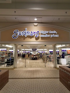
The mall entrance was closed off, no doubt due to the pandemic. Although I didn't get to see it in person, above you can find an image of the mall entrance that I found online. No changes from Peebles besides the new Gordmans logo and customer-voted tagline.
Back inside, here are some more shots of the home decor department, as well as the apparel across from it. I'm assuming apparel occupied the entirety of this space originally, during the Peebles days.
"All treasure, no hunt," proclaims this sign as we move closer to the back of the interior.
A series of shots from the center of the salesfloor now. We see phrases including "you really can buy happiness" and "great minds shop alike." The black carts that we're seeing most likely are still here from Peebles -- just with Gordmans stickers placed atop the Peebles logos.
Presentation-wise, I'd argue that the men's department shown above was probably the least presentable spot of the entire store... store layout matters, and here, we see that all we've got are a bunch of plain, standard rolling racks on top of the same floor tile that's in all of the store's actionways. There's no differentiation to set this space apart from all the rest, and therefore it just looks like it was plopped down in this spot with no regard for the intended layout, Kmart-style. Not a dealbreaker, of course, but still unfortunate... really takes things down a notch, in my book.
Another shot of the closed mall entrance (and adjacent register station), before we move into bedding and baskets in the back ("where frugal meets fierce").
Although we're seeing empty shelves in these particular pictures, the store was quite well-stocked overall. I attribute this to merchandise not being sold during the lockdown period -- and, of course, the store having only recently converted to a Gordmans in the first place, therefore stocking up on merchandise. (The converted store held its grand opening in September 2019, according to this post.)
Kitchenware and pet goods could be found along the back wall of the store, along with an additional selection of home decor items. As we see in the image below, furniture was back here as well, albeit strangely hidden from the actionway. (We also see another new phrase, "designer without the debt.")
"Home, home on the farm" is a play on song lyrics, although I had to admit that the reference was lost on me at first! Notice also the "#gordmans" custom signs on all the letterboards.
Based on the shelving in this area of the store -- both the freestanding units, as well as the built-ins along the perimeter wall itself -- I'm guessing that this is the area where Peebles had its home goods originally. This would make sense, too, with it being the back wall of the store -- same as we saw at the Goody's in Senatobia.
Another look at kitchenware, followed by the small selection of furniture. As with other off-pricers like TJMaxx, the kitchenware selection is joined by some food items. I typically find a lot of these brands unrecognizable, but I actually am familiar with that cranberry health mix...
The pet department lines up with the center actionway running from front to back within the store, which we're taking a quick detour down in these next several images.
Dead center in the store, handbags (on the right) meet up with men's apparel (on the left). The bottom pic gives us another look across the men's department over towards the closed-off mall entrance. I wonder if there used to be some sort of cosmetics counter here during the Peebles days that Gordmans removed. That would make sense given the proximity to the mall entrance, and that would also help explain the men's department floating out in the middle of the tile flooring (as I discussed earlier).
Walking through boys' clothing as we return to the rear wall of the store. The phrases on the wall here are all repeats of ones we've already seen elsewhere. It seems kind of strange to have boys' and menswear directly adjacent to handbags, but I guess Gordmans only had so many options with this store's layout...
At the back left corner of the store, some additional furniture (?) and what I believe to be an unsigned selection of toys brings us into children's apparel, specifically girls' clothing, since we already saw the boys' clothing on the opposite side of that dividing wall in front of us in the bottom pic above. That pic also gives us a really good close-up of one of the department signs, which are done up in the style shown in the graphic below (with an added ghosted "G" emblem in the lighter purple area).
Shoes for the entire family lie just beyond the back left corner. Based on the setup, it looks like shoes were probably in this same spot in the Peebles days, too.
In keeping with the traditional department store setup, Peebles had multiple sets of registers: as we've seen, one at each entry point, as a matter of fact. Gordmans kept them all, but I'm not certain why. Only the ones at the front were open, and I imagine that was the only set they ever intended to have open. Maybe it was too costly to remove them all? You'd gain some selling space, but I guess that was probably also a move that'd be better to save for later, after the concept has taken more time to prove itself. (In that case: just as well that they waited...!)
A quick look at the store's left-side entrance, facing out into the mall's side parking lot, followed by an overview shot back towards the back left corner, with shoes and girls' apparel visible once more.
This is the view that one would see upon entering the store through its left-hand entrance (which we just saw, but which was closed due to -- you guessed it -- the pandemic). Beauty, handbags, intimates, and... menswear. One of these things is not like the other, haha!
Although their purple color does not differentiate them from any of the other signage in the store, I'm pretty certain these shelf-topper signs were still here from the Christmas season. They read (left) "spreading good cheer starts right here!" and (right) "giving more? you're in the right store!"
A look at some womenswear in the front center of the store, followed by a couple views (across the handbags tables) towards boys' apparel in the back center, and menswear in the, well, center-center. It took me quite a while to get these pictures of the center of the store in the correct order! It's been a few years since I was in this place, so remembering the layout was a small challenge...
Unlike those other shelf-topper examples we just saw, these ones seem decidedly less holiday-themed. We've got (left) "today is a good day to look fabulous!" and (right) "ooh la la, cheap & chic!" Pretty interesting ladder-style fixtures they're placed atop, too.
Concluding our diversion through the middle of the salesfloor, we emerge back out into the left-hand actionway, overlooking women's apparel heading up towards the front left corner. Strangely, there are no hanging department signs over here.
The plastic shopping carts may have gotten new stickers, but this fabric stroller basket still bears the Peebles logo. Interestingly enough, the Dyersburg Mall used to have a Goody's in addition to Peebles! That space is right next door to this one, and closed with Goody's bankruptcy in 2009 (prior to the sale to Stage Stores); it is now a Burke's Outlet -- which, by the way, is these days doing business simply as "Bealls." Now that Stage Stores has gone out of business, Burke's Outlet owner Bealls Florida, which previously only had the rights to use that name in Florida, now has the rights nationwide; they initially bought all of Stage's IP, but once they got the one they wanted, they sold off the rest to BrandX, as mentioned earlier. Crazy stuff!
For its part, this Peebles space originally started out as Nashville-based department store Harveys, which sold to Peebles (also pre-Stage-ownership) in 1988. While I didn't get to explore the Dyersburg Mall interior on my visit, l_dawg2000 has an album of pics from 2013 on flickr here.
Another look back toward the girls' apparel area (again, signed simply as "children's"), followed by another look across the horizontal center actionway of the store (above which some of the only hanging liquidation signage can be found). The hanging circle element behind those liquidation banners reminds me of the same "cross-merchandised presentation" spaces of Gordmans 1.0 referenced earlier in the post (which I called "circle display areas" in my flickr album of the Southaven store, lol).
Making our way through the final department of the store, women's apparel, as we prepare to round the front left corner and wrap up our stour. It seems like, all told, there were six repeating phrases (big names, sticker shock, buy happiness, great minds, frugal/fierce, designer/debt) along the perimeter wall, in addition to the four individual phrases on the non-purple signs in the center-store area. Did I miss any?
Interestingly enough, there was one perimeter phrase (in addition to the repeating six) that was only seen once: "have great deals, will travel," visible waaaaay back at the front right corner of the store. Strange; I wonder why that one didn't repeat.
At the very beginning of the women's apparel department -- directly adjacent to the front entrance to the store -- we finally find its hanging department sign, labeled "juniors." We also see another changeable letterboard, reading "trends with benefits."
In contrast, the changeable letterboard seen here at the front entrance has a much sadder message: "everything must go!", with a happy "#gordmans" thrown in to add insult to injury :(
One last glance back over towards the start of the home decor department in the front right corner, followed by a farewell view of the interior as we exit, showing the store's intended presentation of a holiday-themed changing display table directly as one enters the store (at this time, themed for the upcoming Fourth of July holiday). We also see the final individual center-store phrase sign in the background: "spree without the splurge."
Exiting the store, we'll now take a moment to explore its exterior a bit more. Here on the storefront proper, you'll see that the "bigger deals, smaller prices" tagline was installed as one individual sign, which seems like the easier and cheaper method.
In contrast, at the front left corner and along the left-hand wall of the building, the tagline was spelled out with individual letters, which I imagine is much more costly! A closing sign was placed beneath the signage on the corner of the store, just like the front entrance.
The left-side wall of the store, on the other hand, doesn't have any closing signage, but then again, this entrance was also closed off due to the pandemic. Notice the sign on the sidewalk reading simply "USE FRONT DOOR."
A couple more shots of the left side of the building, before we take one final parting shot of the front right corner and main front facade. I'm not certain if Peebles made any modifications to this facade upon taking over the store from Harveys, but I'm inclined to say it's all original... although, given the way the front facade looks different from the left-hand side, perhaps they did modify this somewhat after all.
Here's our receipt from the store. Looks like we may have bought some candlesticks? I wish I could remember what those looked like, and if we still have them! I am looking for some candlesticks, lol. A lot of the furnishings in my apartment were purchased from various liquidation sales in 2020, including Gordmans and Pier 1 Imports. The descriptions on this receipt sound exactly like something I'd be interested in!
--------------------------------------------------
While this (sadly) is the last we'll be seeing of Gordmans, it's actually not the last we'll be seeing of the Dyersburg Mall. At the same time that its Gordmans store was closing, unfortunately for Dyersburg, the other mall anchor -- JCPenney -- had also declared bankruptcy and selected its Dyersburg store for closure. Losing both mall anchors at the same time, and on top of that during the pandemic, had to have been pretty awful for the town. Thankfully, since then, the mall has rebounded, with Ollie's taking over the JCPenney anchor space and Planet Fitness inhabiting the Gordmans (likely after a full gut of the interior, but still better to have the space occupied than sitting vacant!). The mall interior seems pretty healthy and majority occupied, too, at least per a quick glance at their website and leasing plan. Again, we'll see that JCPenney closing post at some point in the future, but for now, this will wrap up our look at the Dyersburg Mall Peebles-turned-Gordmans, and Gordmans' branding overall. I'm glad I got the chance to experience one of these converted stores before they went away, and hope you enjoyed following along with me both in my tour and in my research of the chain's unique attitude and identity. Until next time, then, and as always... thanks for reading, and have fun exploring the retail world wherever you are!
Retail Retell


