Saturday, August 14, 2021

Vintage, Remodeled Burger King, Cleveland, MS

In the famous words of Staind, "it's been awhile"! Way too long, in fact. I apologize for not getting a post up last month. I had every intention to do so, as well as to keep up with my weekly flickr uploads, while moving to my new apartment. But ultimately, I wound up only being able to stick to the latter part of that deal. In truth, I can't promise that I'll even be able to uphold my preferred one-blog-post-per-month standard going forward. However, I will definitely try my best!

To my surprise, I actually found myself in good company amongst fellow retail bloggers when it comes to moving to a new home during the month of July 2021, haha. (Neither of those linked posts explicitly say the authors moved, but the first one sure seems to imply it, and I could've sworn the second one did say it at one point...) Sadly, I am no longer based out of DeSoto County or the Memphis metro area, but I am still within the Mid-South and the great state of Mississippi. Feel free to keep an eye out for some content from my new surroundings eventually; but also don't feel like you'll never see anything from my old digs ever again, as I've got plenty of photos and blog post ideas stored away in my backlog! And specifically here on the blog, as always, I will also try to showcase lots of fun content from areas around the region separate from where I've lived... and indeed, such a place is where we will find ourselves for today's post.

--------------------------------------------------


Burger King, you might recall, made headlines this January, when they announced a complete rebrand to their logo and corporate imagery -- except instead of a totally new, off-the-wall look, the chain instead decided to look back to its history and adopt a vintage-inspired homage to its old identity. To much of the country, this came as a (presumably welcome) surprise; however, to some of us in the retail sphere, we were excited to see the public fruition of this development that had been several months in the making. 

For example, I had received in the mail in July 2020 the above coupon insert, featuring a curious new logo and typeface for Burger King. This was a full six months prior to the official confirmation of the rebrand, but I wasn't the only one to receive the ad and wonder if it was indicative of a larger move taking shape behind-the-scenes. Some further digging revealed that BK's online marketing had switched over to the same font, colors, and photography style shown in the ad, all pointing to a future rebrand, although the chain had stopped short of using the assumedly-new logo itself just yet. Finally, more evidence that I found revealed that Burger King had registered the new logo earlier in 2020, suggesting it would be more than just temporary.

All of that is fine and dandy, but the best confirmation is always spotting some physical evidence of the supposed change(s) out in the wild. Luckily, that is exactly what my new friend The Retrologist managed to do in September 2020, as shown on his Instagram page here. Of the pictured restaurant in Danvers, Massachusetts, he writes, "This remodeled location appears to be a concept store that plays off the chain’s heritage. The biggest clue is the massive sign outside featuring the old logo. ... An employee, who was too young to remember the old logo, said it’s the only such store taking this approach in the country. I reached out to @burgerking’s media department with my questions, and haven’t heard back. But I think it would be awesome if this marked the comeback of the old logo."

If only The Retrologist had known how right he was! Having researched the numerous signs pointing to a full, retro rebrand mentioned prior, I emailed him to share my hope that Burger King would soon go old-school, and also informed him about another remodeling BK location in Depew, NY, that I had learned about from my friends on Discord. Unfortunately, I did not realize that that restaurant was still under construction, and so when The Retrologist visited it, he was not allowed to go inside the dining room. Still, though, he could see the same signage inside as at Danvers, and later he visited yet another store -- again in Massachusetts -- donning the "new-old" look. Below are several photos showcasing the retro design, shared with permission from The Retrologist's Instagram account.

"Have it your way" neon-style sign, bringing back both the vintage slogan and the 1969 logo in this application. Courtesy The Retrologist on Instagram

An overview of the remodeled dining room at the Danvers, MA, Burger King. The above and below images were also taken at this location. Courtesy The Retrologist on Instagram

Some vintage BK images make up a photo collage wall. Keep this one on your mind, we'll revisit it later in the post... Courtesy The Retrologist on Instagram

Close-up of the new-logo Burger King road signage in Depew, NY. Courtesy The Retrologist on Instagram

Interior of the Whitinsville, MA, location. Those Whopper light fixtures really pop in this store! Courtesy The Retrologist on Instagram

"Home of the Whopper" backlit signage. Note also the updated table notices, which feature a redrawn version of the BK King character. Courtesy The Retrologist on Instagram

Exterior of the heavily-remodeled Whitinsville, MA, Burger King. Check out the "Have it your way" sign through the windows, and the old-logo trash can beneath the new-logo façade. Courtesy The Retrologist on Instagram  

In exchanged emails, both of us expressed fascination at this new path for Burger King, and hope that it was indeed to be the future overall direction of the brand. Even more obvious proof popped up in the months to follow, ranging from in-store pandemic-related signage to, most blatantly, a completely new-build location in Aruba, indicating that the new logo would also be rolling out internationally. I also managed to uncover some remodel guidelines for what Burger King called its "20/20 Prime Décor;" these show the same "Have It Your Way" neon sign seen in the locations The Retrologist visited, but evidently were drawn up before the decision was made to pivot to a new logo and brand identity entirely, as the now-former 1999 "swoosh" logo is still very much present throughout the rest of those guidelines. 

In any case, as we all know, Burger King came out in January 2021 and made it all official, and even though it is currently only optional for franchisees to make the switch, I sure hope we will continue to see many retro-style remodels going forward, restoring the Burger King brand to an honorable facsimile of its former self. I'm excited to eventually get to experience one of these stores myself; and if you know of any in the Mid-South or near where you live, please let me know in the comments!

New-build Burger King, Aruba, Jamaica. Courtesy Twitter

Burger King road sign with new logo, Depew, NY. Courtesy Twitter

Elmira, NY, Burger King remodel. This one looks to keep most of the existing architecture intact, compared to the above and below images, but still adopts the new branding. Courtesy The Retrologist

Architect's rendering of a new-build Burger King in Lacey Township, NJ. Courtesy Asbury Park Press

-------------------------------------------------------

Given the slow leak of its new identity throughout 2020, most notably the use of the style in official marketing materials, my impression is that Burger King was probably all set to roll out the new logo at some point in 2020, until the, uh, not-so-positive events of the year pushed them to delay the official rebranding. Whether that's true or not, the cool thing is that they are in good company with fellow fast food chain Pizza Hut, who beat BK to the punch by reviving their own classic logo and brand identity in June 2019. Pizza Hut's approach is very much rooted in that rose-tinted-glasses view of "the way things used to be," including restaurant remodels -- dubbed "Pizza Hut Classic" -- that take some of the remaining dine-in hut-roof buildings and remodel them into an extremely faithful recreation of days gone by. (The Retrologist has photos of that, too, on his Instagram page, in case you were wondering. Truly, he captures a lot of interesting vintage finds, so be sure to check out his full feed if you haven't already!)

In contrast, Burger King is taking much less of a "to-a-T" approach. For instance, whereas Pizza Hut's logo and Classic remodels are either exactly identical to the old things or as exact as is possible for present-day, Burger King's restaurant remodels are much more in the vein of "vintage-inspired" than "truly vintage;" and their logo, too, is not 100 percent identical to any from their past. As The Retrologist explained it to me, "This retro Burger King logo appears to be a blend of the 1969 and 1994 logos, with the lettering of the 1969 logo, and the 'hamburger buns' of the 1994" -- see the excerpt of their logo evolution that I've attached below, and also consider subscribing to read the full review of this rebrand (and many others!) from a very great site I follow, Brand New.

"One of these things is not like the others..." Courtesy Brand New

I considered publishing this post prior to the rebrand becoming official, but I also thought it would be fun to kind of do a "hey, I saw this coming!" post on the back end (like you're reading now), not to mention that I also didn't want to be too premature about it and have it turn out that the retro look wasn't going to be rolled out chainwide after all. Thankfully, that last worry turned out to be a nonstarter, but I still decided to hold off on writing the post until after the rebrand was confirmed. Now that we're eight months into it, the window of relevance may well have almost run out, but in my defense I've had a very busy year so far! There's also the small matter that the Burger King we'll be exploring in today's post isn't actually a retro remodel featuring the 2021 logo and identity I've been focusing on exclusively for the duration of this post so far... but, still, it's very much got its own retro flair to it, and is very much worth exploring. Let's take a look.

--------------------------------------------------

Courtesy flickr

In the days of yore, the iconic blue-roof Burger King restaurants didn't used to have drop ceilings inside their dining rooms covering up those rooves. Instead, the ceilings were completely open, and adorned with (perhaps structural; perhaps decorative) wooden trusses that matched the interior aesthetic the chain was going for at the time. Over the years, those trusses would be foregone and covered up at most Burger Kings; but a few locations managed to keep them intact long past their otherwise-assumed expiration date, including our location of focus today, the Burger King in Cleveland, MS. Pictured below are some images of the Cleveland store while it still had its trusses intact, and with its original blue-roof-era exterior design. Compare to the close-up truss photo shown above.

Courtesy Google Maps

Courtesy Google Maps

Courtesy Google Maps

Love this overview shot! All of these images of the Cleveland BK were taken in 2017. Courtesy Google Maps

This location had a gray roof instead of a blue roof; but still, otherwise it fit the usual mold from that era. Courtesy TripAdvisor

Unfortunately, the Cleveland Burger King had its exterior remodeled in 2018, and its interior followed shortly thereafter; however, unlike a lot of Burger King interior remodels, Cleveland lucked out and got to keep its existing open ceiling. In fact, the décor we will be seeing in this restaurant looks a lot like that Prime 20/20 package I linked y'all to earlier in the post, so there will be even more exciting things to see than just the ceiling aspect. That said, I suspect the ceiling will indeed be the most intriguing feature... mostly because of what happened to those old wooden trusses, as you'll soon see.

Courtesy Google Maps

We'll begin with the exterior. The photo above is from the internet; the photos below are my own. Nothing super notable... it's your standard "Home of the Whopper" fare of recent years. I don't visit Burger King very often, but I think I'm in the loop enough to say that this design is fairly common these days (although of course, please feel free to correct me if I'm wrong). 


Despite how cool the interior we're about to see is, I can't let this post go without saying that we had absolutely terrible service at this location. We were the only customers inside the dining room, and there were plenty of employees visible in the building. Not all of them were busy preparing meals; the drive-thru wasn't very busy either. Nonetheless, we waited at least five minutes -- that's not an exaggeration -- for a single employee to come to the counter to take our order. If I wasn't there to take these pictures, we would have left long before then. It seemed very clear that we were deliberately being ignored. Not a good way to run a business.


That unfortunate aside, well, aside, it's time to get our first taste of this very cool interior design! Walking in the main entrance on the side of the building (there's also a door up front, it should be noted), we are immediately greeted by a photo collage wall made up of various framed, vintage Burger King images. If that sounds familiar, that's because The Retrologist saw something similar at one of the newer BK remodels he visited: refer back to that earlier portion of this post; it looks like his picture captured several of the same images seen here in Cleveland, too, although that newer remodel has some of the images colorized! Very cool to see this feature carrying forward, and I wonder if it wasn't also part of the inspiration for the chain to go full-on retro, even.


Leaving the vestibule, here are some looks at the main order counter. Rather sleek-looking, but not so totally modern that it feels almost lifeless, like we see in some other modern fast food remodels (*cough*McDonald's*cough*). Still, the interior definitely has a darker vibe... kind of coffeehouse-feeling, maybe? That's about the best word I can come up with to describe it. That will also hopefully make more sense once you see the rest of the interior photos.


Without further ado, here are our first glimpses into the dining room proper. Notice that, while the clouds outside the store certainly don't help things, the dark atmosphere seems to come primarily from the ceiling: as I said, instead of a drop ceiling, this store kept its open ceiling. That also resulted in the absence of overly-bright, standard light fixtures, in favor of lots more recessed and mood lighting. The whole ambience feels really nice and rather upscale for a Burger King, in my opinion.


Another view of the dining room as a whole, followed by some views from where I was seated -- the tall-height table with a series of cool-looking lanterns above it, and the 1999 "swoosh" logo engraved into the table. We can see from these photos so far that, in the absence of a drop ceiling, the restaurant received a neat, open, geometric-pattern hanging wood fixture that spans the entire dining room... but what we haven't seen yet is what lies above that fixture. So let's face upward and take a closer look...


Yes indeed -- the old, original wooden trusses still remain in this store, simply buried away behind the new geometric faux ceiling! Very, very cool. As soon as I was able to determine that (not-so-obvious) fact from carefully examining user photos on Google Maps, I was eager to visit this restaurant and see this surviving, if altered, vintage trait for myself. This Burger King is on the route to see family, so I've passed by it many times, and even stopped in once before when I was much younger -- I believe the soda machine was out on that visit? (shows you they had issues with service even back then, lol) -- but had not done so anytime in the most recent decade, meaning this vintage gem was hiding -- as most of them seem to do -- right under my nose this whole time. Go figure...


Here's a closer look at what exactly happened to the trusses, as viewed through the gap in the geometric ceiling from where I was seated. (Yes, even though we had the whole dining room to ourselves, I very strategically chose where to sit for this purpose!) If you look closely, it appears that the overall roof was covered in some of that black/very dark gray sprayfoam insulation material, with the actual trusses either getting a similar treatment, or being painted to match. So yes, they're hidden, but they're not gone -- and that's absolutely what matters.


Some last views of the dining room, before we head back outside the restaurant. While the surviving trusses are most definitely what I came to see the place for, don't be mistaken: I absolutely think the rest of this interior décor is very much worth the visit as well; I was very impressed with the design. I really like all of it, to be honest -- from the floor tiles, to the tables and chairs, to the geometric ceiling and light fixtures (those lamps in the top image above are particularly neat), to the similarly-geometric and multi-textured (wood! brick! stone!) Burger King logo feature on the wall at the front of the building, shown above -- as well as, especially, how nicely it all goes together in creating an enjoyable, cohesive environment. After hearing my impressions of the place, I'm really curious to learn what y'all think about it; so please, feel free to leave a comment below!


One last exterior shot, a wide view from the road, to conclude our coverage of the Cleveland, MS, Burger King. If you have thoughts to share on Burger King's recent rebrand, feel free to leave those in the comments as well; or, as always, you can also email me (though I won't put the blog's email address in posts for a while -- in the past few days I've received over 60 spam emails, so clearly someone nefarious has gotten a hold of it!).

Next month, unless I get sidetracked and am unable to publish a post, our ongoing Fred's series is scheduled to continue, ideally featuring the store that I had already intended to show y'all in March until circumstances prevented me from writing a post then, too. (Fingers crossed that doesn't happen again, haha!) I also have some other cool stuff in the works for the rest of the year, so again, hopefully I'll see you guys once a month every month from here on out, like normal. Until that time, then, and as always... thanks for reading, and have fun exploring the retail world wherever you are!

Retail Retell

Thursday, June 17, 2021

Fred's Closing, Church Road, Southaven, MS (BONUS: Fred's Smallmart)

Today's post highlights DeSoto County, MS, retail.

After our brief excursion to Florida for our Fred's post in March, courtesy of our good friend and guest author Albertsons Florida Blog, this month we find ourselves squarely back in Mid-South territory, preparing to explore a modern Fred's location. 

Given that Fred's traces its roots back to Coldwater and had a very long, storied history in this area of North Mississippi, most of the Fred's stores in the region were housed in older buildings. There were comparatively few modern new-build Fred's stores around here, and in fact I only visited a single one before the Fred's chain collapsed, which is the store that we will be touring today. (Since that time, however, I have been to two additional modern Fred's stores that have been repurposed for other retailers... go figure.)

That said, before we get to today's featured store, as always some history on how the modern Fred's format came to be would be welcome background information. So, to accomplish that, we need to roll the clock all the way back to 2009.

--------------------------------------------------

Not very far from Fred's headquarters along New Getwell Road in Memphis, the company in 2009 debuted a brand-new prototype store at 7657 US Highway 70 in Bartlett, TN. Opened in October, the store boasted numerous improvements based on the results of extensive customer research. "People come to us for things they've run out of during the week," a Fred's executive is quoted as saying at the time. "Now we've given them the tools to make that a bit easier."

"Those tools," according to the Commercial Appeal, "include wider aisles, lower shelves, in-store signs that are easier to see, and related products that are closer to each other. But the biggest changes are to the store's pharmacy, food section, and clothing department.

"The pharmacy, typically assigned to the back of Fred's stores, has been brought to the front in the prototype store. The pharmacy counter has been lowered and the glass wall around it has been removed." In a separate article, that same Fred's exec said the company had "discovered that 50 percent of shoppers didn't even know we had pharmacies in some of the stores. We had to change that."

The food selection was nearly doubled, and apparel items were placed, folded, on tables: "We stole a page from the [warehouse membership] clubs, and right away people think, 'the clothes have got to be a great deal.'" Floors were switched from tile to polished concrete, and the old dual access setup with one entry door and one exit door to either side of the registers was consolidated with a single automatic door in the center of the building.

But perhaps most relevant of all of these changes is the new identity that Fred's adopted. Alongside the new store in Bartlett came an entirely new in-store décor package, logo, and name for the discount store chain. Designed by Toronto-based Watt International, the sign on the outside of the building introduced the prototype as "Fred's Smallmart."

I don't have a photo of the Bartlett Fred's Smallmart while it was in operation, but here's one of it post-closure. Later on in life, in 2018, it was actually (if briefly) turned into yet another prototype store: Fred's Closeout Bonanza, which you can read more about within this post. Courtesy LoopNet

Very tiny screengrab of the picture included with the October 8, 2009, Commercial Appeal article that I've been referencing. The caption reads, "Audra Arnold helps set up the new Fred's Smallmart at 7657 U.S. 70 in Bartlett. Smallmart is a new concept for the Memphis-based company." Courtesy PressReader

It is at this point that I need to thank my fellow flickr contact styertowne for alerting me to the topic of Fred's Smallmart. Despite all the hubbub surrounding the debut of the prototype format, it's probably clear from the public's collective lack of knowledge about Smallmart that the name, at least, if not the overall concept, did not make it past the prototype stages. More on that in a moment, but suffice to say, the Smallmart name did not catch on.

However, that's not to say it was a bad name. To the contrary, consider this: styertowne is a resident of the northeast. Consequently, news about Fred's was very likely low to nonexistent in quantity up that way. There were also very few articles published about Smallmart to begin with; I had to dig quite a bit to find them. Yet despite all of that, not only did styertowne see an article about Smallmart back when it was introduced, he thought the name so intriguing that it still stuck with him over a decade later. That's a surefire sign of great branding!

Memphis marketing consultant John Malmo, in a 2010 piece, expressed a similar opinion:

I'm fascinated at the recent metamorphosis of local retailer Fred's. Changed their logo, colors, and exteriors. I don't know if that is dumb or smart. What bothers me is that there is still no way to know what is Fred's business. The sign only says "Fred's." Shoe store? Deli? Barbershop?

Then I read that Fred's calls its newest store "Fred's Smallmart." I don't know if Smallmart is on the sign or not. But I do know that "Fred's Smallmart" is too much. And Fred's is yesterday. Whereas, Smallmart is absolute genius. A brilliant identity for Fred's retail concept.

Fred's ought to get Smallmart up next to all the Fred's signs right away, if not sooner. Then, next year, lose the "Fred's." Smallmart is an absolute killer identity for Fred's sound retail concept. Smallmart needs not to be a description of Fred's brand; it needs to BE the brand. You not only know what is a Smallmart; you know, too, why to go there. Brilliant.

Very valid points, and at least in dropping the Smallmart name Fred's would go on to adopt another moniker to clue customers in as to what their business entails. Again, more on the decision to swap the names coming up, but for now, let's continue with our story of the Bartlett Fred's prototype:

Whereas the Bartlett building was 18,000 square feet, the Memphis Business Journal reported that Fred's was gearing up to open another prototype Smallmart, this one at only 12,000 square feet, in Tupelo, MS, one month later, in November 2009. Then, the chain -- which was planning to open an additional 25-30 locations within the next year -- would decide which format to open those new stores under, based on the performance of the two different prototypes. In other words, while the Bartlett location was more or less a traditionally-sized Fred's store, the Tupelo building would truly live up to the Smallmart name.

The Northeast Mississippi Daily Journal, thanks to dedicated business reporter Dennis Seid, has additional details on the expansion of the Fred's Smallmart prototype to that area. Not only would a new Smallmart be constructed -- by then, the fourth for the company -- but Fred's also said it was committed to remodeling all of its other existing Tupelo and Saltillo locations to the new format as well. "For Fred's to use Tupelo as a test site of sorts says a lot about the company's confidence in this market," Seid wrote. "Its stores have apparently done well enough that it thinks it can gauge consumer tastes here."

The difference in size compared to the Bartlett prototype meant that the Tupelo Smallmart would lose the apparel and furniture departments typically found at Fred's stores. It would, however, "sell helium balloons, a new item for the company," and "have an expanded food section, an expanded household cleaning section, and a drive-thru for the pharmacy" -- which was again to be moved to the front of the store -- as well as "the usual assortment [of] health and beauty aids, housewares, toys, office supplies," and the like.

But the square footage and merchandise selection weren't the only differences between Tupelo and Bartlett. The Bartlett store, as you saw in the image shown earlier, more or less bore the same architectural design as new-build Fred's stores had for many years before: the low-profile, rectangular roofline rising above the long, wide, bulky awning. We haven't toured any stores of that style on the blog (again, the locations around here were generally even older than that!), but an example image of one can be seen at this link. That would all change with the Tupelo store.

Tupelo, MS, Fred's Smallmart. Courtesy msmudcat2001 on flickr

Images taken February 3, 2010. Courtesy msmudcat2001 on flickr

As you can see above (in some of the only images ever known to exist of a Fred's Smallmart), the Tupelo store brought with it an entirely new architectural design for Fred's, featuring a taller, boxier building; a sleek, flat awning with exposed trusses; prominent blue and green colors, called to attention even more by the comparatively neutral gray to either side; and finally, a new centralized façade shape, designed not only to adhere to, but to showcase, the chain's new, all-lowercase logo. The clipping below, in black and white, captures the ribbon cutting at the Tupelo Fred's Smallmart, located at 1317 E Main St.

Courtesy Northeast Mississippi Business Journal, December 2009 edition.

--------------------------------------------------

By March of 2010, Fred's seems to have definitively settled on a new format to expand to all of their new-build stores chainwide, marrying the larger square footage of the Bartlett prototype with the blue, green, and gray exterior design of the Tupelo location. They added a few windows to the architecture, too, to break up the boxiness, as can be seen when you compare the prototype exterior photo with the finalized design render below.

Fred's Smallmart location. This doesn't match the Tupelo or Bartlett photos above, so this one must actually be one of the ones located somewhere else -- unfortunately, I'm not sure where! Note also the absence of the flat green awning above the entryway at this store. This image can easily be found on the internet, but you'd have to look very closely to be able to tell that it's a Smallmart! Courtesy Randall Commercial Group

The awning returns in this rendering of the later Fred's Super Dollar store format, and the exterior pharmacy sign is now placed alongside the blue paint square and drive-thru window, which makes more sense anyway. Note also the two thin strips of windows added to either side of the centralized entrance, as mentioned above. Courtesy Randall Commercial Group

Also worth noting in that rendering is the adoption of a new name on the logo: no longer Fred's Smallmart, the chain decided to pivot to Fred's Super Dollar. Explains Dennis Seid:

A couple of weeks ago, I wrote that Fred's was launching its "smallmart" concept system-wide, with Tupelo being the first market to turn all of its stores to the new format.

Well, actually, that name was changed mid-stream. The company opted to go with "Fred's Super Dollar" instead, according to Dave Mueller, senior vice president of marketing and strategic initiatives for the Memphis-based retailer.

"Customers saw us as a mini you-know-who," he said, referring to the world's largest retailer. "So we settled on the 'Super Dollar' name. In fact, we used to be called Fred's Super Dollar." [And indeed they did -- see the image below!]

Fred's store in Cordele, GA, modeling the old Super Dollar logo before it was brought back into style. Courtesy Cordele Dispatch

As an aside -- along with the name change, Fred's also dug back into its history to revive its human mascot, "Fred," played this time around by character actor Bob Penny. "Mueller said that bringing back a familiar face was an ode to the past as well, together with resurrecting the 'Super Dollar' name. In other words," wrote Seid, "the company went back to the future."

Fred standee, circa early revived Super Dollar era. The company would go on to drop the Fred character from their advertisements once more, a few years down the road. Courtesy flickr

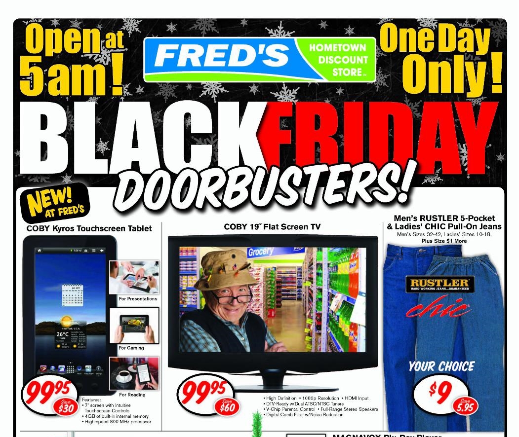
The Fred character can also be seen in this Black Friday 2011 ad, wearing his more traditional fishing bucket hat garb. Note also that the old Fred's logo was still being used in this ad, for some reason. Courtesy flickr 

"Fred" actor Bob Penny, who has also been in Forrest Gump, Mississippi Burning, and My Cousin Vinny, among others. Courtesy Wall of Celebrities

Plans indicated that "the new Fred's Super Dollar format will be rolled out in about a third of the company's nearly 700 stores. This year [2010], 20-25 new stores will be built with the new format, another 15-20 stores will be extensively remodeled, and another 200 will get minor refreshments that will change signs and rework the interior." Pretty much all of the stores that we've seen so far on the blog fell into that latter category, either in 2010 or any years of the decade that followed; the headquarters store on Getwell Road in Memphis was one of the first in line, and received a more extensive remodel, too, replicating the entire new-style blue and green façade (as we have seen). Delta Blues artist Super Chikan performed his song "Fred's Dollar Store" at the ribbon-cutting ceremony celebrating the reopening of the Getwell store on March 26, 2010.


--------------------------------------------------

The first generation of these new, modern Fred's stores brought along with them a new décor package, one which we've seen at many of the locations we've toured, hailing "Super Discount" products to tie in with the "Super Dollar" name, and also featuring not only quotes from "Fred" on the endcaps but happy phrases on the walls as well because, as Mueller put it, "we want to see our customers smile."

Generation 1 modern Fred's store, with the gray exterior walls. The store pictured is located in Foley, AL. Courtesy Highland Group

Fred's "Super Discount" interior décor; note the "Save. Smile. Smart!" phrase on the wall to the left. Courtesy Drug Store News

But that quote is a little hokey, as Seid opined, and the buildings were a little too boxy as well. The response, to be sure, wasn't always great: residents of Pascagoula, MS, in 2011 used words like "gray elephant" and "monster" to describe the new-style Fred's being built there, according to GulfLive. "In particular, they had an issue with the Memphis chain's desire to place a sign near the roadway. ... Spencer Bailey, whose family has had a home on Belair [near the new Fred's lot] for years, said that 'only people who are dead and/or blind' wouldn't be able to tell the building was a Fred's without the additional freestanding sign," bringing up the argument that, "Sure, the sign might be pleasing to the eye when it's built, but if and when the business goes away, it eventually tears up. We're not expecting Fred's to go out of business, but you never know. No one would have thought Kmart would have closed down." (Add Fred's to the list of retailers that Kmart has somehow outlived, by the way.)

Pascagoula, MS, Fred's, seen under construction in 2011. Courtesy GulfLive 

Pascagoula Fred's post-closure. Bailey was right: that sign is tearing up now that Fred's has gone away. Quite the eyesore; thankfully, the building has since been retenanted by DG Market. You can see its interior prior to the DG Market conversion in this video. Courtesy LoopNet

Fred's heard Pascagoula residents, and ultimately refrained from adding an additional roadside sign at that location. What's more, they also must have heard many more complaints about their design, for in 2012 or so, they introduced a new, updated architectural format: out were the ugly gray walls; in was a new, pleasing brick façade, with more, bigger windows added for visual interest. 

I'm not sure where exactly this new prototype debuted, but it managed to get at least a few locations in the Memphis market, including one on Lamar Avenue in December 2013, and two stores in Southaven, MS, including the one we'll be touring today, located at 710 Church Road West (opened April 20, 2012). Along with the refreshed exterior came another new interior design, the same one we saw at the Getwell Road store (linked earlier), emphasizing how "Fred's is known not only for convenience and product variety -- including items such as cleaning and pet supplies, grocery items, and home décor accessories, among others -- but also for low prices."

Generation 2 modern Fred's store, with the brick exterior walls. The store pictured is located at 1290 Lamar in Memphis. Courtesy The Daily Memphian

Fred's "Low Prices!" interior décor, the company's final décor package. Courtesy Memphis Business Journal

A good summary of the changes Fred's undertook beginning in 2009 and progressing through 2013 or so can be found here. In short, the company drastically reimagined itself, adjusting its salesfloor layout, perfecting merchandise selections, becoming "the first in the discount store segment to introduce a loyalty card," debuting fresh, modern interior and exterior designs, and implementing a brand-new name, logo, and visual identity as Fred's Super Dollar. Fred's would go on to keep the same brick exterior design and "low prices" interior décor all the way until the end of its existence as a company. And all of this started with the little prototype that could, Fred's Smallmart.

--------------------------------------------------


Turning our attention now to the store tour portion of this post. As mentioned earlier, our Fred's of focus today is (was) located at 710 Church Road West in Southaven, MS, which opened on April 20, 2012. This location actually had a twin store elsewhere in Southaven, which opened fifteen months later in July 2013; both were targeted for closure in the fourth major 2019 closing round for the chain (fifth, if you count the franchise stores). Since the two stores were virtually identical, I chose to visit only one of them, with the Church Road location winning out because it was generally less busy than the other one.


While those first two images were taken during normal operations way back in December 2015, with the above photo we're jumping forward to August 19, 2019, the date of my liquidation visit. A pretty nice overview of the exterior is given in this photo, where you can see this Fred's was definitely a second-generation modern store design, with the classy brick façade. Note also that the Fred's logo consisted of individual letters affixed to the storefront here, as opposed to a more simple rectangular sign like most other stores got (including the Lamar Avenue store shown earlier).


Pulling into the parking lot, we see that the monument sign out by the road has been taped over, so as to hide the no-longer-in-operation "Pharmacy" tagline. It looks a little awkward here, though, because the ampersand beside it was left visible, effectively leaving the sign to read "Fred's & Super Dollar." Thankfully, the storefront itself fared a little better in that regard -- not that it ever said "Pharmacy" above the entrance anyhow. (That sign would instead have been located off to the right of the façade; we'll see that area later in this post.)


As we head inside, we see that my visit took place as the store was entering its final eight days of operation; the photos in this tour will reflect that fact, too, what with little merchandise remaining and much of the salesfloor being closed off to public access. Even so close to the end, however, the liquidation signs hanging from the ceiling indicate that some items still did not exceed a 20 percent discount -- certainly atypical for this sort of event.


If you looked closely at the exterior images of this store, you should have noticed the presence of floor-to-ceiling windows, much larger than the two small, high-up banks of windows found on the first-gen modern Fred's builds. However, now that we're inside, we can see that the net effect to the interior was unchanged: the extra panels were simply for exterior decoration; inside the store, those windows were blacked out and covered over by shelving, so as to allow for better utilization of the selling space. Only because of the liquidation had those shelves been removed, exposing the hidden windows behind them.


As was common for the modern Fred's prototypes, the pharmacy counter was located in the front right corner of this store, immediately inside the entrance. And like a handful of other locations I visited, the former pharmacy counter at this store had been converted into a sales space for mattresses and appliances, following the pharmacy's closure several months before the store itself was to follow. I previously discussed that move back in the Getwell Road post (linked earlier); it definitely felt odd to see a Fred's store selling those things. 

At this point in this store's liquidation, though, those items had already sold, and the pharmacy space was once again closed off -- as were all of the former health and beauty aisles out in front of it, which we're peering over from this point of view. Note the taped-over remains of the "Pharmacy" sign on the blue wall.


Here's a better shot of the (for lack of a better word) junk that was blocking off the former pharmacy area from access. This Fred's felt mighty cluttered in places, at least compared to several of the other Fred's stores I visited during their liquidation sales.


Some glances across to the rest of the salesfloor stretching off toward the left side wall of the building, with an emphasis on the half-double-wide center aisle, which looks to have been designed as the focal point of the interior. There would once have been two rows of aisles in this store, one along the back wall and this other one closer to the front; but the back aisles had all been closed off and dismantled before my visit, with the remaining merchandise consolidated into these front aisles. 

I almost bought that Grumpy Cat Christmas T-shirt you can see on that hanging apparel rack in the top image above, but ultimately decided against it :P


A brief look down what once was the greeting cards aisle, which would have been the rightmost aisle of this center bunch, followed by a glance from the focal aisles I mentioned back over toward the pharmacy wall. The pathway beside those greeting card shelves would have been the main access point to the back of the store, but again, that was all roped off at this point in the sale. 

It's also pretty surprising to see the greeting cards department entirely empty -- I can guarantee you that the vendor had come and picked those up; no way the department actually sold out in full! Greeting cards always seem to be tough sells, even during liquidations...


Heading down one of those aisles, we find a very varied merchandise selection -- with office supplies on one side, and pet supplies on the other -- followed by a couple of views out toward either side of the rear wall of the building, where you can see what I was talking about concerning it being cleaned out and roped off. I wish I could have explored that area further, but it is what it is, I guess.

The 75 percent off sign in that bottom corner of the last pic above always stands out to me whenever I look at that photo. Whoever wrote the merchandise categories on the signs (e.g. "APPAREL") definitely spent a lot of time perfecting their handwriting for the task!


Another look toward the back wall, this time from the neighboring aisle, joined by a reverse view up toward the front wall and the checkouts. As I've mentioned, all of the other Fred's stores I visited were not modern-build locations, but I felt I would be remiss if I didn't also visit one of those. You can see in these images how different the new-build stores felt, with their open ceilings and concrete floors. Older stores that were retrofitted to this newer layout and interior design tried to emulate the feel, but could only go so far in achieving that... including the Getwell Road store, which even as the flagship Fred's location still kept its drop ceiling and tile floor.


Some more glances down the front actionway here, the first back over toward the pharmacy, and the second facing the opposite direction, where we will arrive eventually at the food coolers. The signage in this store is the "LOW PRICES!" variety, which, like the exterior, indicates a second-generation modern store build. 

Note also the pole sticking up out of the shelving in the bottom picture, telling customers to "enter here for checkout." Queue-style checkout lanes were another feature implemented only in modern Fred's new-builds and remodels, as older stores had individual checklanes instead.


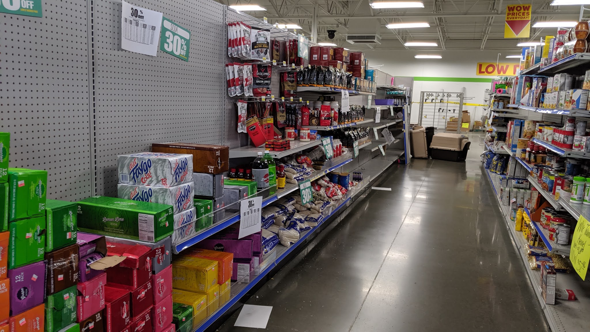
Not far from those coolers we spotted along the left-side wall (which we will see again momentarily), the leftmost of the remaining aisles in the store had been set aside for what was left of the food department -- whether this aisle always housed food, or was simply commandeered for that purpose during the liquidation, I'm not sure. All cold and frozen groceries had been sold out, leaving only these dry goods behind. 

The middle image focuses on some Fred's-brand cereal comparisons, while the top image shows a boatload of unsold Fred's-brand soda, more of which can also be seen one paragraph back. The back of the aisle, in comparison, looked more empty, as can be seen in the final pic above.


As I mentioned, the cold food items must have sold completely out at this store, as the refrigerator and freezer cases you see here beneath the "FOOD" department sign had been decommissioned and, like the entire left-hand side of the store, blocked from access. Something interesting here is that I don't think the food department always occupied this portion of the salesfloor from the beginning; rather, the faux-wood flooring suggests to me that this was originally the apparel department, and only switched over to food when the coolers were installed, as those would have necessitated a location against a perimeter wall. If anyone else has further information on this, please feel free to share it with me in the comments. 

The other two pictures above show the rest of the left-hand wall, devoid of merchandise and shelving. It looks like the pet and household departments would both have occupied space in the back left corner of the store.


Entering the checkout queue, the top photo here takes one last glance out to the left-side wall: note the large selection of beer, cooking utensils, and hair care, items which naturally go perfectly with one another :P  The bottom pic, meanwhile, focuses on an interesting item I saw in the checkouts: heard of 5-Hour Energy? Well now, try new 6-Hour Sleep!


Only one register was open, and for all intents and purposes the employee working it appeared to be the only employee in the entire store, although it's possible there could have been more in the back. But this close to closure, it's also just as possible that the store was down to a skeleton crew. Either way, I couldn't get very many photos of the front end, but at least I was able to get this close-up of one of the register counters, featuring a message from the chain's mascot, "Fred," asking customers to complete an online survey in order to tell the company whether their visit was "a beautiful 'swan' or an ugly duckling" -- presumably in keeping with his fisherman persona. To the left of that, take note of the payment method sticker featuring the old Fred's logo, which had been several years outdated by the time this store opened! 

Besides the cell phones and fidget spinners you see, tobacco was another item available for sale behind the checkouts; the manager's office was located in that space, too. The second picture shows a more drawn-out view of the entire front actionway, with the registers on the left and the salesfloor aisles on the right.


One last interior shot before we head back outside. I like the design of the cart storage area here; it's nice, neat, and tucked away, efficiently maximizing space. However, it would seem that the area was designed without the security sensors in mind... that row of carts on the left looks all but impossible to pull a cart out from, due to the awkward angle created by the security sensor! Oops...

I should also note that all the carts here were for sale as part of the fixture liquidation (you can see the stickers on their handles), and unlike all of the other Fred's I visited, the entire fleet not only matched but was fairly new and in good condition, which was pleasant to see. Fred's was assuredly not a chain for consistent shopping cart quality, in my experience.


Some more exterior views of the store, featuring shots of both the central and right-hand portions of the façade, as well as a panorama-style shot that my Google Photos app fashioned for me out of those two. Notice that one of those window panes to the left of the entrance was boarded up -- yikes -- and that there's a secondary, standalone Fred's logo just awkwardly sitting off to the right; that's where the exterior pharmacy sign would have been, before the word "Pharmacy" was removed leaving just the "Fred's" portion behind.


One more glance at the monument sign out by the road -- even its base is brick, just like the store itself! -- followed by what I think turned out to be a very nice wide shot of the store, as viewed from the street. Note the "STORE CLOSING" banner on the far left, near the ground. 

Like I said, there is one other Southaven store that was identical to this one, which we won't be seeing as a Fred's but will be seeing in the future nonetheless... stay tuned for that!


Besides the panorama I showed you earlier, Google Photos also did something it's never done before or since, and put together this gif, comprised of a series of photos I took while driving past the storefront. It's an interesting concept for sure, but I for one get a little dizzy if I look at it too long, haha! I wish there was a way to pause the sucker... in lieu of that, though, feel free to just scroll past it, lol :P


Our final photo of the Church Road Fred's here showcases how the property it sits on matches the beauty of the building itself. This lot always felt like a bit of an odd location for a store to me, as the Fred's building is very much secluded, off by itself in a fairly heavily wooded lot (for a retail store); development along Church Road hasn't quite extended to this portion of the roadway yet, although logic would dictate it will eventually meet up here, extending from Tanger Outlets to the east and Highway 51 to the west. In the meantime, though, a consequence of the location and lot meant that -- while very nicely landscaped and detailed (check out that fancy streetlight!) -- this Fred's felt alone and never busy; honestly, I'm surprised that it lasted until the penultimate closure round, as opposed to closing earlier in 2019. Its twin store was always at least twice as busy as this one. That, coupled with its location, probably speaks to why that one has been backfilled already, whereas thus far this Church Road Fred's still has not found a buyer, remaining on the market just shy of two years past its closure (a leasing photo can be seen below).

Former Church Road Fred's, vacant and for lease. Notice that the boarded-up window has been fixed! Courtesy LoopNet


Last but not least, as always, here are two quick shots of my receipt and the liquidation flyer I picked up. At least, I'm fairly certain that flyer came from this store; I picked up so many of them that it's definitely possible I got some of them mixed up, haha! The receipt for sure came from this store, though -- those are conveniently labeled :P

--------------------------------------------------

That will wrap up this month's Fred's post, my first back on the job since last December, believe it or not. My thanks once again to Albertsons Florida Blog for holding down the fort in my absence, and I hope y'all will stick around for yet another Fred's post this September, where we'll rewind the clock just slightly, to a store that closed in the second liquidation round announced in 2019. After that, we'll have one more from the same round as this Church Road store; and then it's off to the very final round, when all the Fred's stores shut down for good as the company entered bankruptcy and decided to dissolve its business. Plus, there's lots more in the way of other, non-Fred's retail content set to come to the blog this year as well; so, I hope you're looking forward to that, and until then, thanks for reading and have fun exploring the retail world wherever you are!

Retail Retell