Cleveland, MS - home to Delta State University - is located in Bolivar County. Bolivar County happens to be just outside of the MSRB coverage area, so technically this post can be considered a continuation of
the Retail Road Trip theme from the last update! This also coincides with the upcoming finale of a two-week series of the same name I've been carrying out on
my flickr photostream, similarly with photos of stores located in the Mississippi Delta. Today's post begins by taking a look at some retail sights from the area I accidentally left off from my last post before detouring to the Cleveland Walmart a little further down the page.
 |
| McDonald's, Greenville, MS. This newer, "eyebrowed" location is along Highway 1 on an outparcel of the Greenville Mall. |
 |
| An older mansard-roof McDonald's still stands in Greenville along Highway 82. |
 |
| A closer look at the front of G'ville's original McD's |
 |
| Connie's Kitchen is a local joint in Leland, MS - and it's darn good, too! |
 |
| Walgreens in Cleveland, MS |
 |
| An untouched Burger King in Cleveland. |
 |
| Another shot of the BK. I spy an old Payless in the background too! |
 |
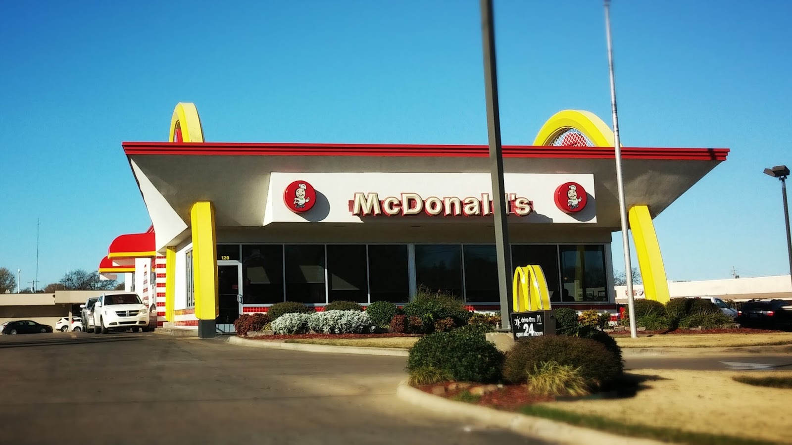
| Cleveland's McDonald's is likely old, but not as old as it looks! |
 |
| McDonald's used this classic style for a time. It's very retro-cool. |
 |
| A final, edited look at the Cleveland McD's |
In addition to un-remodeled fast food joints and DSU, Cleveland is home to the largest Walmart store in the entire state of Mississippi!! I've been unable to find exact square footage, but I'm pretty sure it's over 200,000 square feet. I've also heard that it's among the largest WM stores in the country (!)... but for all that extra space, there's not much special about this Walmart. In fact, its most recent remodel was anything but thorough. Take a look for yourselves...
 |
| A panoramic-style shot of the entire (very large!) storefront. |
 |
| Aside from that daytime drive-by shot, my photos here are all from a nighttime visit. Shouldn't affect interior views that much, but didn't help this exterior one any :/ |
 |
| The store has the latest variation of Project Impact décor, introduced with the new spark logo several years ago. |
 |
| A McDonald's restaurant acts as the store's food tenant, in the front right entrance by grocery. |
 |
| A look down the front actionway. Lots of open space... |
 |
| Bakery in the front right corner. Previous versions of Project Impact had more three-dimensional signage. |
 |
| Deli and McDonald's |
 |
| Meat & Poultry and Seafood are located in a jut-out area of sorts, so that the "coffin coolers" don't block the main aisle. |
 |
| The aisles, which are numbered by twos |
 |
| Back toward produce and the front end |
 |
| Lots going on here décor-wise! Gooseneck signs of many eras line the grocery aisles. |
 |
| This black sign is of the oldest style present... |
 |
| ...and these green ones aren't too much newer. |
 |
| The aisles as seen from the main entrance walkway, straight toward the back of the store. |
 |
| Speaking of the back of the store... |
 |
| Back in grocery, with a look at the deli. |
 |
| Dairy in an alcove in the back. Walmart made no attempt to conceal the freezer units here. |
 |
| Dairy, toward the front service departments |
 |
| Another dairy sign is in the corner of the department, closest to general merchandise. |
 |
| The "Cheap Impact" versions of aisle signs are notorious for losing their numbers, like you see here, although original Project Impact aisle signs aren't immune either. What's odd is that this sign was up at all, considering it was evidently not in use! |
 |
| Old black checkout lane lights up front! I was excited to see these. |
 |
| Unfortunately, I was only able to get this one last shot with a checklane light, and McDonald's in the background. My phone died immediately afterward :( |
 |
| More photos (actually quite a comprehensive tour, surprisingly) can be found on this store's Yelp page, where this and the next pic came from. |
 |
| Had my phone survived, I would have noticed books and magazines still in the front of this store... and featuring old shelftag décor to boot! |
From remnants of old décor, to what's new: as a bonus to this post, flickr user
Just Chilling. has granted me permission to repost his pictures of
the Walmart in Houston, TX, located at Highway 6 and Westpark, which earlier this year underwent a remodel to Walmart's latest décor package. We on flickr have taken to calling the décor "black décor 2.0," in homage to Walmart's older décor package that spawned, for example, the "olives" sign in the Cleveland store above. It seems to me that Walmart has designed something modern, but also reminiscent of their past, which Project Impact all but erased. We should be seeing this in the Mid-South sooner or later... but for now, let's head down to Texas!
 |
| The front of the store, decked out in Walmart's latest color scheme - a big departure from the earth tones used by Project Impact. |
 |
| Closer look at the storefront. The gray and blue together is reminiscent of Walmart's old red-gray-blue scheme... |
 |
| ...but by itself, the gray seems just a tad dull. |
 |
| Heading inside... |
 |
| New signage extends as far out as the vestibule! |
 |
| The pharmacy signage literally cuts the corners here, which is a little unfortunate for being our first look at the new décor. |
 |
| Overall, the signage is probably even cheaper to produce than "Cheap Impact," but looks a whole lot better, haha! |
 |
| Simple splashes of color among otherwise black and white backgrounds and text, along with iconography, make up the gist of the décor. |
 |
| Cosmetics was enclosed into its own department in this Houston store, with only one or two entry/exit points and its own register as well. This is likely to reduce theft, and will probably be rolled out to many Walmarts soon. |
 |
| Pet Care. The icon here is a pawprint: somewhat predictable :P |
 |
| The toys icon is a train. I'm digging the simplicity of the décor, as well as all the neat icons! |
 |
| Price scanner signs bear the most resemblance to Project Impact décor. |
 |
| Auto Care Center in the back left corner. This pic shows just about every style of signage the new décor features: wall signs, hanging individual department signs with big icons, and hanging 3D rectangle signs for encompassing departments (e.g. home). |
 |
| Paint & Hardware also has signage along the back wall |
 |
| Here's an example of the individual signs versus the rectangular ones; "housewares" falls under the larger "home" umbrella/banner. |
 |
| Gooseneck signs return to black in this package! |
 |
| Entertainment in the back of the store gets a pretty substantial update, due to all the new displays |
 |
| "JC" notes that the fabrics and crafts department has been upgraded back to its former glory, as many times Project Impact downsized the department. |
 |
| Shoes. Both minimalistic product photos and blue spark logo signs fill the spaces between department signs. |
 |
| Boys department sign. These icons work much better with product renderings as compared to people :P |
 |
| Baby rectangle sign... |
 |
| ...and men's wear rectangle sign, looking toward grocery. |
 |
| Entering grocery from the back, in the dairy department. Looks great! |
 |
| Closer-up on the dairy sign |
 |
| Aisle signs are the same as the Cheap Impact ones, just in black. I would expect those numbers to start falling out one of these days! |
 |
| In addition to new décor, this store got a tiling job, as well as new two-tiered carts: nice! |
 |
| Main grocery aisle, back toward dairy |
 |
| Packaged Deli features a sandwich icon |
 |
| Meat & Poultry |
 |
| Smaller product identifier signs carry the iconography right on over! |
 |
| Seafood. Love the crab! |
 |
| Bakery |
 |
| Product images line the front of the service departments. Likely meant to entice customers, and succeeding on me right now :P |
 |
| Individual signs throughout produce eliminate the need for a larger "fresh produce" department sign, "JC" reports. |
 |
| Produce signs have been included for virtually every product, likely per customers' requests |
 |
| Deli signage, with cheese icon |
 |
| A look across the main grocery area, with produce and the service departments. This look is a big departure from Project Impact, but seems very well executed! |
 |
| A look at the front end, also decked out in the new motif |
 |
| "Scan & Go" rectangle signs advertise the self-checkouts. At first, that wordage had me thinking of a price scanner instead. |
 |
| And customer service, front and center, finishes our tour. Thanks again to Just Chilling. on flickr for allowing the MSRB to share these photos - check out the rest of his album on this store's remodel here! He also discovered this link, which features still more "black décor 2.0" photos. |
 |
| If not the new décor, chances are you've at least seen these black product signs pop up in your local Walmart's baked goods area. |
 |
| They're also all throughout produce: part of a new strategy as reported by USA Today (the courtesy for this and the above photo). |
 |
| Also in the news, Walmart-wise? Smiley is back! Read more on his return here and here. Photo courtesy Walmart. |
That does it for today's hodgepodge of a post, haha! Hope you enjoyed Retail Road Trip, and be sure to watch out for Walmart's latest décor in your local Mid-South supercenter. Also, I know this post was more Walmart-centric than Kroger-, but I thought I'd quickly mention
the Arlington, TN, Kroger Marketplace broke ground this week. And on the subject of Kroger: stick around for the next two blog posts as summer gets underway... ;)
Until next time, have fun exploring the retail world wherever you are!
Retail Retell